13 Trendy Room Ideas Makeovers That Look Incredibly Expensive
- Swap Hardware for an Instant Upgrade
- Go Bold With a Statement Ceiling
- Layer In Warm, Multi-Source Lighting
- Install a Herringbone Tile Backsplash
- Add Board and Batten or Wainscoting
- Bring In Natural Stone or Stone-Look Surfaces
- Create a Built-In Look With Simple Shelving
- Refresh Cabinets With a Two-Tone Paint Job
- Add Molding and Trim Details to Plain Walls
- Style Open Shelves Like a Boutique Display
- Upgrade to a Statement Light Fixture
- Add Texture With Wood Accents
- Declutter and Edit Your Decor Ruthlessly
13 Trendy Room Ideas Makeovers That Look Incredibly Expensive
You don’t need a designer’s budget to get a designer’s look. Most of the rooms that feel high-end aren’t actually full of expensive materials — they’re just thoughtfully put together. A few smart swaps, the right lighting, and some intentional styling choices can make a space look like it cost triple what it actually did.
I’ve pulled together thirteen room makeover ideas that consistently read as “expensive” no matter your actual budget. Some are weekend projects, others take a bit more planning, but all of them punch way above their price tag.
Swap Hardware for an Instant Upgrade
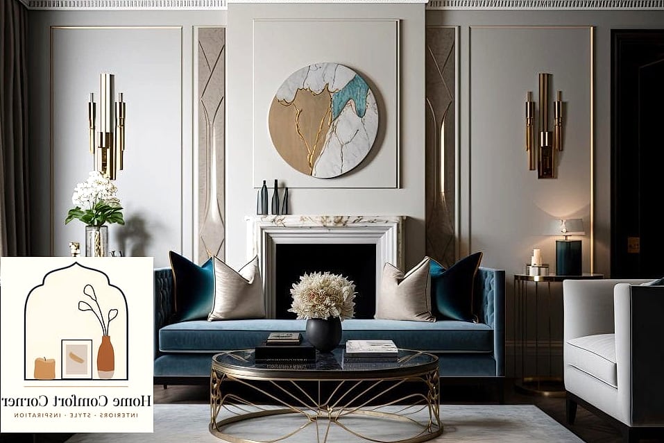
This is the cheapest trick in the book, and it works every single time. Pulling old builder-grade knobs off cabinets and replacing them with brushed brass or matte black hardware changes the entire personality of a room.
It works especially well in kitchens and bathrooms where cabinets are the main visual feature. A mixed metal approach — brass on cabinets, black on plumbing fixtures — is having a real moment right now and reads as intentional rather than mismatched.
Budget kits start under $50 for a full kitchen, and it’s genuinely a Saturday afternoon project. No contractor needed, and renters can usually swap the old hardware back before moving out.
Go Bold With a Statement Ceiling
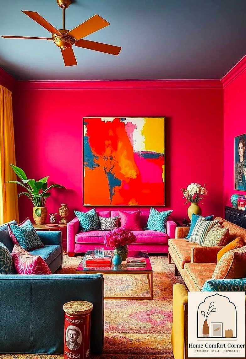
Ceilings get ignored way too often, and that’s exactly why painting or wallpapering one feels so fresh. A deep color, a subtle pattern, or even a grasscloth texture overhead pulls the eye up and makes the whole room feel taller and more considered.
This works beautifully in dining rooms, bedrooms, and powder rooms where you want drama without redoing four walls. Dark navy or forest green ceilings paired with white trim look particularly custom.
Peel-and-stick wallpaper is a great renter-friendly option here, and it goes up in an afternoon. Just make sure your ceiling is smooth first, since texture will show through thin paper.
Layer In Warm, Multi-Source Lighting
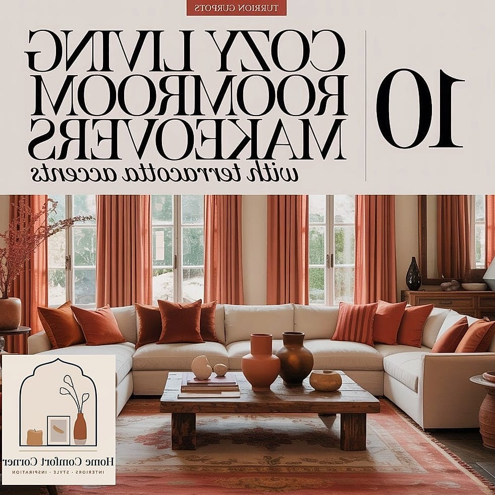
One overhead fixture lighting an entire room is one of the fastest ways to make a space feel flat and builder-basic. Expensive-feeling rooms almost always have several light sources working together — a floor lamp, table lamps, maybe some picture lights or a plug-in sconce.
Living rooms and bedrooms benefit the most from this layered approach. Warm bulbs (look for 2700K) make a huge difference over the cold, harsh light that comes standard in a lot of fixtures.
You don’t need an electrician for most of this. Plug-in wall sconces and lamps on dimmer plugs get you 90% of the effect without touching any wiring.
Install a Herringbone Tile Backsplash
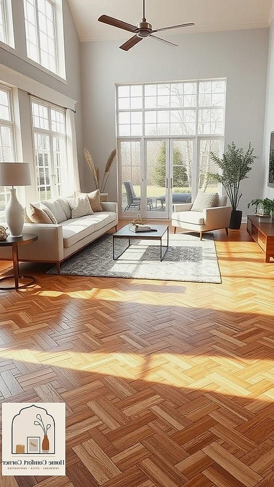
A herringbone pattern instantly reads as custom, even when you’re using the same basic tile as everyone else. The zigzag layout does all the heavy lifting, adding movement and texture that a straight-stack layout just can’t match.
Kitchens are the obvious spot, but herringbone also looks fantastic in a bathroom shower niche or as a small accent behind a bathroom vanity. Ceramic subway tile in herringbone costs about the same as a standard install — it’s really just a labor and layout difference.
If you’re comfortable with a wet saw, this is a doable DIY weekend project. If not, it’s still one of the more affordable things to hire out since the tile itself stays budget-friendly.
Add Board and Batten or Wainscoting
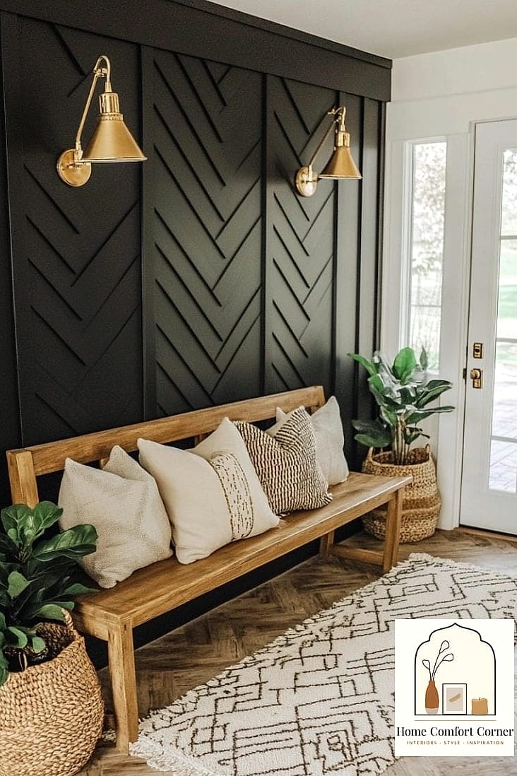
Adding dimension to a plain wall with board and batten is one of those upgrades that instantly makes a room feel more custom without requiring a full renovation. It’s basically MDF strips and paint, but the shadow lines it creates look like real millwork.
This is perfect for entryways, dining rooms, and bedroom accent walls. Painting it the same color as the wall above (rather than stark white against a colored wall) gives it a more sophisticated, monochromatic look that’s very on-trend right now.
Home improvement stores sell pre-primed boards specifically for this, which keeps the project affordable. Expect a full weekend for a standard-sized wall, including painting and drying time.
Bring In Natural Stone or Stone-Look Surfaces
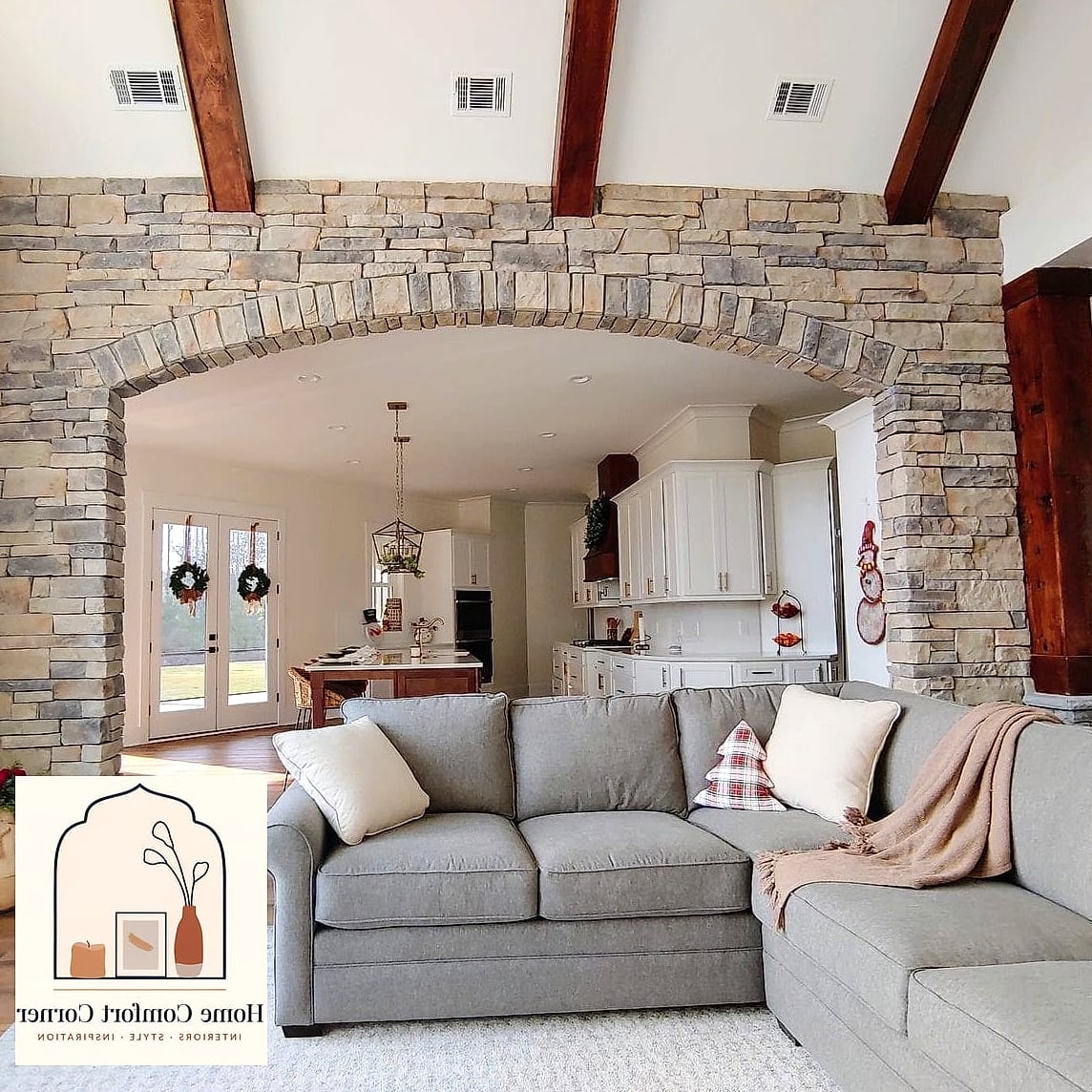
Real marble is gorgeous but pricey and high-maintenance. The good news is that today’s porcelain and quartz options mimic natural stone so convincingly that most guests won’t know the difference.
Countertops are the obvious application, but stone-look surfaces also work as a fireplace surround, a bathroom shower wall, or even a statement kitchen island waterfall edge. The veining and warm color palette do a lot of visual work.
Porcelain slabs are more scratch and stain resistant than natural marble, which makes them a genuinely practical choice for busy kitchens or families with kids. Quartz is another solid middle-ground option if you want something between budget laminate and pricey natural stone.
Create a Built-In Look With Simple Shelving
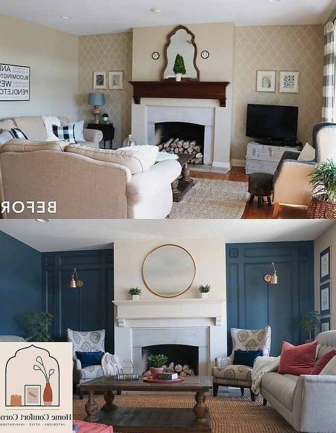
Real built-ins are expensive, but you can fake the look with stock cabinets and shelving from a home improvement store. Flanking a fireplace or window with matching cabinets, then adding crown molding across the top, creates a seamless built-in appearance for a fraction of custom carpentry costs.
This trick works especially well in living rooms and home offices where you want storage that looks architectural rather than added-on. Painting the shelving unit the same color as the wall behind it makes it disappear into the wall rather than looking like a separate piece of furniture.
Open shelving styled with a mix of books, greenery, and a few ceramic pieces keeps it from feeling too stiff. Leave some negative space — overcrowded shelves read as cluttered rather than curated.
Refresh Cabinets With a Two-Tone Paint Job
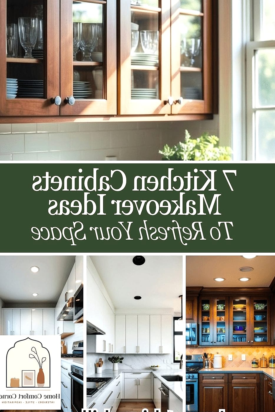
An all-white kitchen is timeless, but a two-tone cabinet approach feels noticeably more current and custom. Painting lower cabinets a deep color like navy, charcoal, or forest green while keeping uppers white or a soft neutral adds visual weight without overwhelming the space.
This works in kitchens of any size, though it’s especially effective in smaller kitchens where an all-dark palette might feel closed in. Pairing the darker lowers with warm wood open shelving or a butcher block counter section softens the contrast.
Cabinet paint kits designed for kitchens hold up better than standard wall paint, so it’s worth the extra cost there. Budget-conscious folks can start with just the island for a similar effect at a smaller scale.
Add Molding and Trim Details to Plain Walls
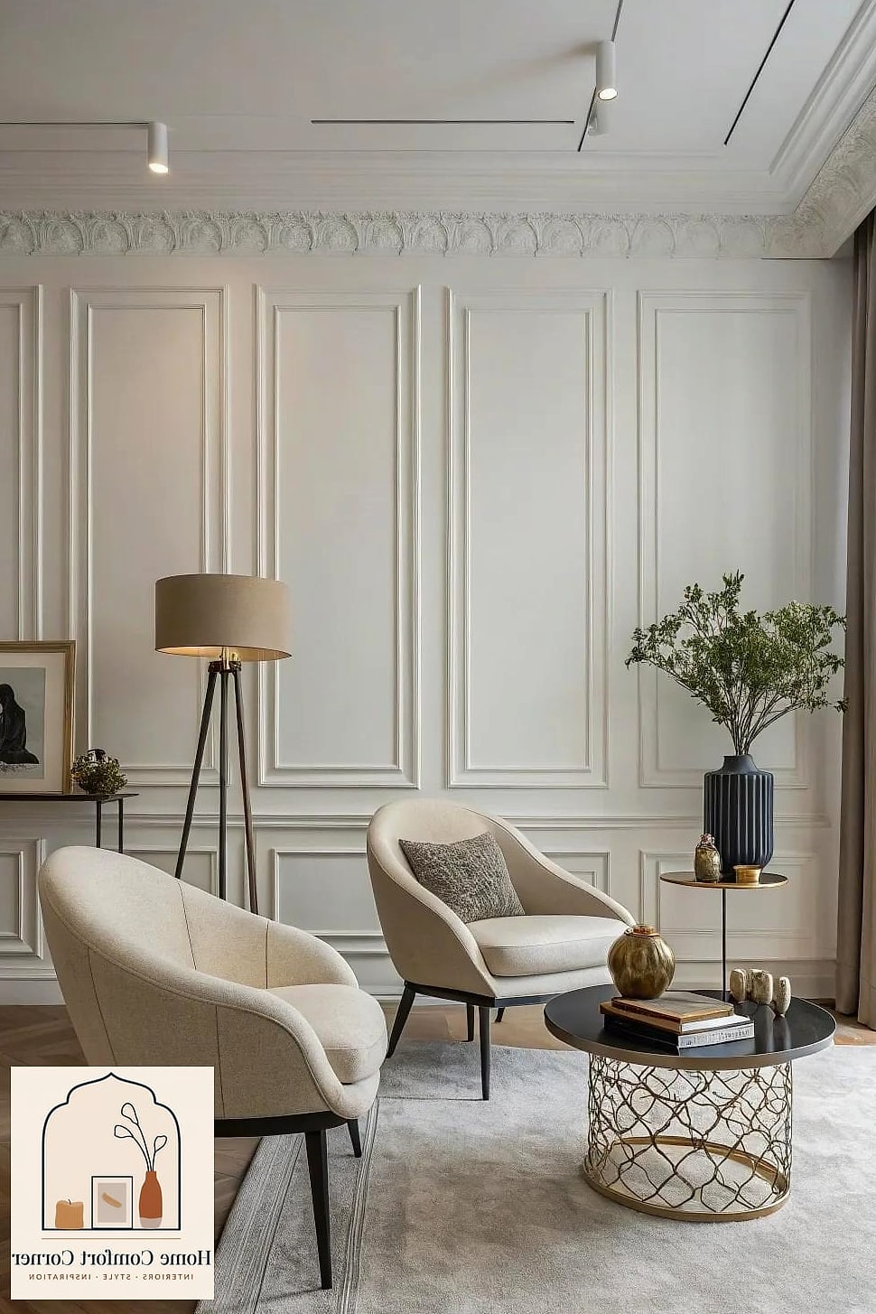
Picture frame molding — those simple rectangular outlines applied directly to painted walls — is a favorite trick for making a rental or basic builder home feel like it has real architectural bones. It’s essentially strips of thin trim and some caulk.
Dining rooms, primary bedrooms, and hallways all benefit from this treatment. Keeping the molding the same color as the wall (rather than white trim on a colored wall) gives it a more subtle, upscale look versus a stark contrast.
This is a genuinely beginner-friendly DIY project since the trim pieces are lightweight and forgiving to cut. A caulk gun and some wood filler for nail holes will get you a clean, finished look.
Style Open Shelves Like a Boutique Display
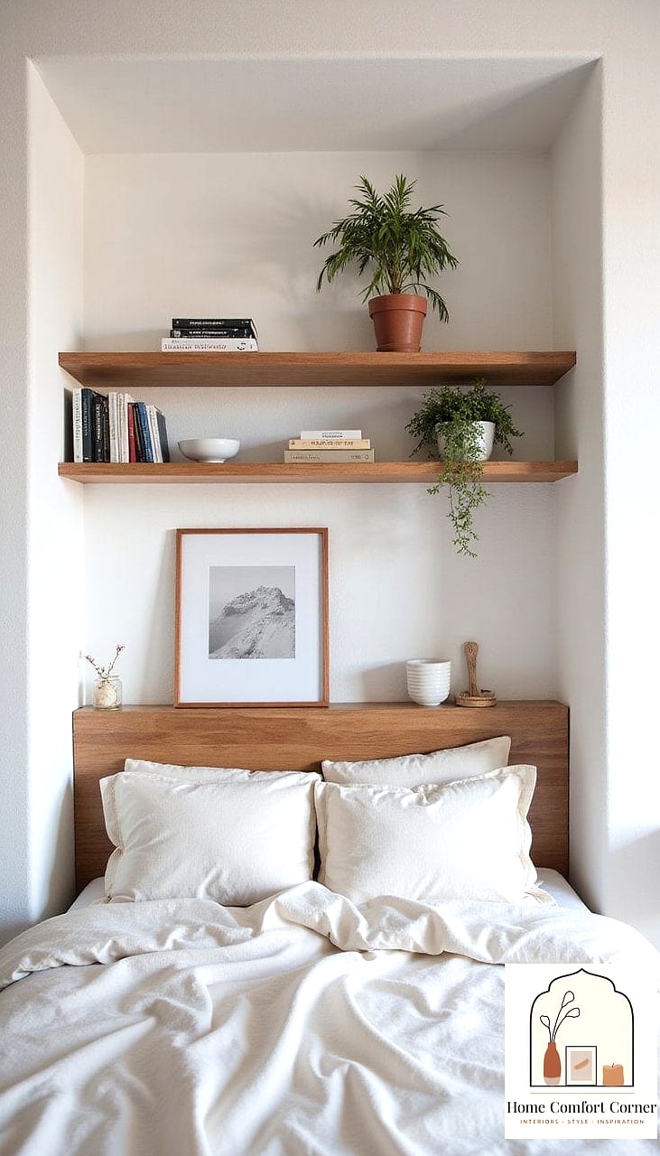
Open shelving gets a bad reputation for looking cluttered, but styled well, it can look like something out of a design magazine. The trick is grouping items in odd numbers, varying heights, and leaving breathing room between groupings instead of lining everything up evenly.
Kitchens and bathrooms are popular spots, using a mix of everyday dishware, woven baskets for hidden storage, and a plant or two for softness. A neutral color palette across your displayed items — creams, warm woods, muted greens — keeps it looking pulled together rather than random.
This is a completely free or low-cost update if you’re just rearranging what you already own. It’s also endlessly changeable, so you can restyle seasonally without spending anything new.
Upgrade to a Statement Light Fixture
Swapping a builder-basic flush mount for something with more presence is one of the fastest ways to elevate a room’s whole vibe. A woven pendant, a sculptural chandelier, or an oversized drum shade over a dining table draws the eye immediately and signals intentional design.
Entryways, dining rooms, and primary bedrooms are the best spots to splurge here, since these fixtures tend to be focal points anyway. Even a mid-range fixture looks expensive when it’s proportional to the space and hung at the right height.
If rewiring feels intimidating, plenty of statement fixtures now come with plug-in cord kits designed to hang from an existing hook, which is a nice workaround for renters.
Add Texture With Wood Accents
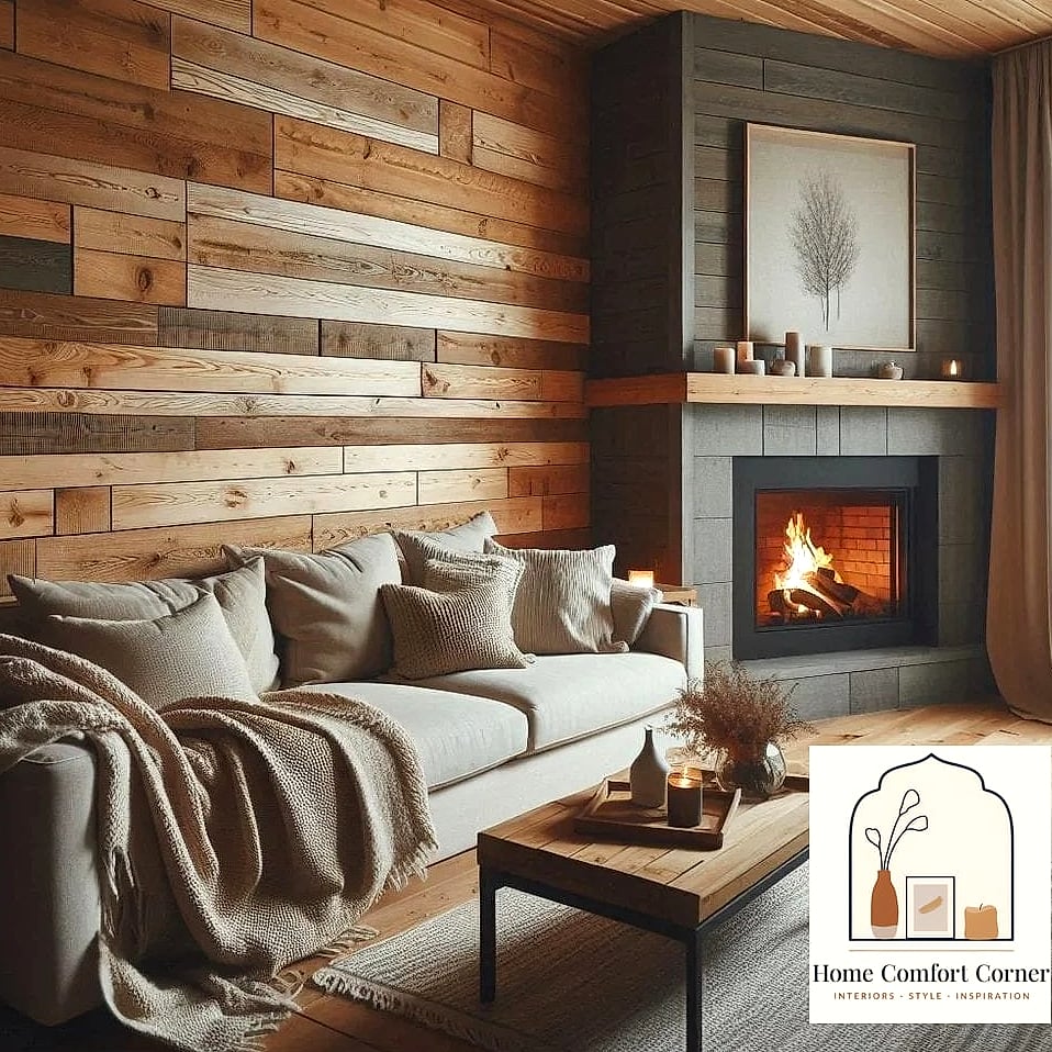
Smooth, flat surfaces everywhere can make a room feel a little sterile, even when the color palette is nice. Bringing in warm wood tones — through a slatted accent wall, a wood ceiling beam, or simply furniture with visible grain — adds richness that reads as high-end.
Living rooms and bedrooms benefit most from a wood accent wall behind a bed or television, since it acts almost like art. Slat wall panels are widely available now and install with basic tools and adhesive or a nail gun.
If a full wall feels like too much commitment, start smaller with a wood shelf, a wooden mirror frame, or a reclaimed wood mantel. Even small doses of warm wood balance out a room that’s feeling too cool or clinical.
Declutter and Edit Your Decor Ruthlessly
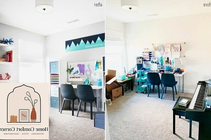
This one costs nothing and might be the most impactful item on this whole list. Expensive-looking rooms almost always have fewer things in them, not more. Editing down knickknacks, excess furniture, and mismatched decor lets the pieces that remain actually get noticed.
This applies everywhere, but living rooms and bedrooms show the biggest transformation since they tend to accumulate the most stuff over time. Try removing a third of what’s currently on your surfaces and see how much calmer the room feels immediately.
Storage bins and baskets are your friend for corralling the things you’re keeping but don’t need on display. A room with breathing room between objects reads as curated and intentional, while a packed room reads as chaotic no matter how nice the individual pieces are.
Any one of these ideas on its own can shift how a room feels, but combining a few — say, new hardware, layered lighting, and a good declutter — is usually where the real transformation happens. Start with whichever feels most doable for your space and budget, and build from there.