17 Contemporary Interior Design Makeovers That Look Incredibly Expensive
- Swapping Builder-Grade Hardware for Brushed Brass
- Painting Kitchen Cabinets a Warm Neutral
- Adding a Zellige Tile Backsplash
- Installing Floating Shelves in Place of Upper Cabinets
- Replacing a Vanity Mirror With a Framed or Arched Version
- Adding a Herringbone Tile Pattern to a Small Space
- Layering Lighting Instead of Relying on One Overhead Fixture
- Installing a Waterfall Countertop Edge
- Painting an Accent Wall in a Moody, Saturated Color
- Replacing a Standard Shower Curtain With a Frameless Glass Enclosure
- Adding Wainscoting or Board and Batten
- Swapping Carpet for Wide-Plank Wood or Wood-Look Flooring
- Creating a Built-In Look With Stock Cabinetry
- Choosing Matte Black Fixtures Over Chrome
- Adding Texture With Limewash or Venetian Plaster Paint
- Replacing a Hollow Front Door With a Solid Wood or Paneled Door
- Decluttering and Editing Down Decor Across the Whole Home
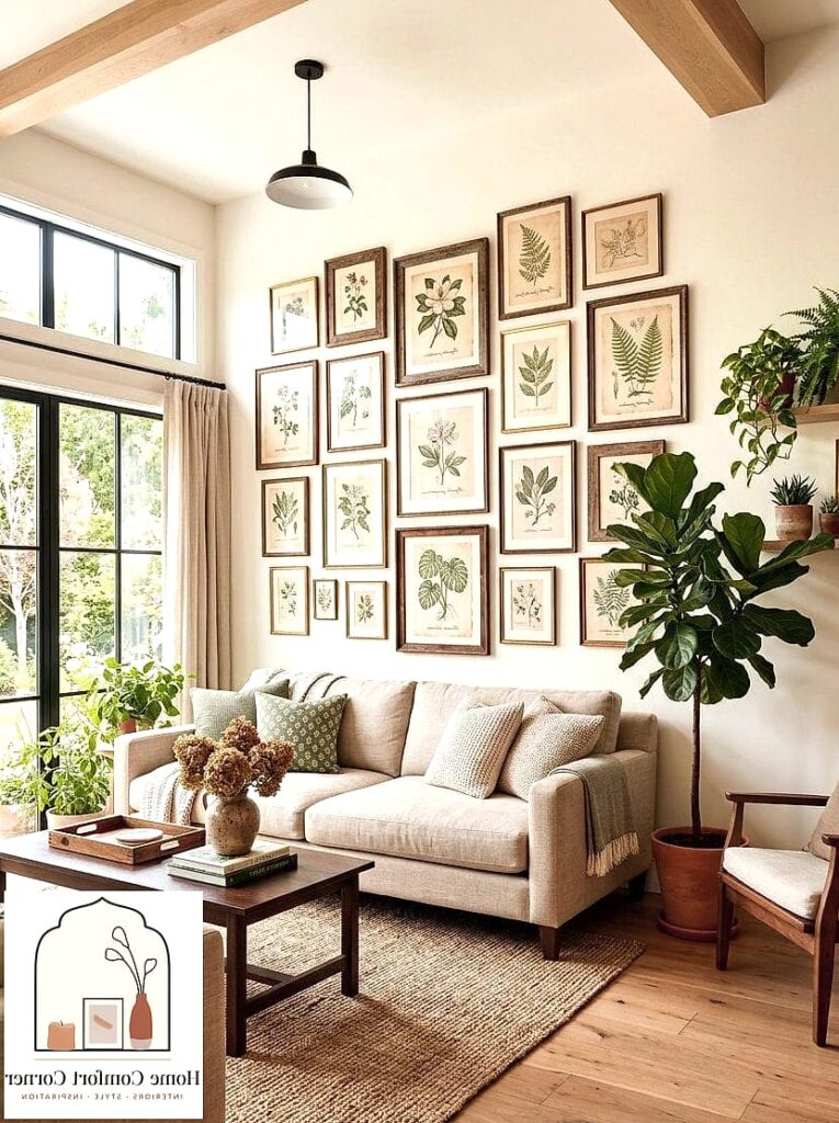
- Adding a Statement Rug to Anchor a Room
17 Contemporary Interior Design Makeovers That Look Incredibly Expensive
You don’t need a designer on speed dial or a bottomless renovation budget to make your home look like it belongs in a magazine. Most of the spaces that read as “expensive” are really just a handful of smart choices layered together — the right finish, a little restraint with color, some intentional lighting. I’ve pulled together seventeen contemporary makeovers that consistently fool people into thinking way more money was spent than actually was.
Swapping Builder-Grade Hardware for Brushed Brass
This is probably the cheapest high-impact change on this entire list. Pulling off shiny gold or dull brass knobs and replacing them with brushed brass or unlacquered brass hardware instantly makes cabinets look custom.
It works in kitchens, bathrooms, and even on interior doors. The warm tone pairs beautifully with neutral cabinetry and dark wood alike, and it doesn’t scream “trendy” the way polished chrome sometimes can.
Budget-wise you’re looking at a weekend project and maybe a couple hundred dollars for a full kitchen. Just measure your existing hole spacing before you order anything, since drilling new holes is a whole extra headache.
Painting Kitchen Cabinets a Warm Neutral
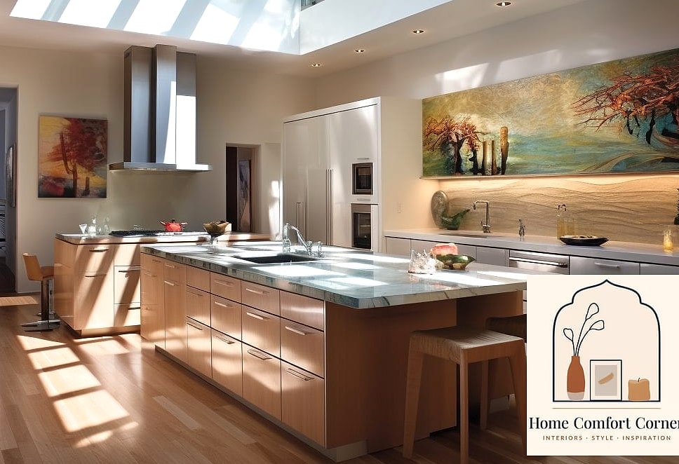
White kitchens aren’t going anywhere, but the newer expensive-looking version leans into warm neutrals — think greige, soft taupe, or a muted olive. Stark white can actually read a little flat and builder-basic these days.
Warm tones make a kitchen feel considered rather than default. Pair the cabinets with quartz countertops in a similar warm palette and you get a cohesive, high-end look without touching the layout.
This is a bigger project than swapping hardware, obviously. If you’re not confident with a sprayer, cabinet painting kits with a good foam roller can still give a smooth, professional-looking finish.
Adding a Zellige Tile Backsplash
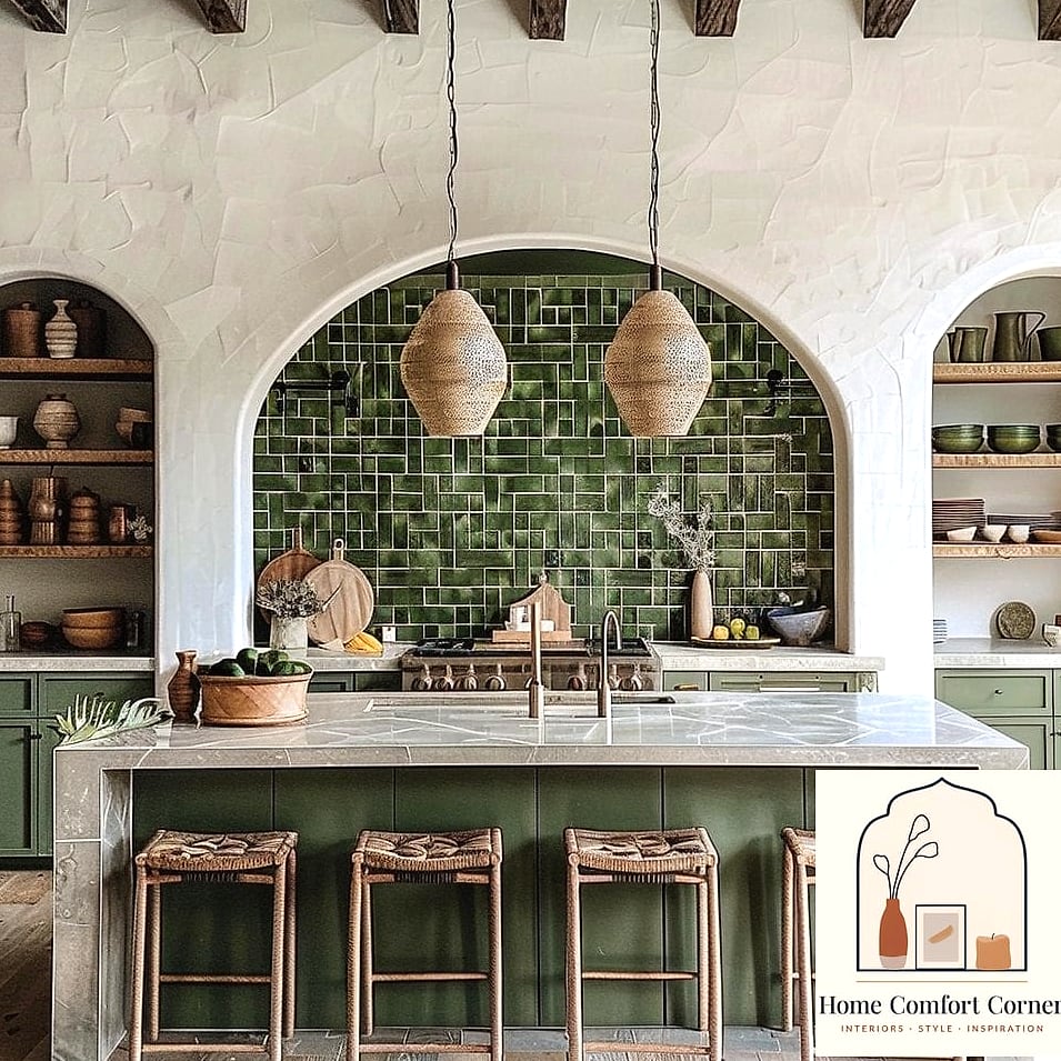
Zellige tile has that handmade, slightly imperfect look with a soft sheen that catches light differently across every single tile. It instantly reads as artisanal rather than mass-produced.
It works best in kitchens and bathroom vanity areas where you want a focal point without going overboard. A neutral zellige in warm white or clay tones sits well against most cabinet colors.
Real zellige is pricier and can be tricky to install because the tiles aren’t perfectly uniform, so budget extra time and possibly a pro. There are also convincing porcelain look-alikes now if you want the vibe for less.
Installing Floating Shelves in Place of Upper Cabinets
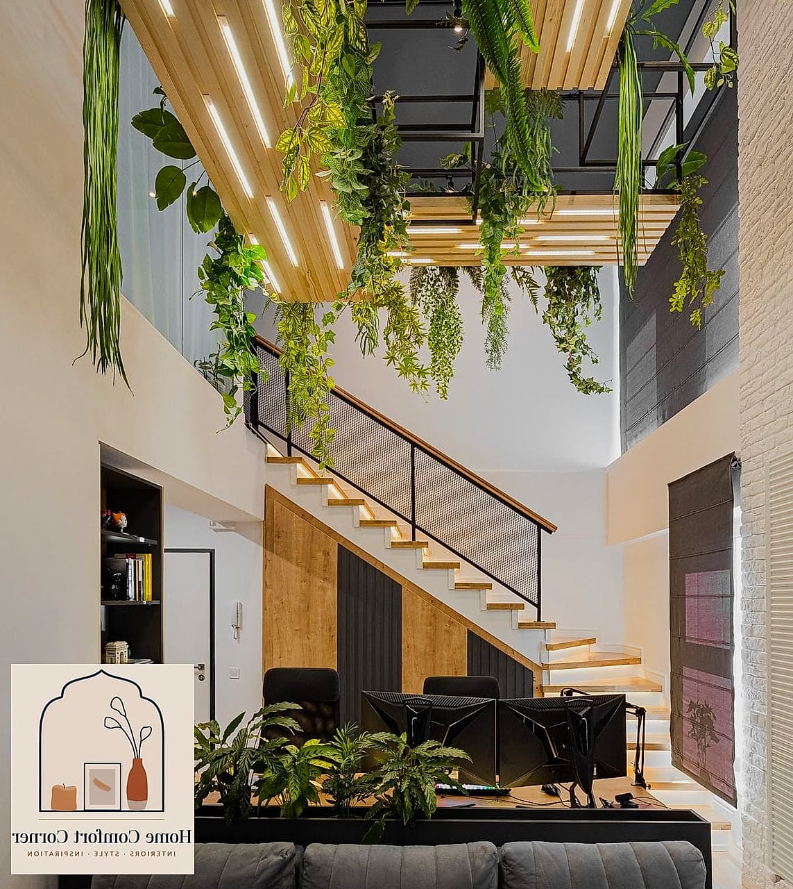
Open shelving gets a bad reputation for being hard to keep tidy, but done right — with matching dishware and a little breathing room — it makes a kitchen feel airy and custom-built.
Floating shelves work especially well in smaller kitchens where upper cabinets can feel heavy and closed-in. Wood shelves against a tiled or painted backsplash create nice visual contrast.
Keep the styling simple: a stack of bowls, a few glasses, maybe one plant. Overloading the shelves undoes the whole clean effect, and honestly it makes dusting way more annoying too.
Replacing a Vanity Mirror With a Framed or Arched Version
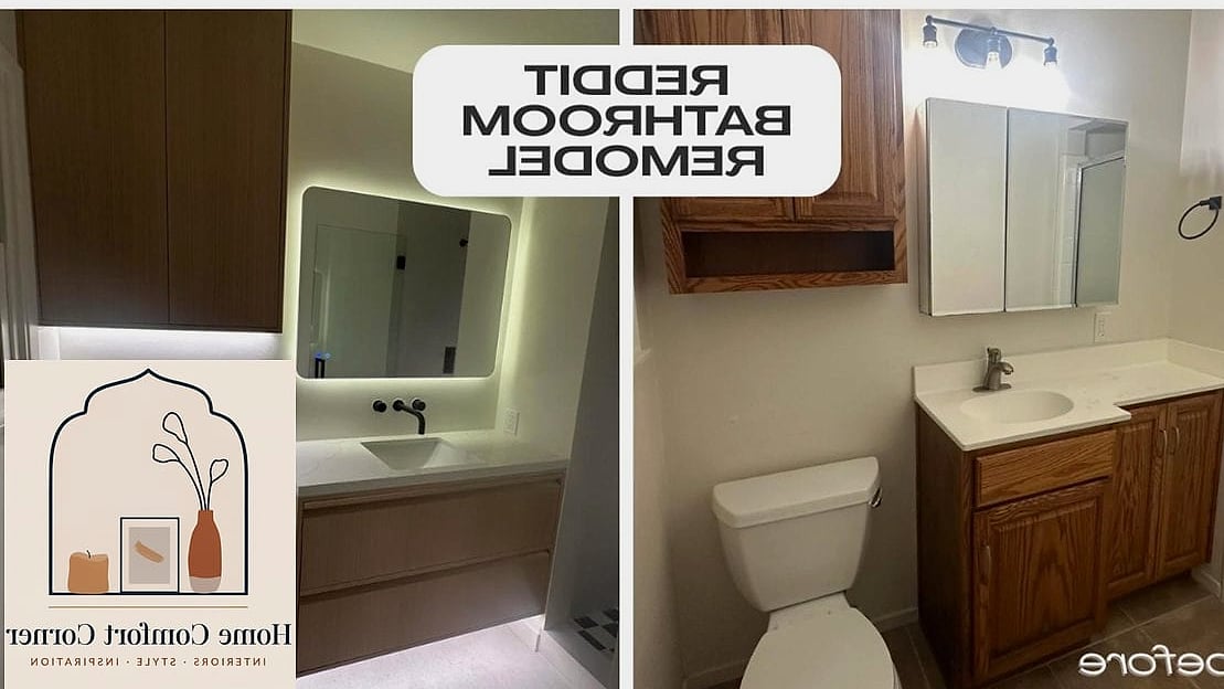
Builder-grade bathrooms almost always come with a plain rectangular mirror glued straight to the wall. Swapping it for a framed mirror, or better yet an arched one, changes the whole feel of the room.
Brass or black metal frames pair nicely with matte black or brushed brass fixtures. An arched mirror softens all the hard lines you typically get in a bathroom.
This is a genuinely easy DIY if your current mirror isn’t glued down. If it is glued, there are removal kits, but honestly this might be a job worth handing off.
Adding a Herringbone Tile Pattern to a Small Space
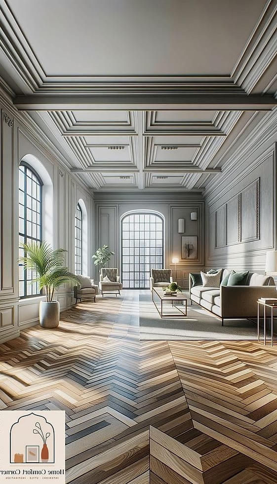
Pattern does a lot of heavy lifting when it comes to making something feel intentional. Herringbone tile, whether it’s in a bathroom floor, shower niche, or entryway, adds movement and texture that flat tile just can’t match.
Small bathrooms and entryways are ideal spots since the pattern draws the eye without overwhelming a large area. Stick to two or three tones max so it doesn’t feel busy.
Installation is more labor-intensive than a standard grid layout, which usually means higher labor costs if you’re hiring it out. It’s doable as a DIY if you’ve tiled before, but I wouldn’t recommend it as your first tiling project.
Layering Lighting Instead of Relying on One Overhead Fixture
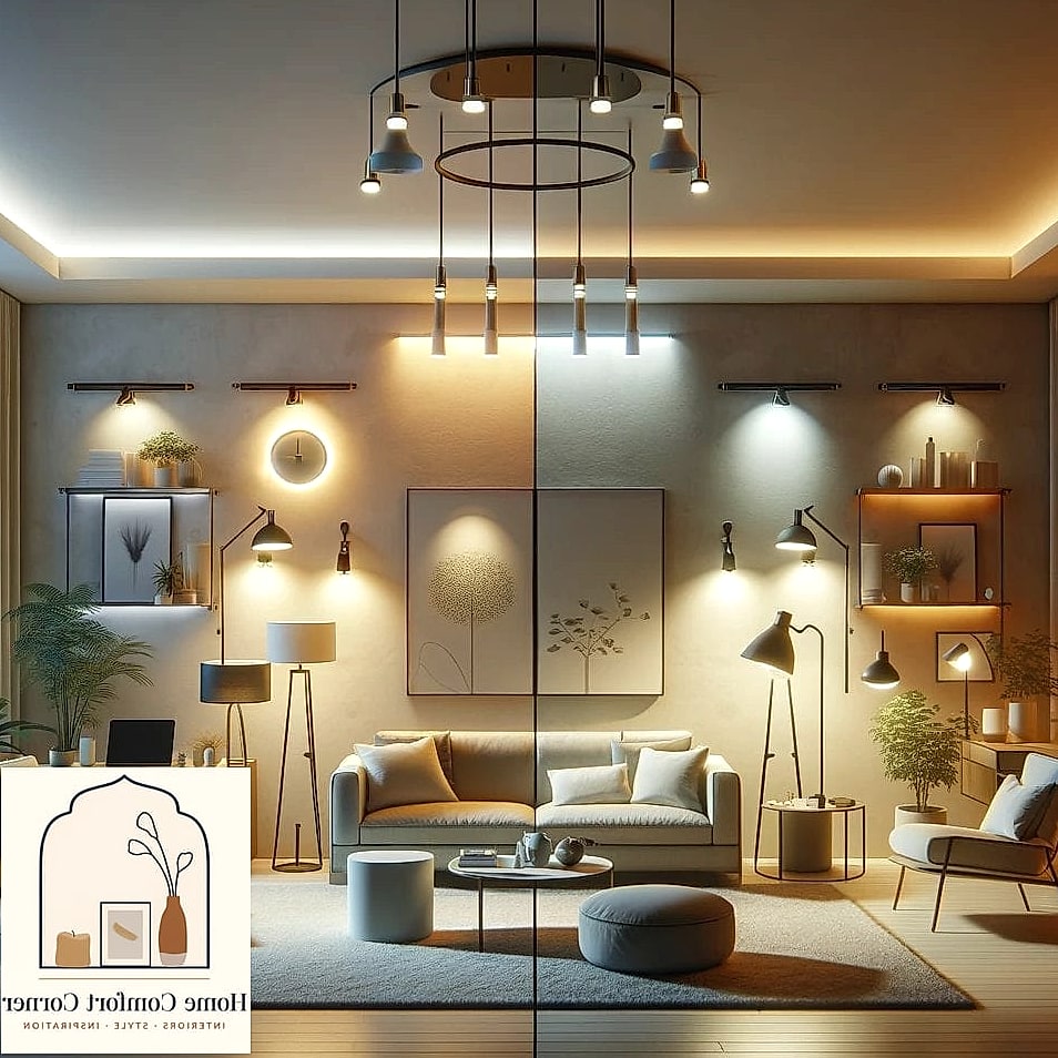
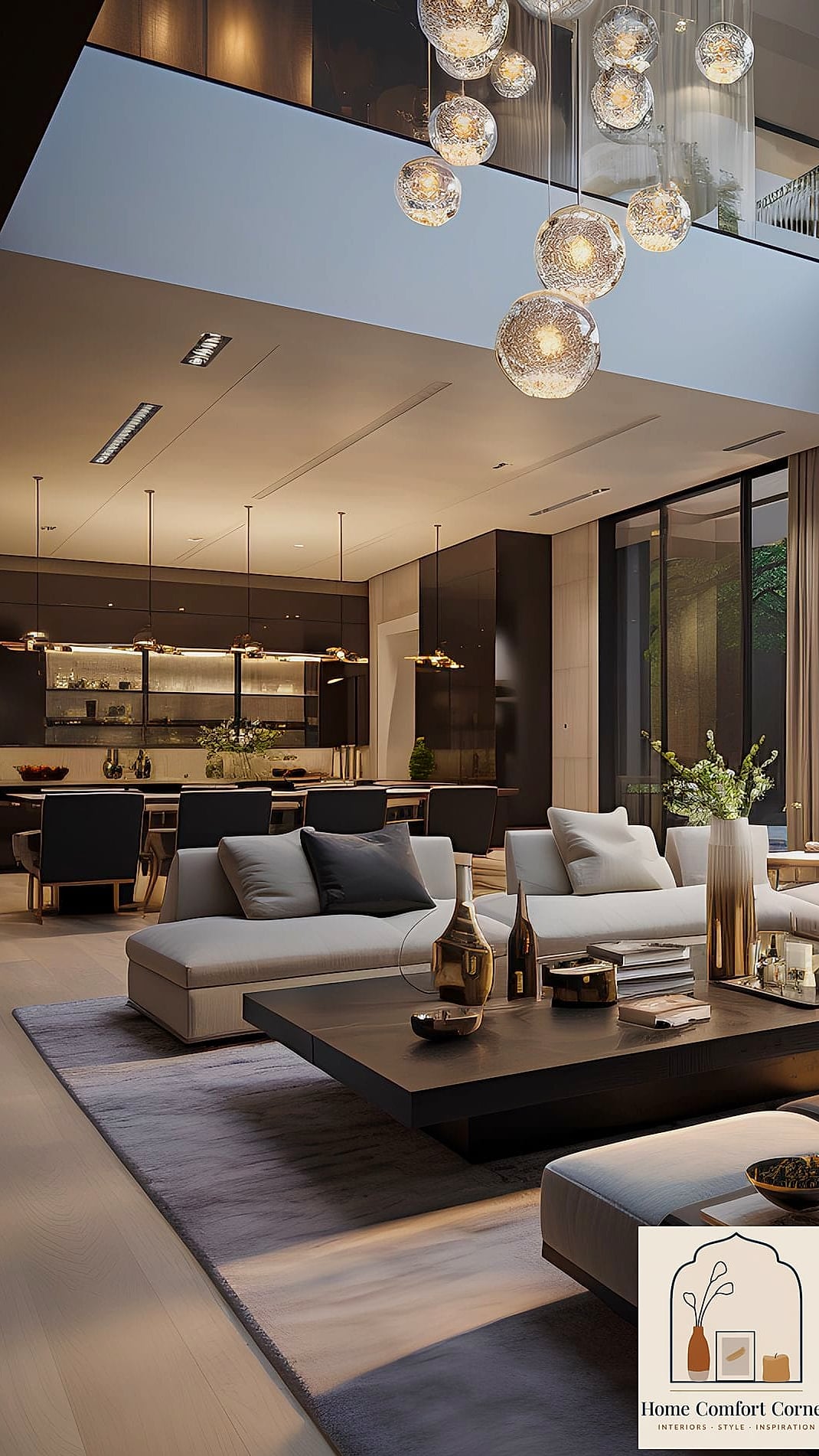
One of the biggest giveaways of a builder-basic room is a single overhead light doing all the work. Expensive-feeling spaces layer lighting — ambient, task, and accent — so the room has depth at night.
This works in every single room of the house, honestly. A living room might get a floor lamp, a table lamp, and a dimmable overhead fixture. A kitchen benefits from under-cabinet lighting plus pendants over an island.
Dimmer switches are a cheap upgrade that make a huge difference here. Warm-toned bulbs (look for 2700K) also help avoid that harsh, sterile feeling.
Installing a Waterfall Countertop Edge
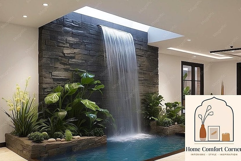
A waterfall countertop, where the material wraps down the side of an island instead of stopping at the edge, is one of those details that immediately signals a bigger budget was involved.
It works best on kitchen islands and bathroom vanities with clean, simple cabinetry underneath. Quartz is the most practical material choice since it’s consistent and durable, though marble gives a more luxurious, veined look.
This isn’t really a DIY project since it requires precise cutting and seaming. It’s an investment, but it’s also one of the details people notice first when they walk into a kitchen.
Painting an Accent Wall in a Moody, Saturated Color
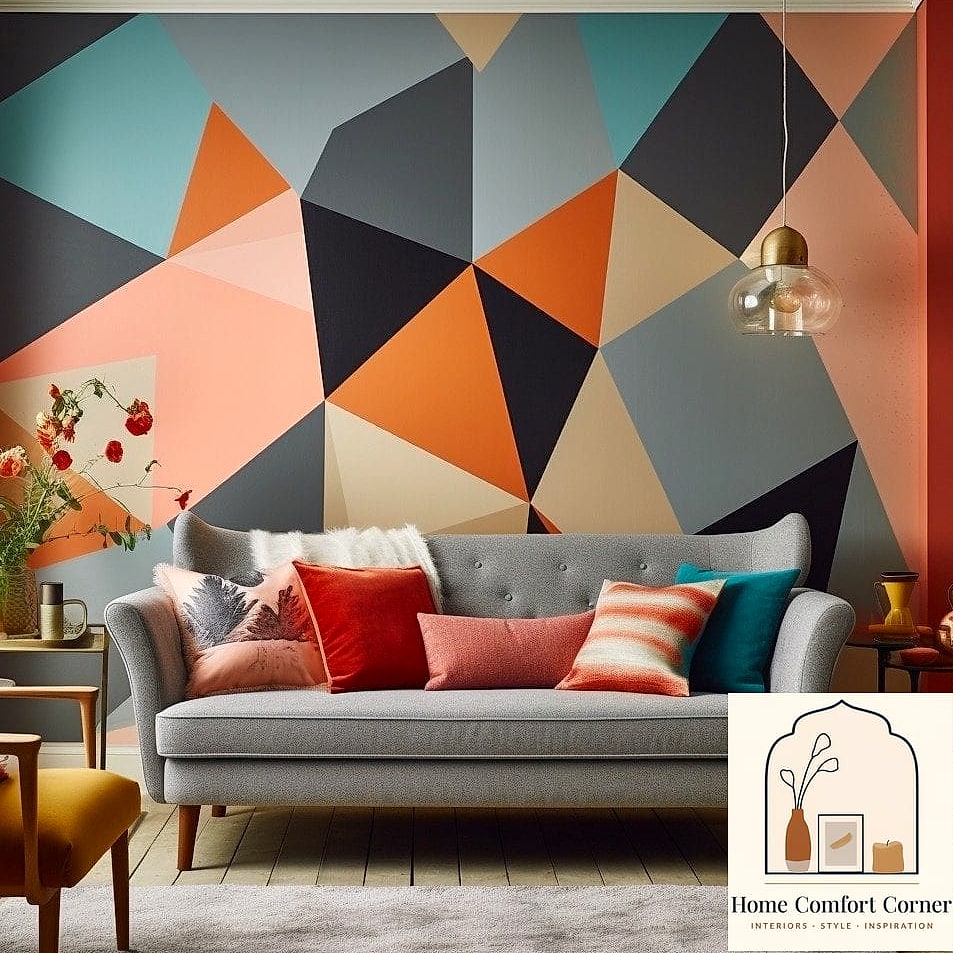
Forget the single stripe of color behind a couch — the expensive-looking version of an accent wall now is a deep, saturated hue like a forest green, deep terracotta, or charcoal, often carried onto the ceiling too.
Bedrooms and dining rooms are great candidates since these are spaces meant to feel cozy and enveloping rather than bright and open. Pair with warm wood tones and brass or black accents.
Deep colors can make a small room feel smaller if you’re not careful with lighting, so add plenty of warm lamp light to balance it out. A sample pot on the wall for a few days before committing is always worth the extra step.
Replacing a Standard Shower Curtain With a Frameless Glass Enclosure
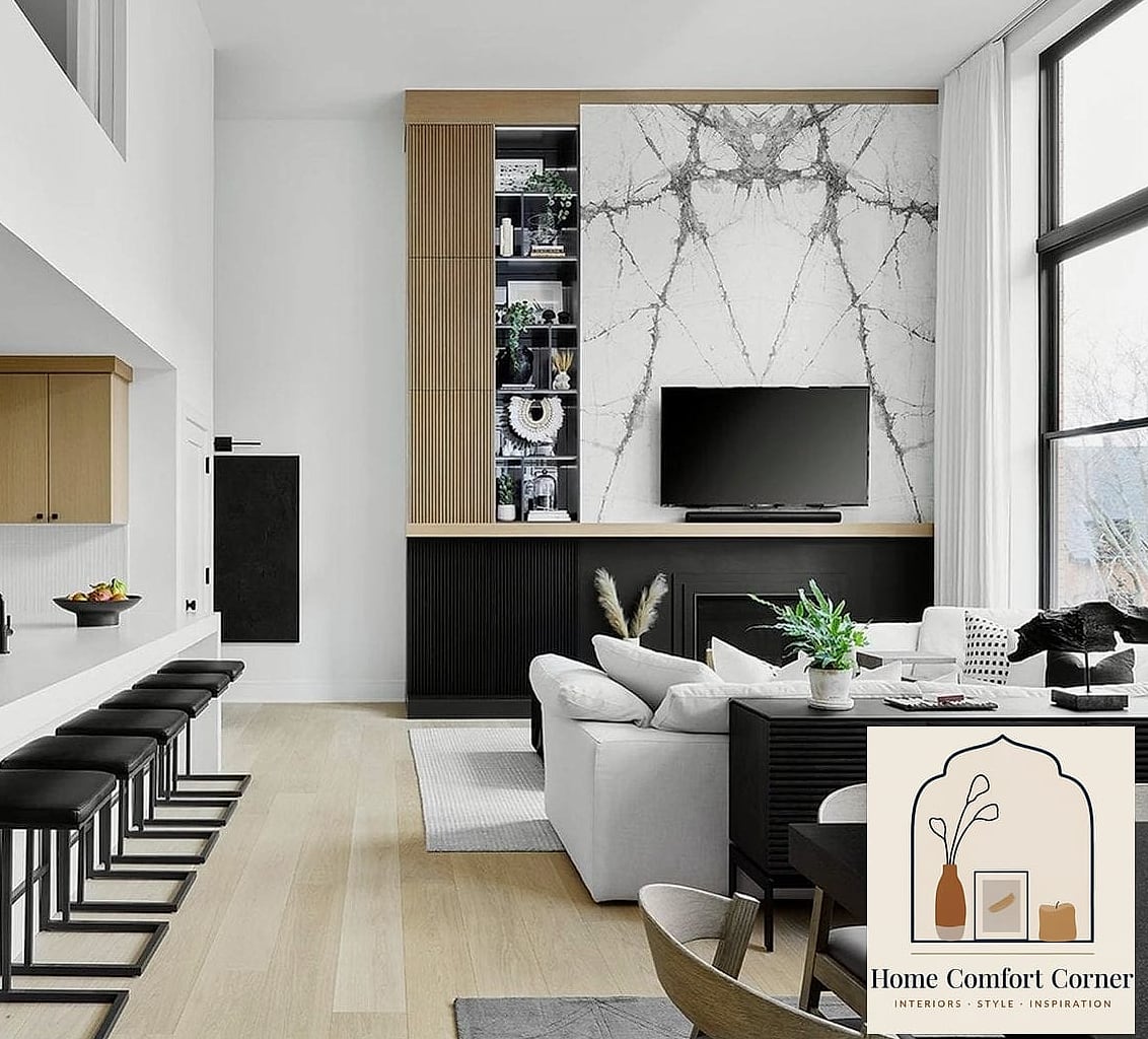
Nothing says “budget bathroom” quite like a plastic shower curtain billowing around. A frameless glass enclosure instantly makes a bathroom feel like it belongs in a boutique hotel.
This works best in bathrooms with decent square footage since glass makes the whole space feel more open. Pairing it with a tiled shower floor or a statement tile on the shower wall amps up the effect even more.
It’s a bigger investment and typically needs a professional installer for a proper seal. If a full renovation isn’t in the cards, even a sleek sliding glass door over a tub can get you most of the way there.
Adding Wainscoting or Board and Batten
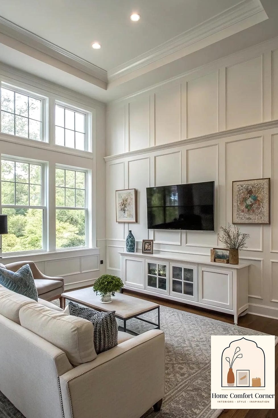
Board and batten paneling adds architectural interest to walls that would otherwise be flat and forgettable. It’s a detail you’d expect in a much older, more expensive home, which is exactly why it reads as high-end now.
Dining rooms, entryways, and even bedrooms all benefit from this treatment. Painting the paneling and the wall above it the same color keeps things looking cohesive rather than choppy.
This is a genuinely approachable DIY with MDF boards, a miter saw, and some caulk. Budget a full weekend, plus another day or two for painting and drying time.
Swapping Carpet for Wide-Plank Wood or Wood-Look Flooring
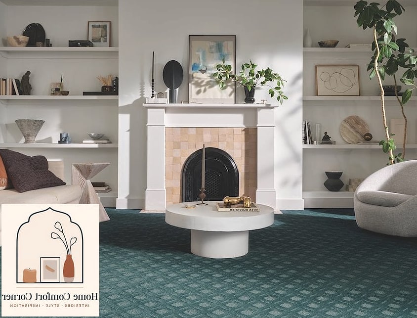
Wall-to-wall carpet, especially in a dated color, is one of the fastest ways to make a home feel older and cheaper than it is. Wide-plank flooring in a warm or medium wood tone modernizes a space almost instantly.
This works throughout main living areas, though bedrooms can go either way depending on how much you want that cozy carpet feel underfoot. Wide planks in particular read as more current than narrow strip flooring.
Real hardwood is the priciest option, but quality luxury vinyl plank has gotten remarkably convincing and is far more forgiving for pets and humidity. It’s also fairly DIY-friendly with click-lock systems.
Creating a Built-In Look With Stock Cabinetry
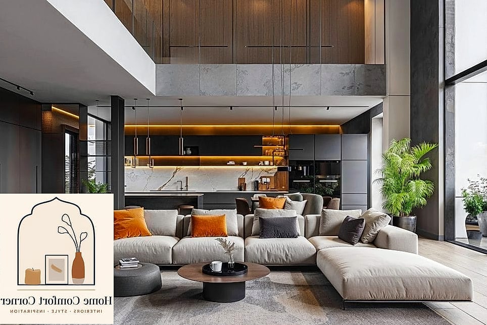
Custom built-ins around a fireplace or in an entryway are a hallmark of a well-designed, expensive home. You can fake this look using stock cabinetry from a home improvement store, trimmed out to fit the space perfectly.
This works especially well flanking a fireplace or filling an awkward alcove that would otherwise be dead space. Adding crown molding at the top and matching paint to the wall color sells the “built from scratch” illusion.
It takes some carpentry skill to get the trim details right, but it’s a fraction of the cost of true custom millwork. Even simple bookshelves from a big box store can be dressed up this way.
Choosing Matte Black Fixtures Over Chrome
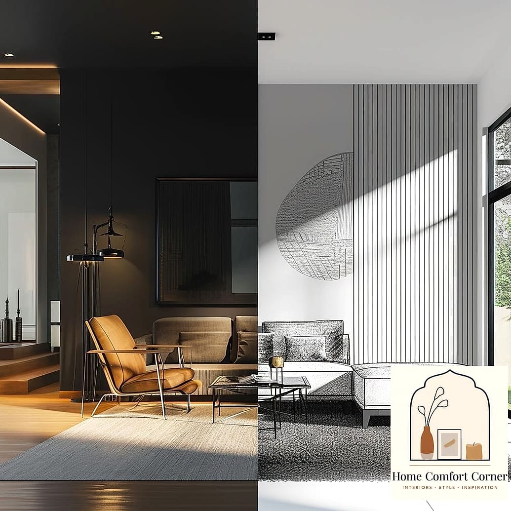
Chrome fixtures aren’t inherently cheap, but matte black has become the shorthand for contemporary and intentional. Faucets, showerheads, and even light fixtures in matte black add a bit of drama and contrast.
Kitchens and bathrooms both benefit, especially when paired with warm wood tones or white oak cabinetry for contrast. It also hides water spots better than chrome, which is a nice bonus if you’ve got hard water.
Matte finishes can show fingerprints more than you’d expect, so a quick wipe-down routine helps keep them looking sharp. Mixing metals (black fixtures with brass hardware, for example) is very on-trend right now too.
Adding Texture With Limewash or Venetian Plaster Paint
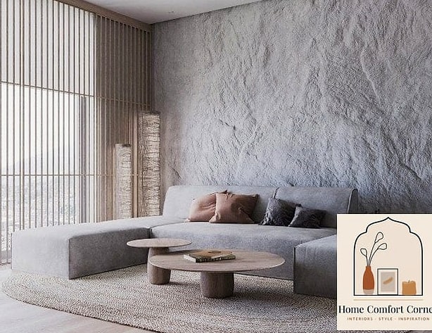
Flat paint can look a little lifeless, especially in larger rooms. Limewash and Venetian plaster finishes add subtle texture and depth, almost like the wall has history to it, which is a big part of why they read as expensive.
These finishes work beautifully as an accent wall or throughout an entire powder room, where the smaller space lets you appreciate the texture up close without it becoming overwhelming.
Limewash kits designed for DIY use have made this much more accessible than true plaster application. It does take some practice on a scrap board first, since the brushstroke technique matters a lot here.
Replacing a Hollow Front Door With a Solid Wood or Paneled Door
Interior doors get overlooked constantly, but a solid, paneled door with a substantial feel (and sound) changes how a whole hallway or entry reads. Hollow, flat doors are one of those quiet builder-grade tells.
This makes the biggest difference on a front door or a primary bedroom door, since these get the most attention. A rich stain or a deep painted color both work depending on your overall palette.
Solid doors cost more and are heavier, so double check your hinges can handle the weight. If a full replacement isn’t realistic right now, adding trim detail or a new substantial door handle can help bridge the gap.
Decluttering and Editing Down Decor Across the Whole Home
This one costs nothing and might be the most underrated makeover on the list. Expensive-looking homes almost always have less stuff in them — fewer knickknacks, cleaner countertops, more breathing room around furniture.
It matters everywhere, but especially in kitchens, living rooms, and entryways where clutter accumulates fastest. Hidden storage like baskets, drawer organizers, and closed cabinets let you keep function without the visual noise.
Try editing decor down to pieces you’d actually miss, then giving what’s left more space to breathe on a shelf or table. It’s a free project, though I won’t pretend it’s not a little emotionally hard to let things go sometimes.
Adding a Statement Rug to Anchor a Room
A too-small rug shoved under just the coffee table is one of those things that instantly undercuts an otherwise nice room. A properly sized rug that extends under at least the front legs of your furniture pulls everything together.
Living rooms and dining rooms need this most, since furniture needs to feel grounded rather than floating awkwardly on bare floor. A textured wool or vintage-style rug adds warmth that a flat, synthetic one can’t match.
Bigger rugs cost more, obviously, but this is one area where sizing up is almost always worth it over choosing a fancier material at a smaller size. Rug pads also extend the life of the rug and keep it from sliding, which matters more than people expect.
Putting even three or four of these makeovers together in one room tends to compound the effect — a warm neutral cabinet color, brushed brass hardware, and layered lighting can transform a kitchen without a single wall coming down. Start with whatever fits your budget and skill level right now, and let the rest be next year’s project.