15 Beautiful Interior Design Logo Inspiration Photos Worth Saving
- Minimalist Line Art Furniture Icon
- Monogram with a Modern Twist
- Abstract Room Outline Mark
- Botanical Accent Paired with Typography
- Bold Geometric Shape Logo
- Hand-Drawn Sketch Style Logo
- Elegant Serif Wordmark Only
- Layered Color Block Emblem
- Vintage Badge or Crest Style
- Negative Space Furniture Silhouette
- Soft Gradient Icon Mark
- Custom Hand-Lettered Script
- Architectural Blueprint-Inspired Mark
- Single Object Icon with Bold Outline
- Two-Tone Icon and Wordmark Combo
15 Beautiful Interior Design Logo Inspiration Photos Worth Saving
If you’re building a brand for your design studio, staging business, or home decor shop, your logo is doing a lot of heavy lifting. It’s the first thing people notice before they ever see your portfolio. I’ve spent years helping clients pull together mood boards for their homes, and honestly, branding a design business isn’t all that different from designing a room. You’re working with balance, color, texture, and a feeling you want people to walk away with.
I pulled together fifteen logo directions that keep showing up in the interior design world for good reason. Some are minimal, some lean bold, and a few are just plain clever. Save the ones that speak to you.
Minimalist Line Art Furniture Icon
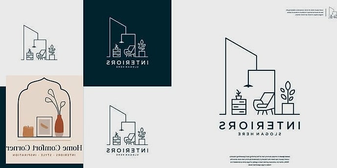
There’s something about a single continuous line forming a chair or a lamp silhouette that feels instantly sophisticated. This style works because it doesn’t try too hard. It’s the kind of logo that looks just as good stitched on a tote bag as it does stamped on a business card.
Designers gravitate toward this look when they want their brand to feel calm and editorial, almost like a page out of a design magazine. Pair it with a thin serif font and lots of white space, and you’ve got something that reads high-end without shouting about it.
Monogram with a Modern Twist
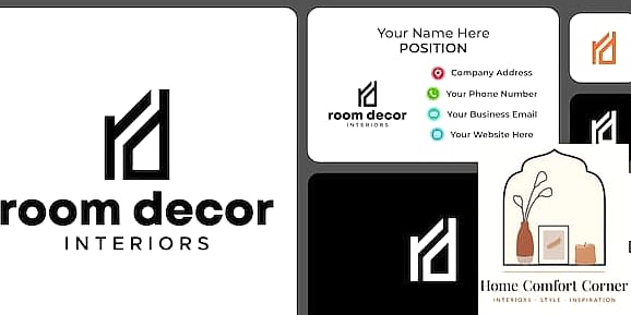
A classic monogram never really goes out of style, but the modern versions feel fresher than the stuffy corporate ones from a decade ago. Think interlocking letters with uneven line weights or a monogram tucked inside a soft geometric shape.
This direction works especially well for solo designers or small studios where the brand is essentially tied to a person’s name. It gives you something recognizable that can scale down to a tiny favicon without losing its shape.
Abstract Room Outline Mark
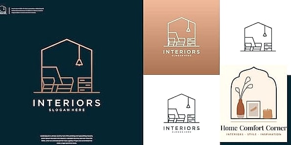
Instead of drawing an actual piece of furniture, some of the best logos I’ve seen simplify an entire room into a few clean shapes. Think a window, a door frame, or a floor plan reduced to its bare geometry.
It’s a smart way to hint at “interiors” without being literal about it. This style tends to age well too, since it’s not tied to a specific furniture trend that might look dated in five years.
Botanical Accent Paired with Typography
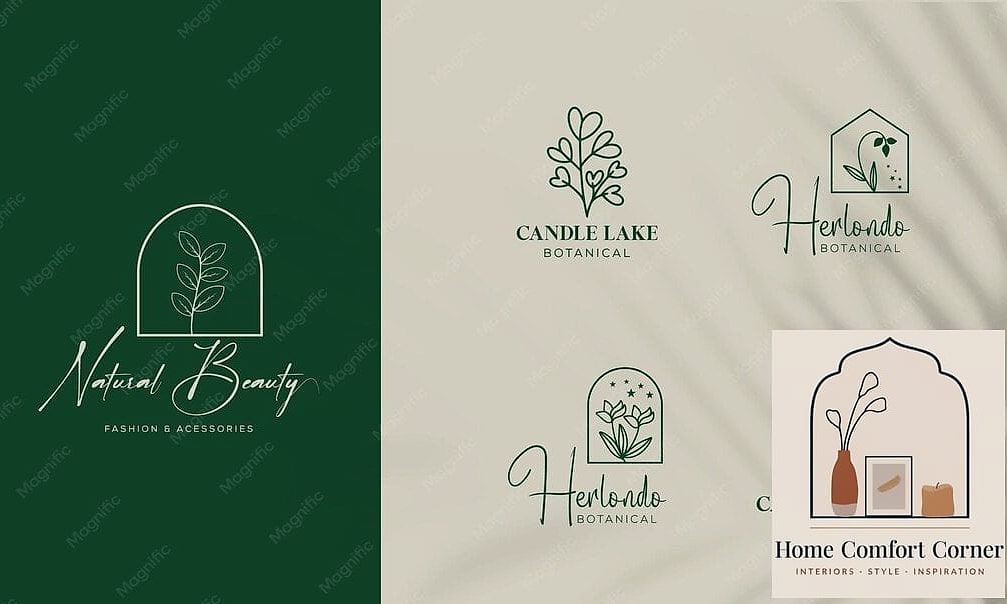
Adding a small leaf, branch, or sprig next to your studio name brings in warmth without overwhelming the design. It’s a nod to the natural materials so many designers love working with, like warm wood tones and greenery styling in real spaces.
This combo feels especially fitting for designers who lean into organic modern or Japandi-inspired interiors. Keep the botanical element small and simple so it doesn’t compete with the wordmark.
Bold Geometric Shape Logo
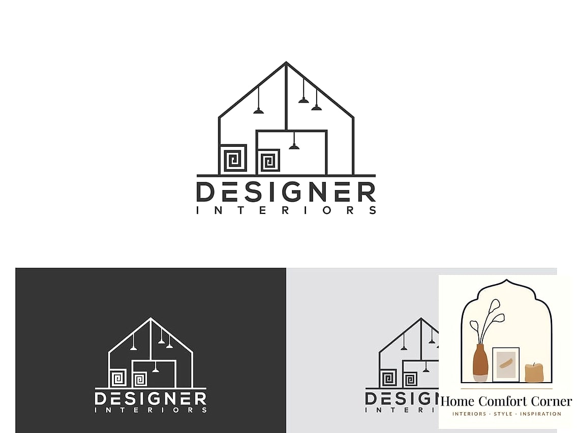
Circles, arches, and half-moons have been everywhere in interior design lately, and that trend has spilled right over into logo work. A single confident shape, maybe in a warm terracotta or deep forest green, can carry an entire brand identity on its own.
This is a great option if you want your logo to feel current and a little architectural. It photographs beautifully on packaging, signage, and even embossed on paper samples.
Hand-Drawn Sketch Style Logo
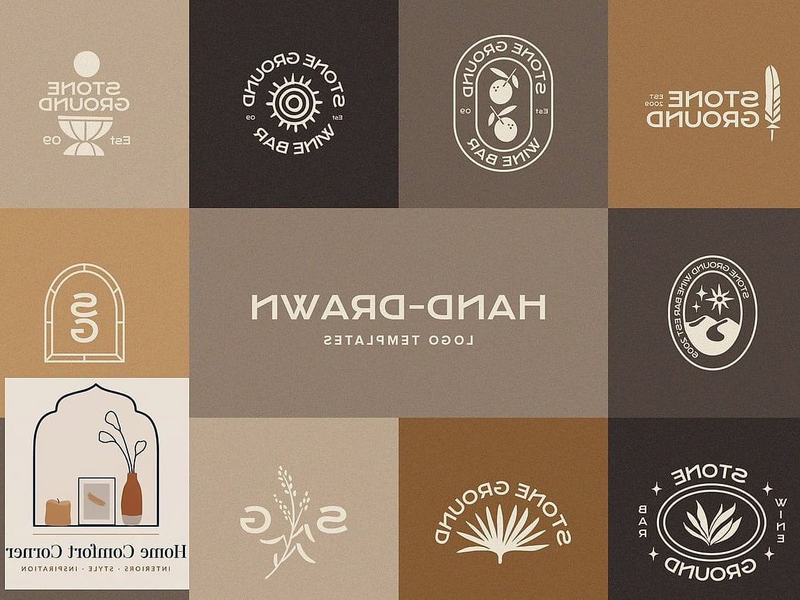
Some of my favorite studio logos look like they were pulled straight from a designer’s actual sketchbook. Loose, hand-drawn lines forming a chair or a lighting fixture give off a genuine, approachable feeling.
This style tends to appeal to designers who want their brand to feel personal rather than polished to a corporate shine. It’s less about perfection and more about showing the creative process behind the work.
Elegant Serif Wordmark Only
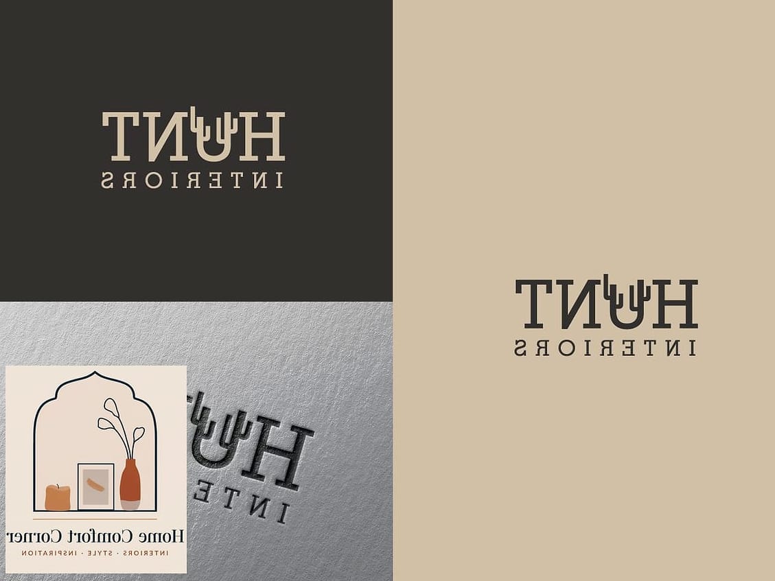
Sometimes the simplest option is the strongest one. A well-chosen serif typeface, spaced out generously, can say “established, trustworthy, refined” without any icon at all.
This works particularly well for designers focused on traditional, transitional, or classic interiors. The trick is picking a typeface with real personality in the letterforms, since the type itself becomes the entire visual identity.
Layered Color Block Emblem
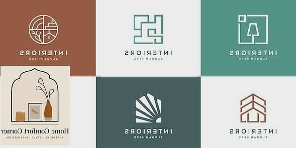
Overlapping shapes in two or three complementary colors create a logo that feels playful but still grounded. Picture a soft blush square layered behind a navy circle, forming a subtle badge shape.
Designers who work with bold color palettes in their actual projects tend to lean toward this style. It signals right away that this isn’t a brand afraid of color, which sets expectations before a client even sees the portfolio.
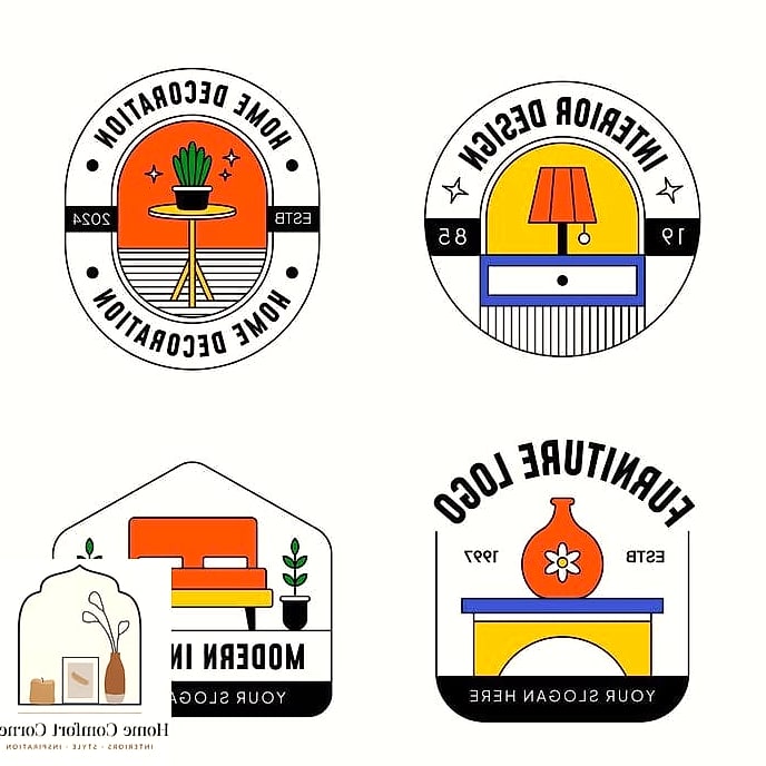
Vintage Badge or Crest Style
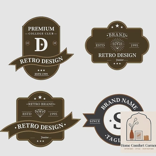
Circular badge logos with a border, some small text arcing around the edge, and a central icon give off an established, almost heritage feel. It works surprisingly well for interior designers who specialize in traditional or farmhouse style homes.
The nostalgic quality pairs nicely with brands that want to feel trustworthy and rooted, almost like a family business even if it’s brand new. Just be careful not to cram in too much detail, or it can get muddy at small sizes.
Negative Space Furniture Silhouette
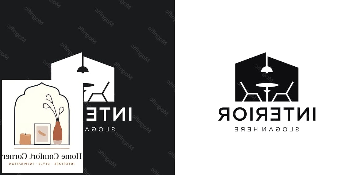
This is one of those logo tricks that feels like a little magic trick once you notice it. A chair or lamp silhouette is formed using the empty space between two shapes rather than being drawn directly.
It takes a skilled designer to pull off well, but when it works, it’s memorable in a way that a straightforward icon just can’t compete with. People remember logos that make them look twice.
Soft Gradient Icon Mark
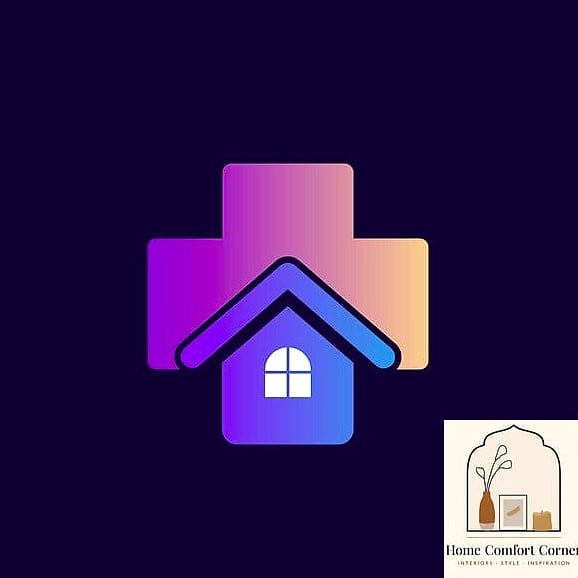
Gradients have made a real comeback, and in the interior design space they tend to show up in warm, sunset-inspired tones rather than anything too neon. A simple icon, like an arch or a lamp, rendered in a soft gradient feels modern and a little dreamy.
This direction suits designers who work with soft, romantic interiors full of layered lighting and warm textures. It’s a subtle way to bring some depth into an otherwise flat design.
Custom Hand-Lettered Script
A flowing script logo brings a personal, boutique feeling that block lettering just can’t match. It works especially well for designers who offer a very curated, one-on-one client experience rather than a large firm structure.
Pair it with a simple icon or keep it as a standalone script for maximum impact. Just make sure it’s still legible at a small size, since overly ornate scripts can turn into an unreadable squiggle on a business card.
Architectural Blueprint-Inspired Mark
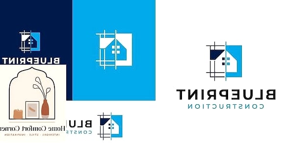
Thin lines, technical-looking details, and a grid-based layout give this style a smart, structured feel. It leans into the more technical side of interior design, appealing to clients who care about craftsmanship and precision.
This direction pairs beautifully with a muted, almost monochrome color palette. It also tends to photograph really well on business cards printed on matte, textured paper stock.
Single Object Icon with Bold Outline
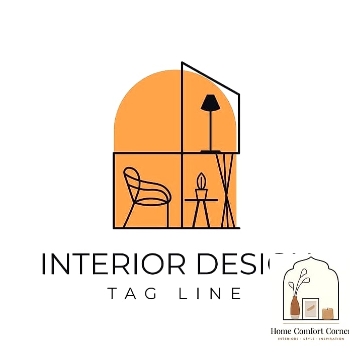
Rather than an entire scene, some of the strongest logos zero in on one object, a single lamp, a chair, or even a paint roller, rendered in a bold, thick outline. It’s simple, graphic, and easy to recognize from across a room or a phone screen.
This style holds up really well across everything from an Instagram profile photo to an embroidered apron. It’s a practical choice for designers who need their branding to work hard across a lot of different formats.
Two-Tone Icon and Wordmark Combo
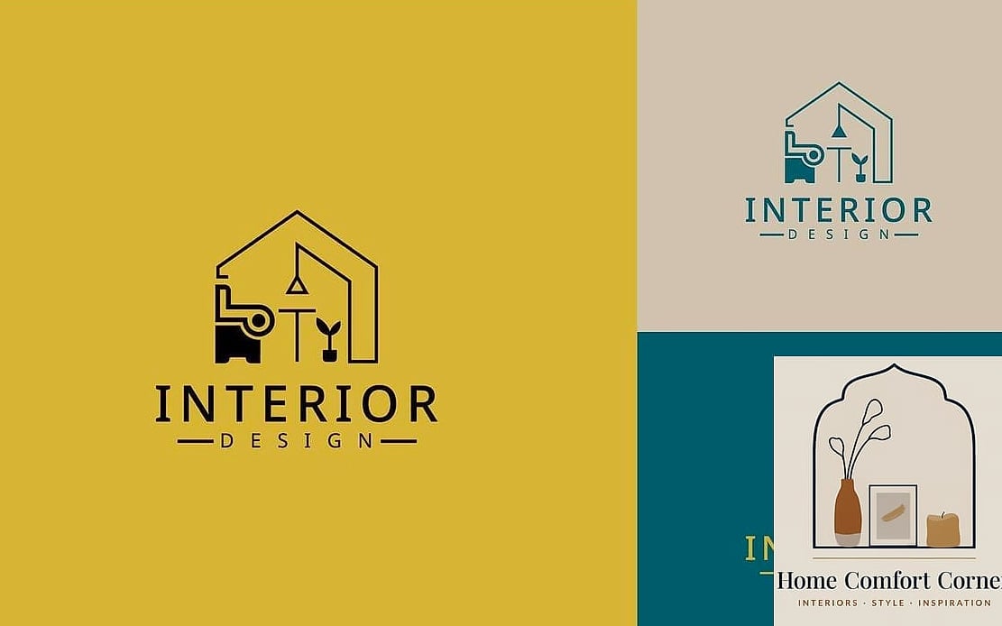
Sometimes the winning formula is just picking two colors that feel true to your brand and sticking with them everywhere, icon and text included. A soft sage and cream combo, or a deep charcoal paired with warm brass, instantly feels intentional and cohesive.
This approach works for nearly any design style since the color story is doing most of the personality work rather than an elaborate icon. It’s also one of the easier logos to apply consistently across a website, packaging, and printed materials.
Building a logo is a lot like designing a room you’ll actually live in. It should feel like you, hold up over time, and work in more places than you originally planned for. Save whichever of these fifteen directions caught your eye, and let it guide the rest of your brand from there.