12 Home Decoration Ideas to Steal From Interior Designers
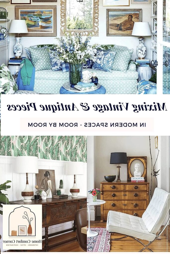
- Layer Your Lighting Instead of Relying on One Overhead Fixture
- Bring in a Statement Rug That Anchors the Room
- Mix Metals Instead of Matching Everything
- Add Architectural Interest With Trim or Millwork
- Use Open Shelving to Break Up Heavy Cabinetry
- Choose a Grounding Neutral Palette, Then Add Personality Through Layers
- Hang Curtains High and Wide
- Incorporate Natural Textures Like Wood, Rattan, and Woven Fiber
- Group Art and Objects in Odd Numbers
- Define Zones in Open-Concept Spaces With Rugs and Furniture Placement
- Add a Bold Ceiling Moment
- Style Your Coffee Table (and Every Other Surface) With Intention
12 Home Decoration Ideas to Steal From Interior Designers
Ever walk into a friend’s house and immediately wonder why it feels so much more “finished” than yours, even though you can’t point to one specific thing? That’s usually the work of a few smart design moves layered together. Interior designers rely on the same tricks over and over because they simply work, and the good news is most of them don’t require a big budget or a contractor. Here are twelve ideas straight from the pros that you can start using this weekend.
Layer Your Lighting Instead of Relying on One Overhead Fixture
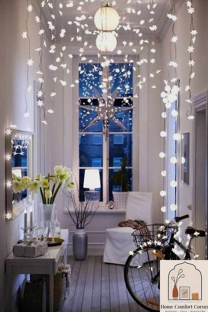
Designers almost never let a single ceiling light do all the work in a room. Instead they mix ambient light, task lighting, and accent lighting so the space feels warm from every angle. Think a floor lamp in the reading corner, a table lamp on the console, and maybe a couple of picture lights over artwork.
This matters most in living rooms and bedrooms, where flat overhead lighting can make everything look a little sterile. Warm bulbs (around 2700K) paired with dimmers give you flexibility for movie nights versus mornings. It’s a low-cost swap, and even renters can pull this off with plug-in lamps and no electrical work required.
Bring in a Statement Rug That Anchors the Room
A lot of people size their rugs too small, which is probably the single most common mistake designers point out. The fix is simple: go bigger than feels comfortable. In a living room, all your front furniture legs should ideally sit on the rug, not hover off the edge.
Beyond sizing, a bold pattern or a rich color can do the heavy lifting for an entire room’s personality without you having to repaint or reupholster anything. Wool rugs hold up beautifully in low-traffic formal spaces, while a flatweave or synthetic blend is more forgiving for families with kids or pets who track things in.
Mix Metals Instead of Matching Everything
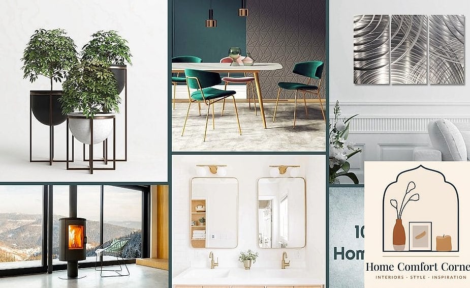
For years the rule was to pick one metal finish and stick to it religiously. That’s loosened up a lot. Now designers happily combine brushed brass hardware with black fixtures and a little brushed nickel in the mix, as long as there’s some intentional balance.
A kitchen might have black pendant lights, brass cabinet pulls, and stainless appliances, and it reads as curated rather than chaotic. The trick is repetition — use each metal at least twice in a room so it looks planned rather than accidental. This is an easy weekend project if you’re just swapping cabinet hardware.
Add Architectural Interest With Trim or Millwork
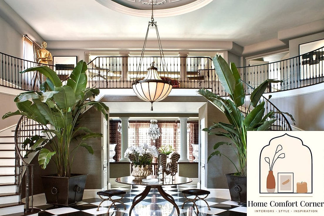
Board and batten, picture-frame molding, and wainscoting have made a huge comeback because they add texture and shadow to walls that would otherwise be flat and forgettable. You don’t need to redo a whole house — an entryway, a dining room, or even just the wall behind a bed can get this treatment.
MDF trim kits from a home improvement store are fairly DIY-friendly if you’re comfortable with a miter saw, or you can hire it out for a still-reasonable cost. Paint the trim and the wall the same color for a subtle, monochromatic look, or contrast them for something bolder.
Use Open Shelving to Break Up Heavy Cabinetry
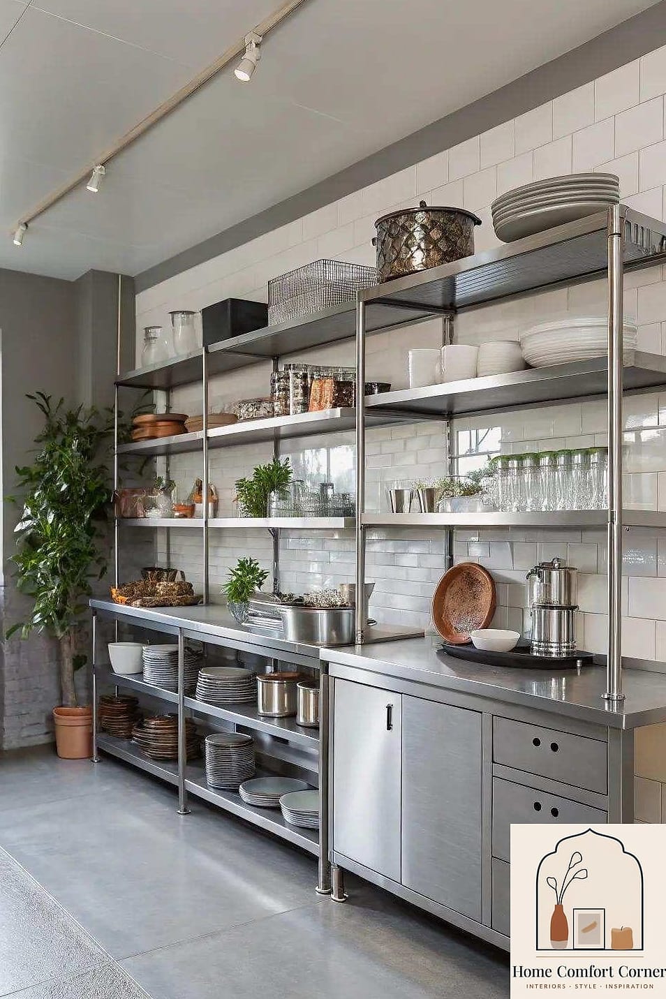
Wall-to-wall upper cabinets can feel a little closed in, especially in smaller kitchens. Swapping even one or two upper cabinets for floating shelves opens things up visually and gives you a spot to style everyday dishware, cookbooks, or a few plants.
The catch is that open shelving means everything is on display, so it works best if you’re willing to keep things tidy and edit down what you store there. Pair it with a mix of matching dishware and a couple of interesting objects — a ceramic vase, a wood cutting board leaned upright — for that lived-in-but-curated look designers love.
Choose a Grounding Neutral Palette, Then Add Personality Through Layers
A lot of professionally designed rooms actually start with a pretty restrained color palette on the big stuff — walls, floors, large furniture — and then get their personality from pillows, art, rugs, and accessories. It’s a lot less risky than committing to a bold wall color you might tire of.
Warm whites, greige tones, and soft taupes are still popular because they play well with both cool and warm undertones in flooring and trim. Then you layer in color through things that are cheap and easy to change later, like throw pillows or a piece of art, so your room can evolve without a repaint.
Hang Curtains High and Wide
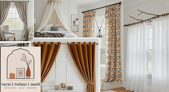
This one gets mentioned constantly by designers because it’s such a simple fix with a huge visual payoff. Instead of mounting your curtain rod right above the window frame, mount it closer to the ceiling and extend it several inches past each side of the window.
The effect tricks the eye into thinking your ceilings are taller and your windows are wider than they actually are. Floor-length curtains that just barely skim the floor (or puddle slightly for a softer look) finish the effect. It’s genuinely one of the cheapest upgrades on this list relative to how much impact it has.
Incorporate Natural Textures Like Wood, Rattan, and Woven Fiber
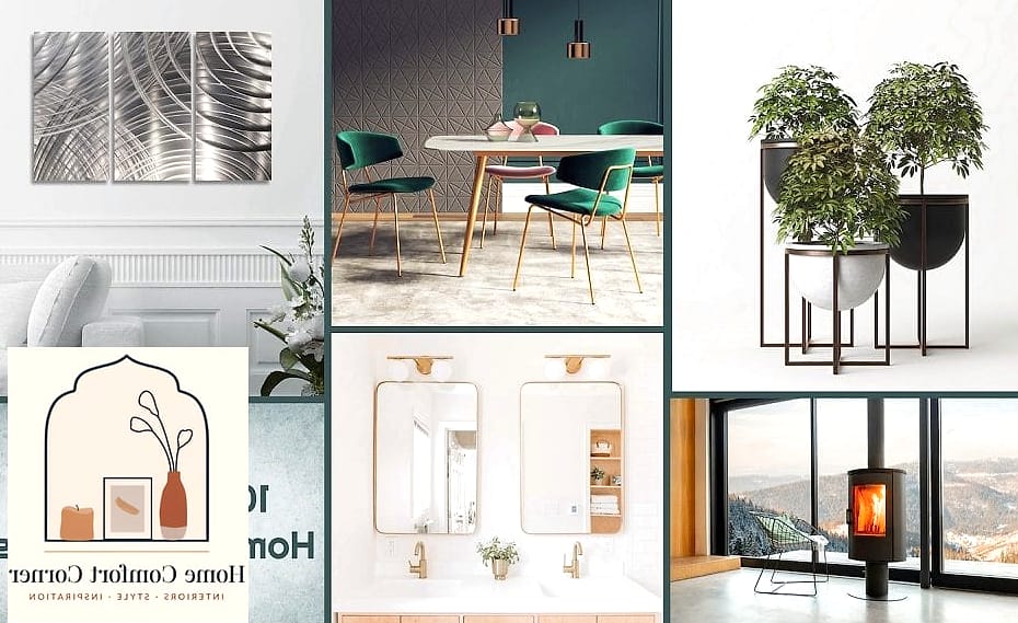
Smooth, glossy surfaces are fine, but a room full of them can start to feel a little cold. Designers counter that by working in natural materials — a woven jute rug, rattan pendant lights, a butcher block cutting board leaned against a backsplash, linen curtains.
These textures add warmth and depth without adding more color, which is helpful if you’re already committed to a neutral palette. Bathrooms benefit from this too; a teak bath mat or a rattan storage basket softens all that hard tile and porcelain.
Group Art and Objects in Odd Numbers
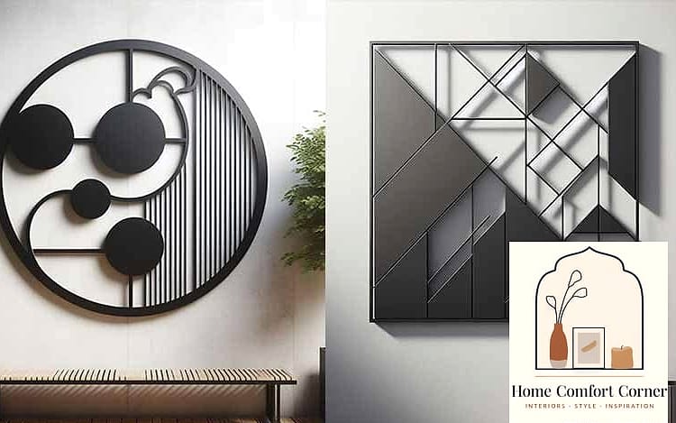
There’s a reason designers gravitate toward groupings of three, five, or seven rather than even numbers — odd-numbered groupings tend to feel more visually interesting and less rigidly symmetrical. This applies to everything from a gallery wall to a styled bookshelf to a cluster of candles on a coffee table.
When arranging, vary the height and scale slightly rather than lining everything up perfectly even. A tall vase, a stack of books, and a small sculptural object grouped together reads as intentional styling rather than random clutter.
Define Zones in Open-Concept Spaces With Rugs and Furniture Placement
Open floor plans are great for entertaining but can feel a little directionless without some help. Rather than adding walls, designers use furniture arrangement and rugs to visually separate a living area from a dining area or a home office nook.
Floating a sofa away from the wall, for instance, instantly signals “this is the living room” even in a big shared space. A console table behind the sofa can double as a soft boundary and gives you another surface for lamps, decor, or a catch-all tray for keys and mail.
Add a Bold Ceiling Moment
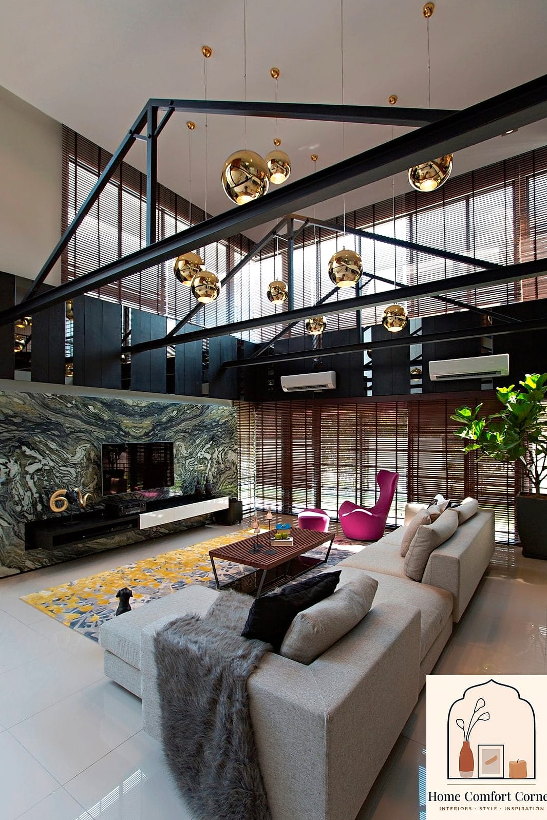
The “fifth wall” is a favorite designer talking point for a reason — most of us never think to decorate our ceilings, which means it’s an underused opportunity to add wow factor. A dramatic paint color, wallpaper, or even a simple wood beam treatment overhead can completely change how a room feels.
This works especially well in smaller rooms like powder baths, entryways, or nooks where a bold choice feels cozy rather than overwhelming. If painting the whole ceiling feels like too much commitment, start with a closet or a pantry ceiling as a low-stakes trial run.
Style Your Coffee Table (and Every Other Surface) With Intention
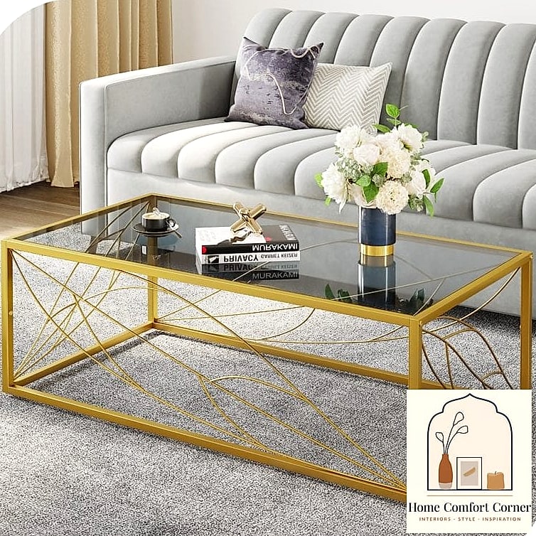
Empty surfaces can feel unfinished, but cluttered ones feel chaotic — designers land somewhere in the middle with a formula that’s easy to copy: one larger object (a tray or a stack of books), one smaller accent (a candle or small dish), and something organic (a plant or a bowl of fruit).
This same three-part approach works on a console table, a bathroom counter, or a kitchen island. It keeps surfaces looking pulled together without requiring you to buy a ton of new decor — often you can just rearrange what you already own into smaller, more thoughtful groupings.
Pulling even three or four of these twelve home decoration ideas into your space can shift how a room feels almost immediately. You don’t need a full renovation budget to borrow from the pros — sometimes it really is just about rehanging your curtains a few inches higher or finally committing to that odd-numbered shelf arrangement you’ve been putting off.