9 Posters For Room Decor Ideas to Steal From Interior Designers
- Go Oversized Instead of Small and Scattered
- Frame It Like a Gallery Piece
- Build a Color Story Around One Print
- Lean Into Vintage Travel and Botanical Prints
- Create a Poster Gallery Wall With Mixed Sizes
- Use a Statement Poster to Anchor a Neutral Room
- Hang Posters in Unexpected Rooms
- Layer Posters With Other Wall Textures
- Try Peel-and-Stick or Poster Panels for a Renter-Friendly Option
9 Posters For Room Decor Ideas to Steal From Interior Designers
Posters get a bad rap sometimes, like they’re only for dorm rooms and college apartments. But the designers I follow and talk shop with use them constantly, and not just as filler. A well-chosen poster can set the tone for an entire room, add color where you need it, or make a rental feel like it actually belongs to you.
The trick is treating posters like real art instead of an afterthought. That means thinking about scale, framing, placement, and how they play with everything else in the space. Here are nine ways to do it right.
Go Oversized Instead of Small and Scattered
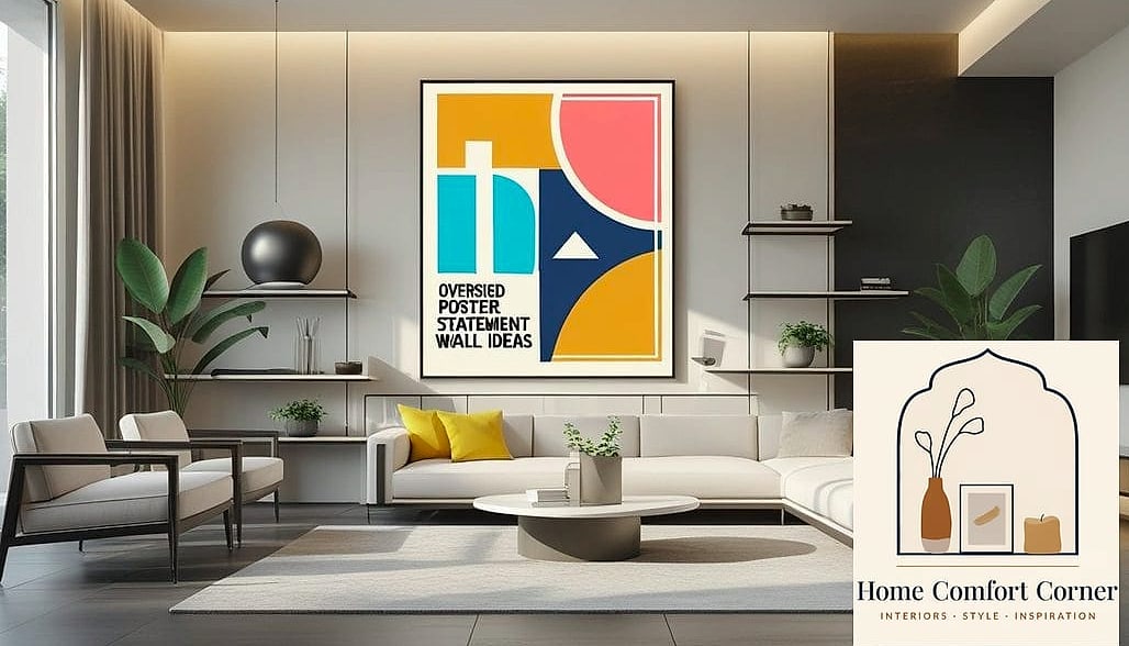
One giant poster almost always looks better than three small ones fighting for attention. Designers lean into this because a single large-scale print acts like a piece of art rather than decor you picked up on a whim.
This works especially well above a sofa, bed, or console table where you need something substantial to anchor the furniture below it. A general rule is to cover about two-thirds the width of whatever it’s hanging above.
Budget-wise, oversized posters are often cheaper than you’d expect since you’re paying for one print instead of several. Just make sure your frame or hanging method can support the weight if you’re going really big.
Frame It Like a Gallery Piece
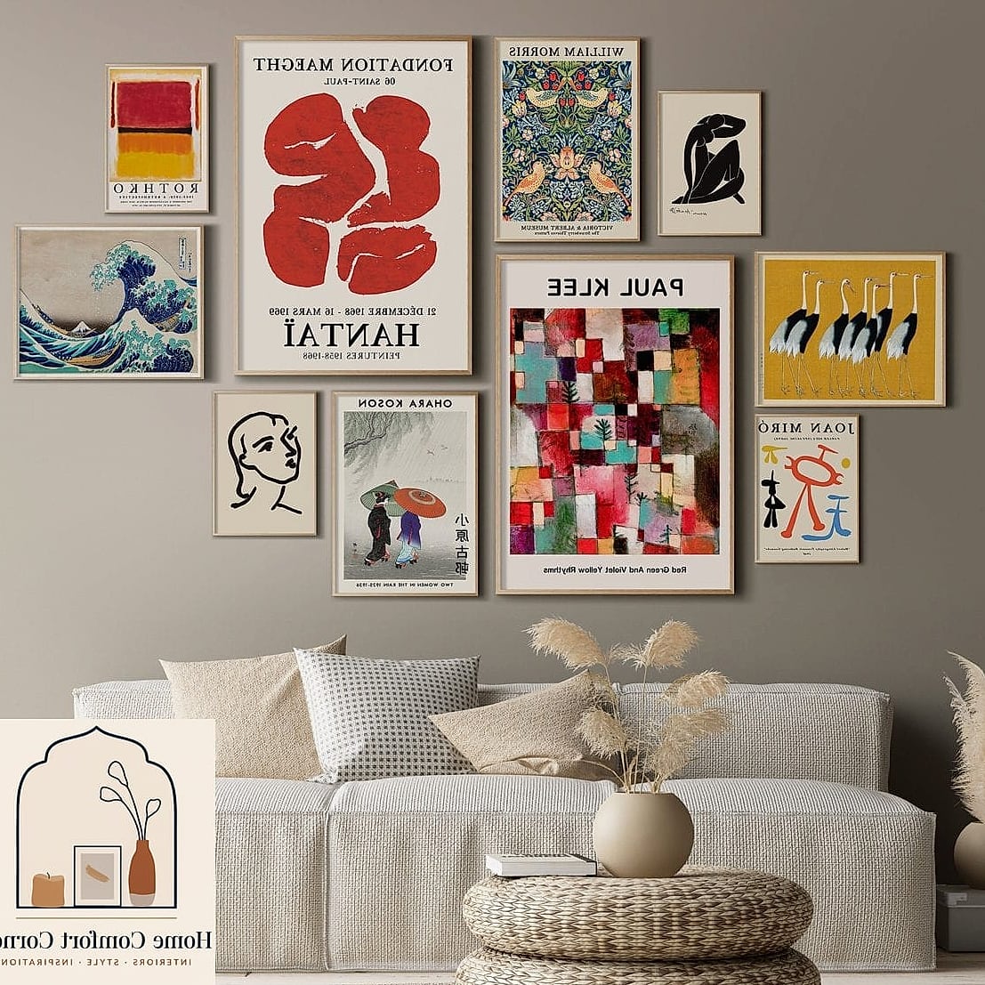
A poster in a cheap plastic frame reads very differently than the same poster in a substantial wood or metal frame with a mat around it. This is probably the single easiest way to make budget wall art look expensive.
Matting adds breathing room between the print and the frame edge, which instantly makes things feel more intentional. A two to three inch mat border tends to look proportional on most standard poster sizes.
Black and brushed brass frames are having a moment right now, and both work well against neutral color palettes. If you’re renting, look for frameless clip options or lightweight frames that won’t leave a heavy anchor hole in the wall.
Build a Color Story Around One Print
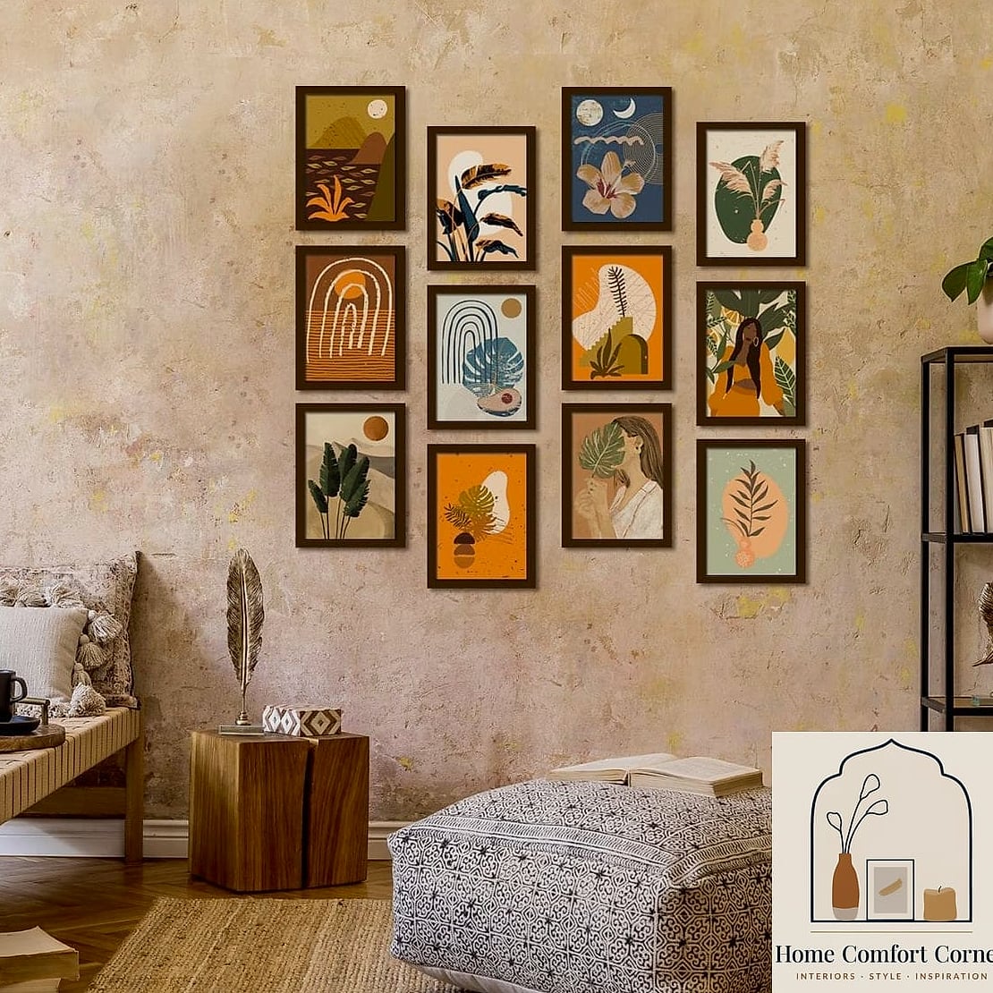
Instead of picking wall art last, some designers start with a poster they love and pull the room’s palette from it. If your poster has rust, sage, and cream tones, those become your throw pillow, rug, and accent colors.
This approach works particularly well in smaller rooms where every design decision needs to feel connected rather than random. It also takes the guesswork out of shopping for coordinating pieces later.
You don’t need an exact match either. Pulling one or two dominant colors from the print and repeating them elsewhere in the room usually reads as more sophisticated than a perfect color match would.
Lean Into Vintage Travel and Botanical Prints
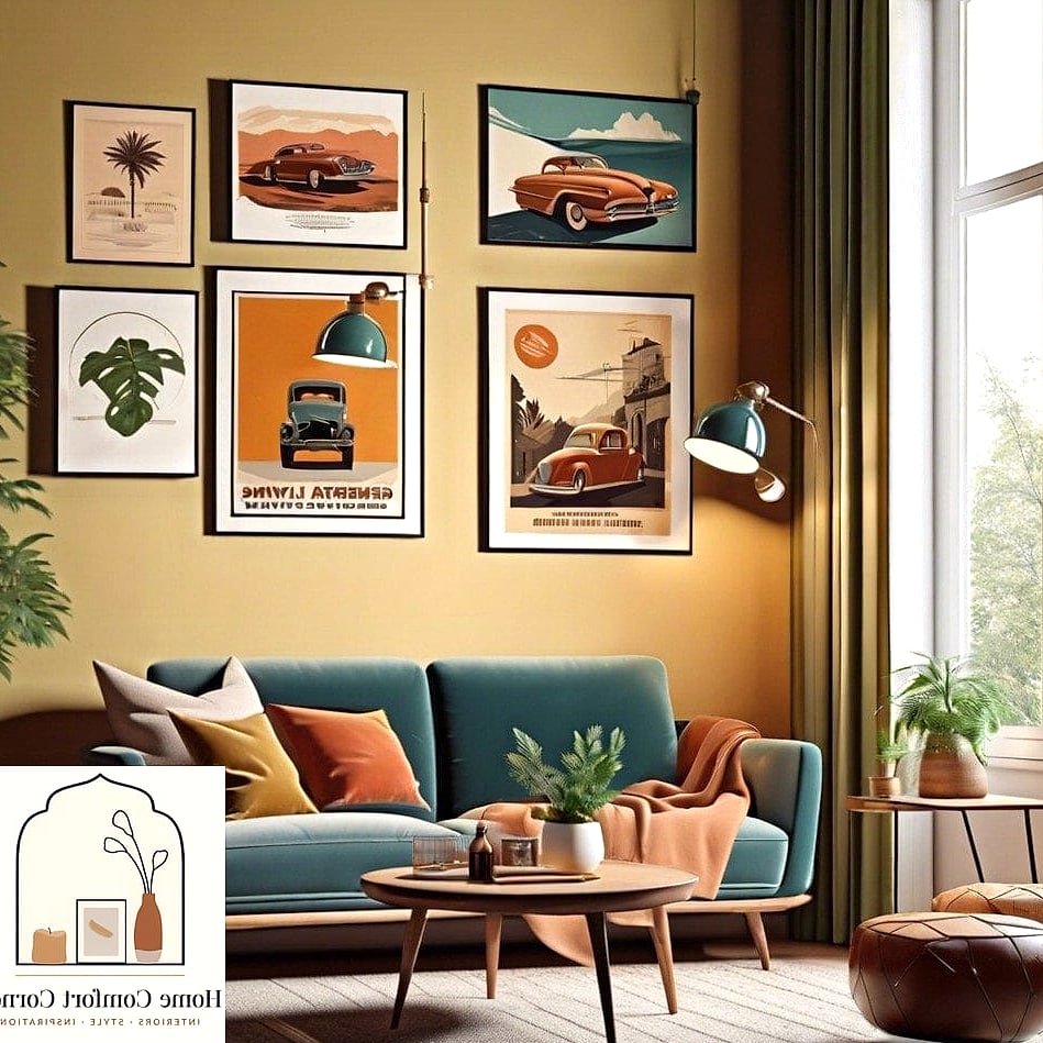
Vintage-style travel posters and botanical illustrations have staying power that trendier graphic prints just don’t have. They work in traditional homes, modern spaces, and everything in between.
These feel especially at home in entryways, home offices, and reading nooks where you want something that sparks a little wanderlust or calm. Botanical prints in particular pair beautifully with warm wood tones and natural textures.
You can find genuinely well-made reproductions for under thirty dollars, or splurge on limited edition prints if you want something more collectible. Either way, this category rarely goes out of style.
Create a Poster Gallery Wall With Mixed Sizes
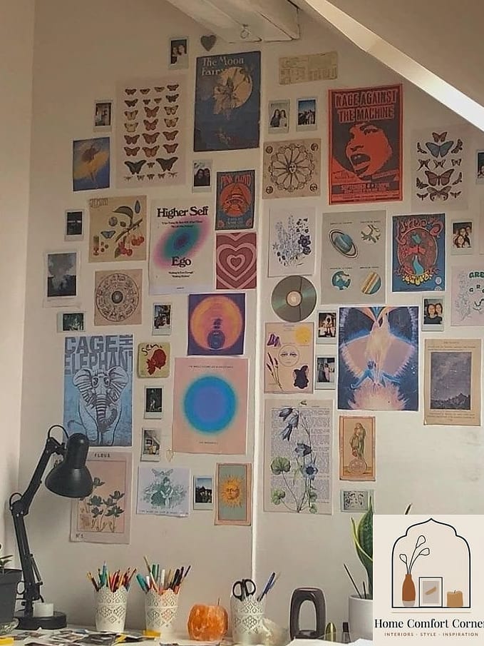
If you love the idea of multiple pieces, the key is variation rather than a uniform grid. Mix a couple of large posters with a few smaller ones, and vary the frame colors or styles slightly for visual interest.
This works great on a staircase wall, a long hallway, or behind a bed as an alternative to one big headboard piece. Lay everything out on the floor first so you can adjust spacing before committing to nail holes.
Keep about two to three inches between frames for a cohesive but not cramped look. Renters can pull this off with adhesive hooks rated for the frame weight, which saves your security deposit.
Use a Statement Poster to Anchor a Neutral Room
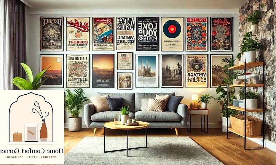
If your furniture and walls are mostly beige, white, or gray, a bold graphic poster becomes the focal point almost automatically. Designers use this trick constantly in minimalist and Scandinavian-inspired rooms that need a jolt of personality.
This is a smart move in living rooms and bedrooms where you’ve invested in quality neutral furniture but the space still feels a little flat. One striking print does more visual work than a handful of small accessories ever could.
Look for prints with strong color blocking or an unexpected shape. Even a single poster in a saturated color against a white wall creates enough contrast to make the whole room feel more finished.
Hang Posters in Unexpected Rooms
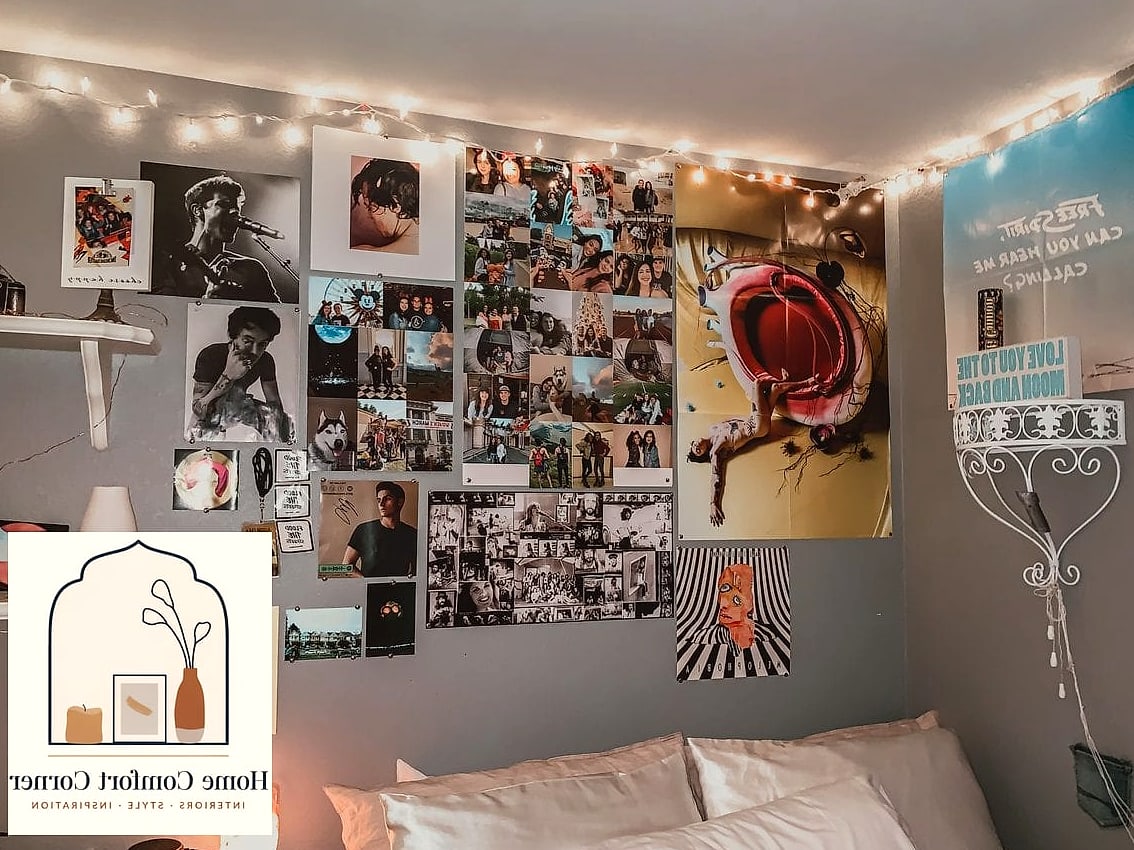
Kitchens, laundry rooms, and bathrooms rarely get real art, but a framed poster in these spaces makes them feel considered instead of purely functional. Think a citrus print in the kitchen or a vintage soap advertisement in the laundry room.
Just be mindful of humidity in bathrooms and steam in kitchens near the stove. Framing behind glass helps protect the paper, and choosing a spot away from direct water exposure extends the life of the print significantly.
This is also a low-commitment way to test out a bolder print or color you’re not ready to use in your main living spaces yet.
Layer Posters With Other Wall Textures
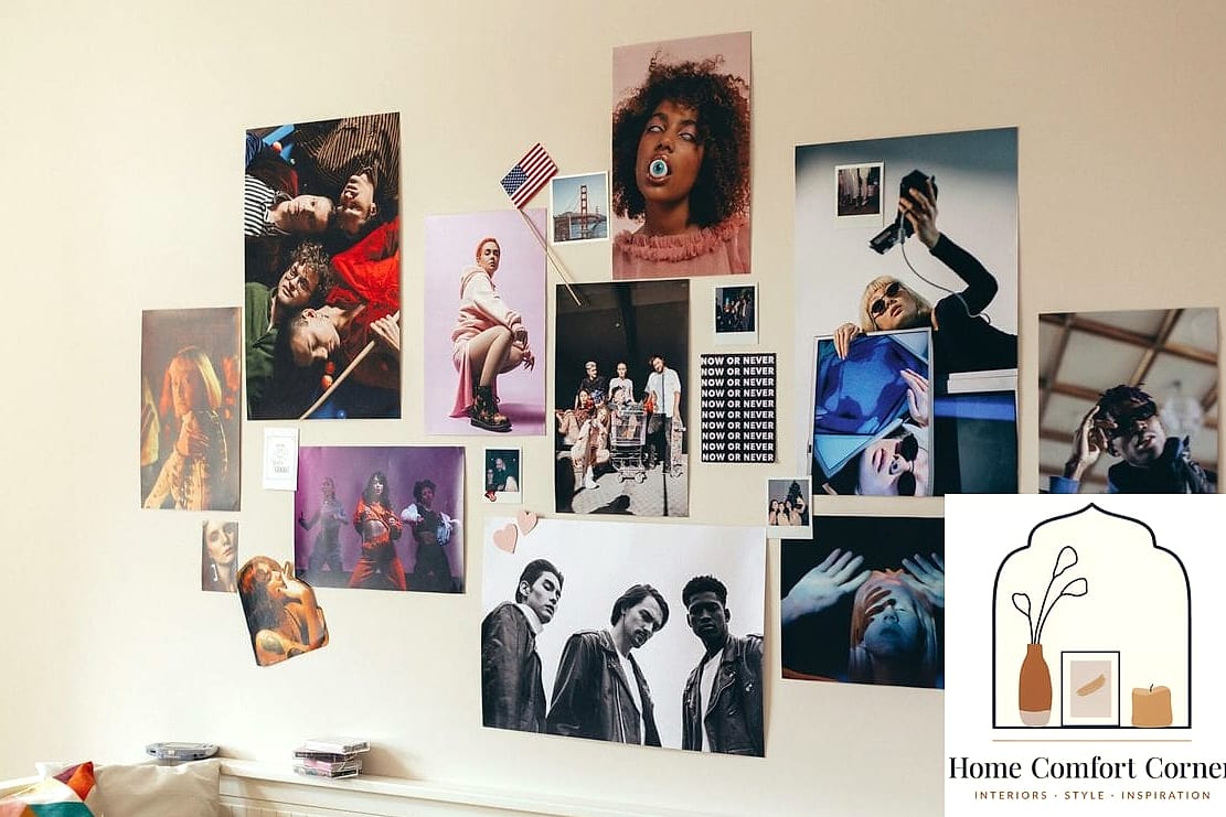
Posters don’t have to stand alone. Mixing a framed print with a woven wall hanging, a small mirror, or a floating shelf with objects on it creates depth that a single flat piece can’t achieve on its own.
This layered approach works especially well in bedrooms and living rooms where you want the wall to feel curated over time rather than decorated in one trip to the store. Designers often build these arrangements slowly, adding pieces as they find them.
A floating shelf beneath a poster is a great spot for a small plant, a candle, or rotating seasonal decor, which keeps the whole arrangement feeling fresh without rehanging anything.
Try Peel-and-Stick or Poster Panels for a Renter-Friendly Option
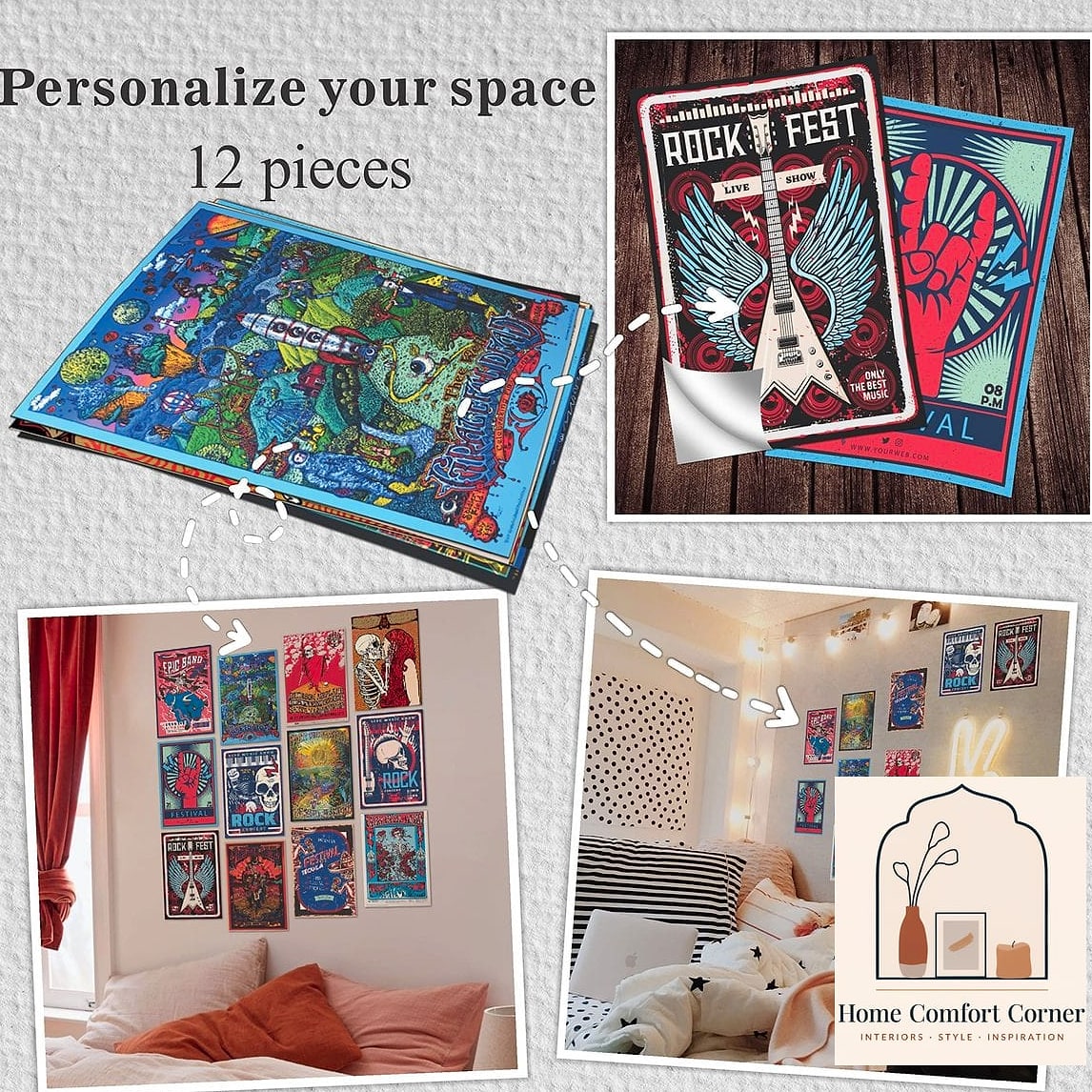
If you’re not ready to commit to frames and nail holes, removable poster panels and peel-and-stick wall art have gotten genuinely good. Some mimic the look of a framed gallery piece using lightweight adhesive backing.
This is ideal for apartments, dorms, or rooms you plan to redecorate again within a year or two. It’s also budget-friendly, since most options run far less than a framed original.
The main tradeoff is durability. These won’t hold up as long as a properly framed poster, so treat them as a temporary solution rather than a permanent design choice, and check the adhesive is rated safe for your wall type before applying.
Posters are one of the most flexible, low-cost ways to change how a room feels, whether you’re settling into a first apartment or refreshing a room you’ve lived in for years. Start with one piece you genuinely love, build the framing and placement around it, and the rest of the room tends to fall into place from there.