17 Pink Room Aesthetic Decor Inspiration Boards You’ll Want to Copy
- Dusty Rose and Warm Wood
- Millennial Pink Accent Wall
- Hot Pink Maximalist Statement Room
- Blush Pink Nursery With Neutral Accents
- Pink and Terracotta Boho Bedroom
- Barbiecore Glam Room
- Pink Tile Bathroom Revival
- Coquette Pink Bedroom With Bows and Lace
- Pink and Sage Green Cottagecore Bedroom
- Modern Minimalist Pink Bedroom
- Pink Velvet Accent Furniture
- Pink Kids’ Room That Grows With Them
- Dark Academia Meets Pink
- Pink Home Office With Gold Accents
- Pink Ombre Wall Treatment
- Pink and Black Contrast Bedroom
- Pastel Pink Reading Nook
17 Pink Room Aesthetic Decor Inspiration Boards You’ll Want to Copy
Pink has come a long way from its “just for little girls’ rooms” reputation. These days it’s showing up in grown-up bedrooms, home offices, and even living rooms, and honestly, it works. There’s a shade of pink for every personality, from soft and dusty to bold and saturated.
If you’ve been scrolling Pinterest for hours trying to figure out which pink direction to take, I get it. There are so many ways to do this color right, and just as many ways to make it feel dated fast. So I pulled together seventeen distinct pink room boards that actually hold up, each with its own vibe, materials, and styling approach.
Dusty Rose and Warm Wood
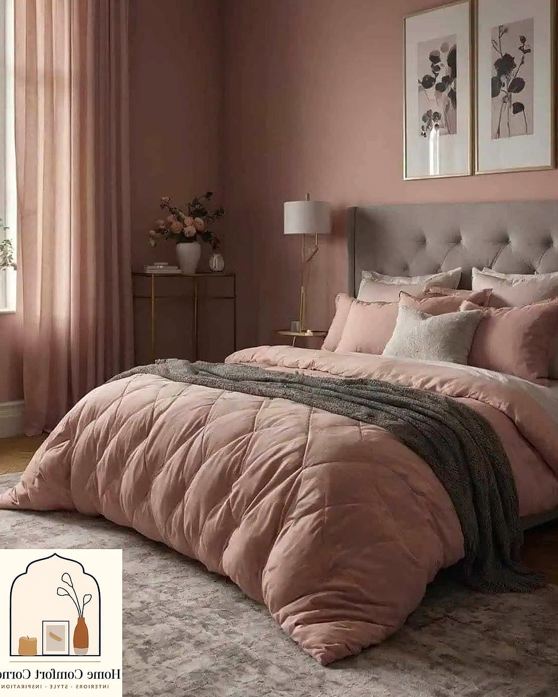
This board leans into a muted, grayed-out pink paired with warm wood tones like oak or walnut. It feels more sophisticated than sweet, which is exactly why it works so well in adult bedrooms and living rooms.
The trick here is keeping the wood tones warm rather than cool-toned, so the pairing feels cohesive instead of clashing. Add linen bedding, a woven rug, and brass hardware on any dressers or nightstands.
This palette ages well and doesn’t feel trendy in a way that’ll bug you in three years. It’s also renter-friendly since most of the color comes from textiles and accessories rather than paint.
Millennial Pink Accent Wall
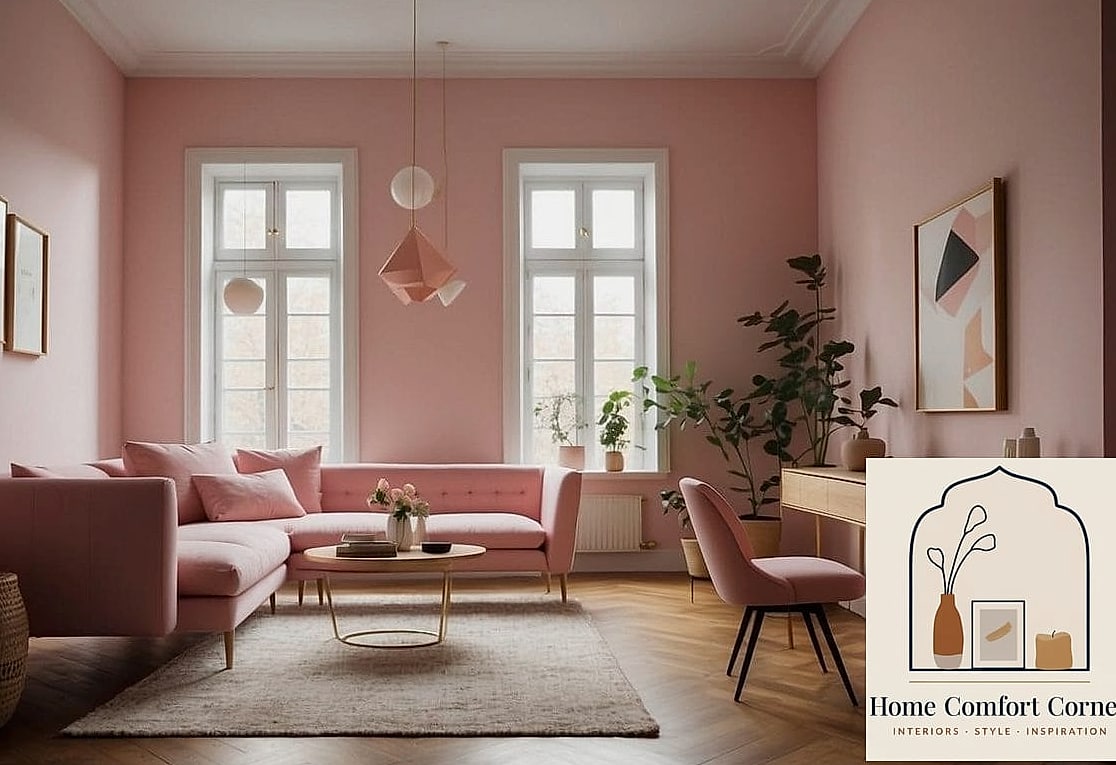
A single wall in that soft, slightly grayish pink everyone fell in love with a few years back still holds up beautifully. It’s a low-commitment way to bring in color without overwhelming a room.
Pair it with white trim, matte black light fixtures, and simple gallery-style art. This works especially well in bedrooms or home offices where you want a calm backdrop that isn’t boring.
If you’re renting, consider a peel-and-stick wallpaper version instead of paint. Several brands now make millennial pink options that look surprisingly close to the real thing and remove cleanly.
Hot Pink Maximalist Statement Room
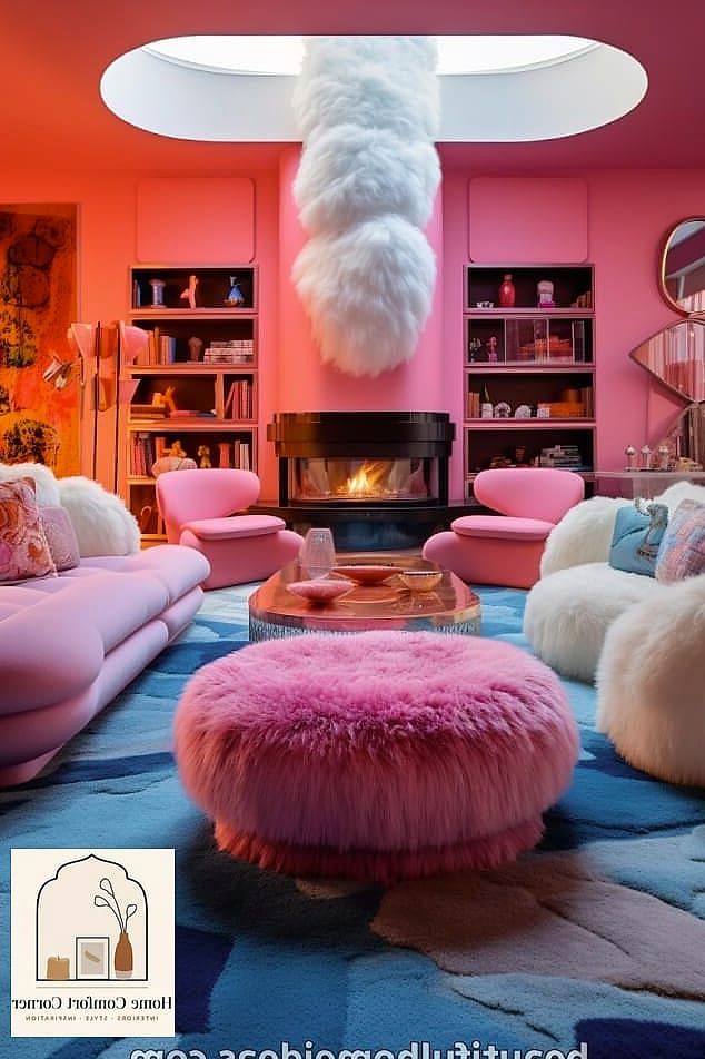
For the person who wants their space to feel like a mood, not a mistake, this board goes all in on saturated hot pink. Think pink walls, pink textiles, and layered patterns that shouldn’t work together but somehow do.
Balance the intensity with neutral flooring, like a natural wood or a light rug, so your eyes have somewhere to rest. Mixing in gold or brass accents keeps it feeling intentional rather than chaotic.
This look isn’t for everyone, and that’s kind of the point. It’s a statement, and it photographs incredibly well for anyone who loves a bold interior.
Blush Pink Nursery With Neutral Accents
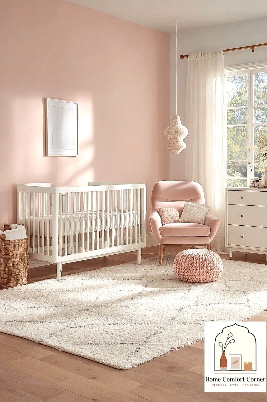
Blush is the softest, most muted version of pink, and it’s an easy pick for a nursery that won’t feel too juvenile as your kid grows. Pair it with cream, oatmeal, and a touch of sage green for a gender-neutral but still distinctly pink feel.
Textured elements like a boucle glider, a jute rug, and linen curtains keep things soft without being overly sweet. This palette also transitions well into a toddler room without a full redo.
Because blush is so light, natural lighting really makes it shine. If the nursery gets good daylight, you’ll notice the color shift subtly throughout the day.
Pink and Terracotta Boho Bedroom
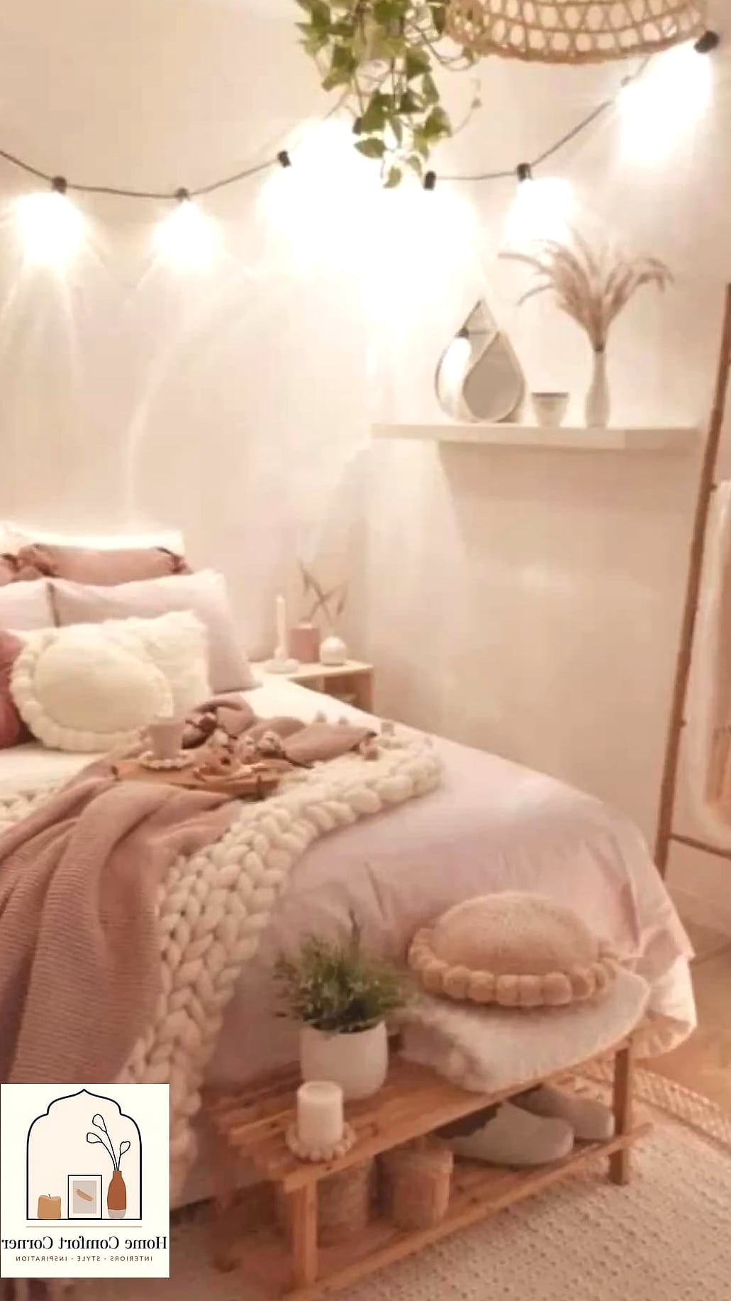
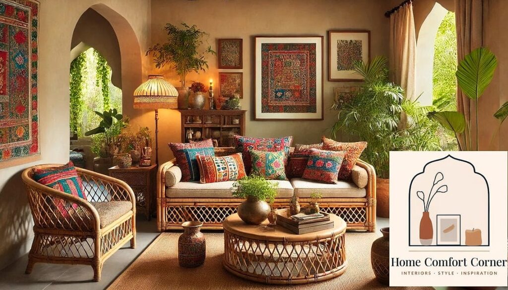
This combination brings warmth and earthiness into a pink room, which keeps it from feeling too soft or delicate. Terracotta pots, woven wall hangings, and rattan furniture all play nicely against a dusty pink backdrop.
Layered textiles are key here: think patterned throw pillows, a woven pouf, and a vintage-style rug with some age to it. This board works particularly well in bedrooms with lots of plants and natural light.
It’s also a great option for anyone who loves the boho look but wants to move away from the neutral beige version everyone’s already seen.
Barbiecore Glam Room
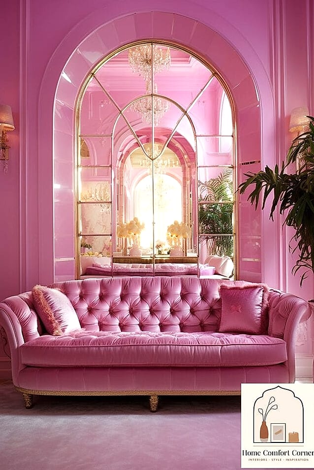
If you’re not afraid of pink and love a little sparkle, this is your board. Barbiecore leans into glossy finishes, metallic accents, and pink in nearly every shade at once, from bubblegum to fuchsia.
A mirrored or acrylic vanity, faux fur throws, and disco-ball-adjacent decor pieces all fit right in. This works best in a bedroom or dressing area where the fun factor matters more than resale value.
It’s a playful, personality-forward look that’s genuinely enjoyable to decorate. Just budget a little extra for statement pieces since the glam details tend to cost more than basic decor.
Pink Tile Bathroom Revival
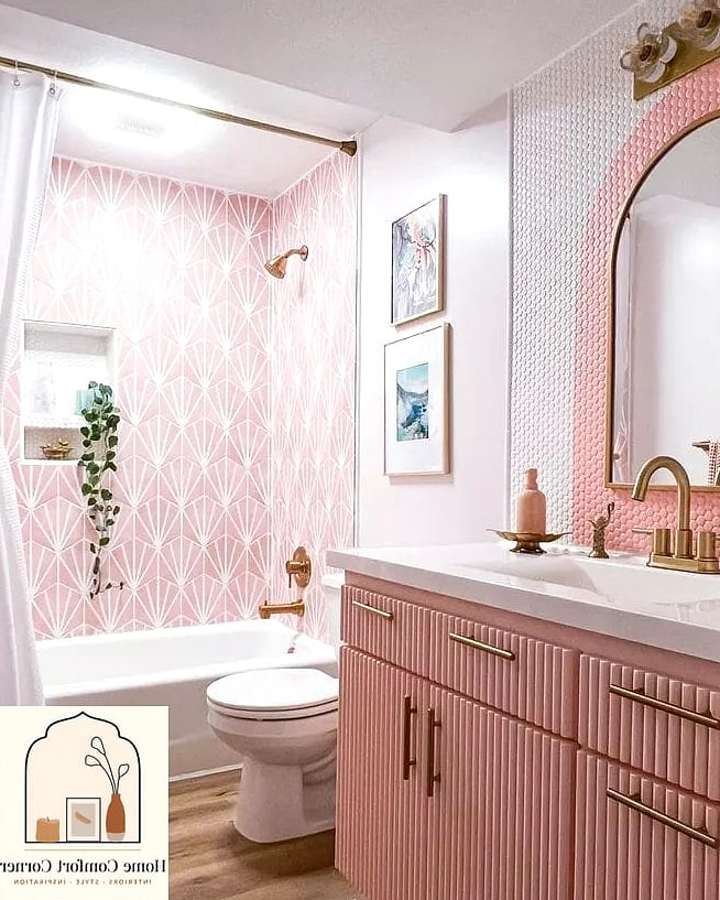
Vintage pink bathroom tile has had a major moment, and honestly, if you already have it, this board is here to convince you not to rip it out. Leaning into the retro pink rather than fighting it can result in a genuinely charming space.
Pair existing pink tile with black and white accents, brass fixtures, and simple white countertops. New paint on the walls in a complementary sage or cream tone helps the whole room feel updated without touching the tile at all.
This is one of those upgrades that instantly makes a bathroom feel more custom without requiring a full renovation. It’s also a great budget move since you’re working with what’s already there.
Coquette Pink Bedroom With Bows and Lace
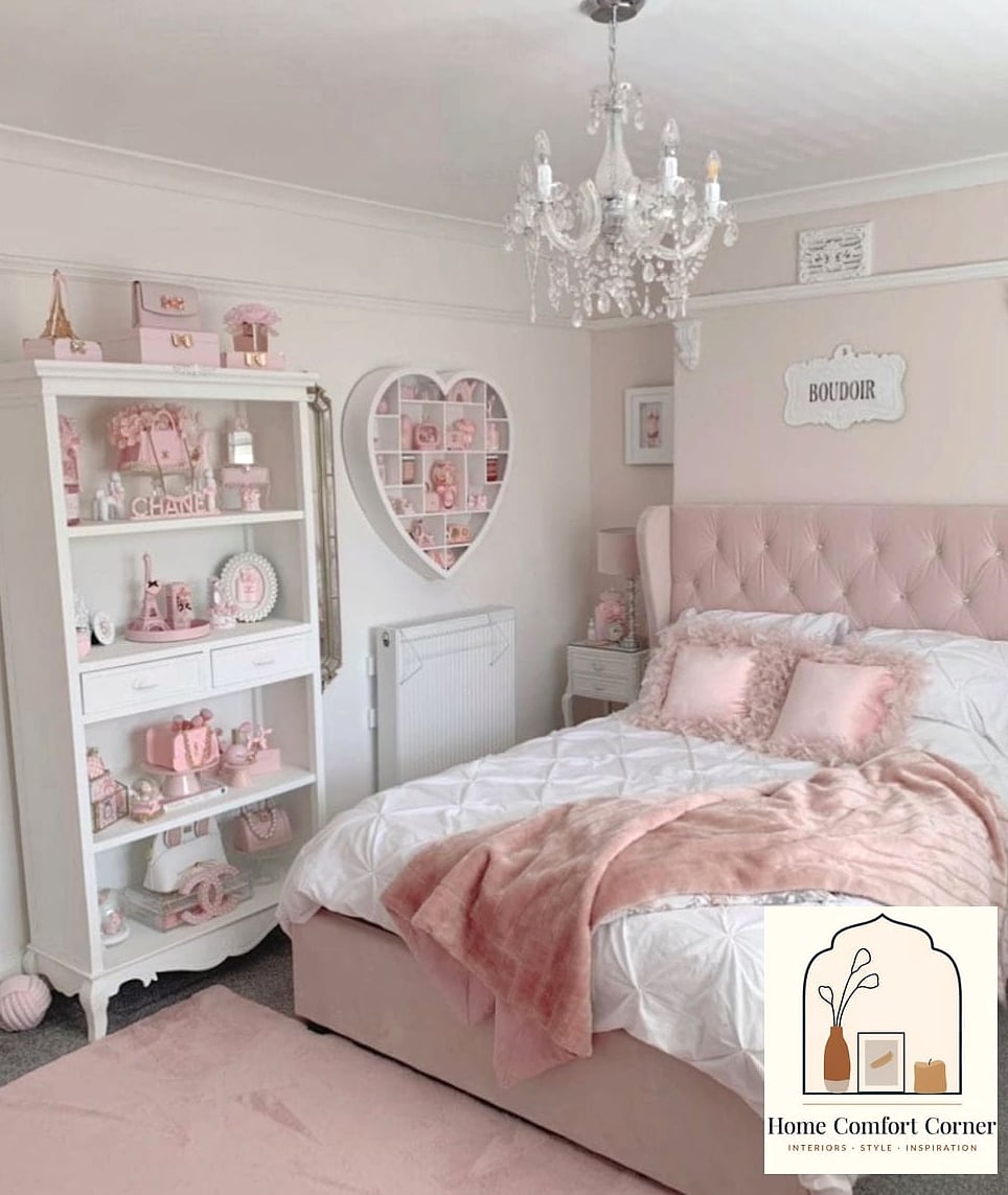
The coquette aesthetic has brought back bows, lace trim, and delicate details in a big way, and pink is basically its signature color. Think ruffled bedding, bow-shaped wall hooks, and a vanity with feminine hardware.
This works best in bedrooms where you want a romantic, girly feel without going full glam. Layer in a canopy bed frame or sheer curtains for extra softness.
It’s a strong option for teens and young adults who want something more elevated than a childhood pink room but still distinctly feminine.
Pink and Sage Green Cottagecore Bedroom
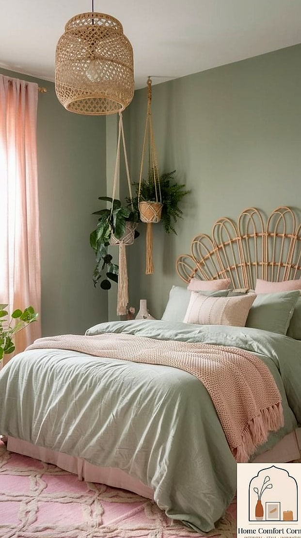
This pairing feels like a garden in the best way. Soft pink walls or bedding combined with sage green accents create a calming, nature-inspired palette that fits the cottagecore trend perfectly.
Floral patterns, vintage furniture, and pressed botanical art all support the look. A quilted bedspread and mismatched vintage lamps add to that lived-in, collected-over-time feeling.
This board works well in guest rooms and bedrooms alike, and it’s especially good for anyone drawn to a softer, more romantic style without leaning into anything too sparkly or bold.
Modern Minimalist Pink Bedroom
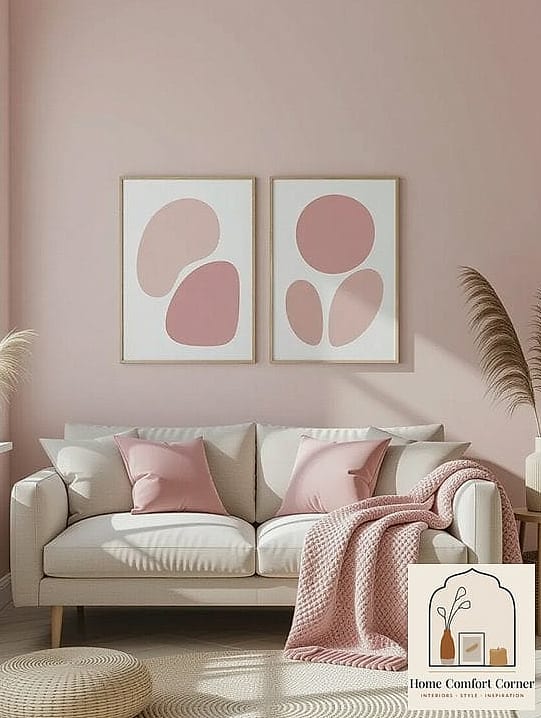
Not every pink room needs to be loud. This board keeps things clean and simple, with one soft pink accent wall, white bedding, and minimal decor. It’s proof that pink can be sophisticated and restrained at the same time.
Matte black or brushed brass fixtures add contrast without competing with the wall color. Keep floating shelves sparse, maybe just one or two curated objects, to maintain that minimalist feel.
This look is great for small bedrooms since the light color palette helps the space feel more open. It’s also one of the easier boards to recreate on a tighter budget.
Pink Velvet Accent Furniture
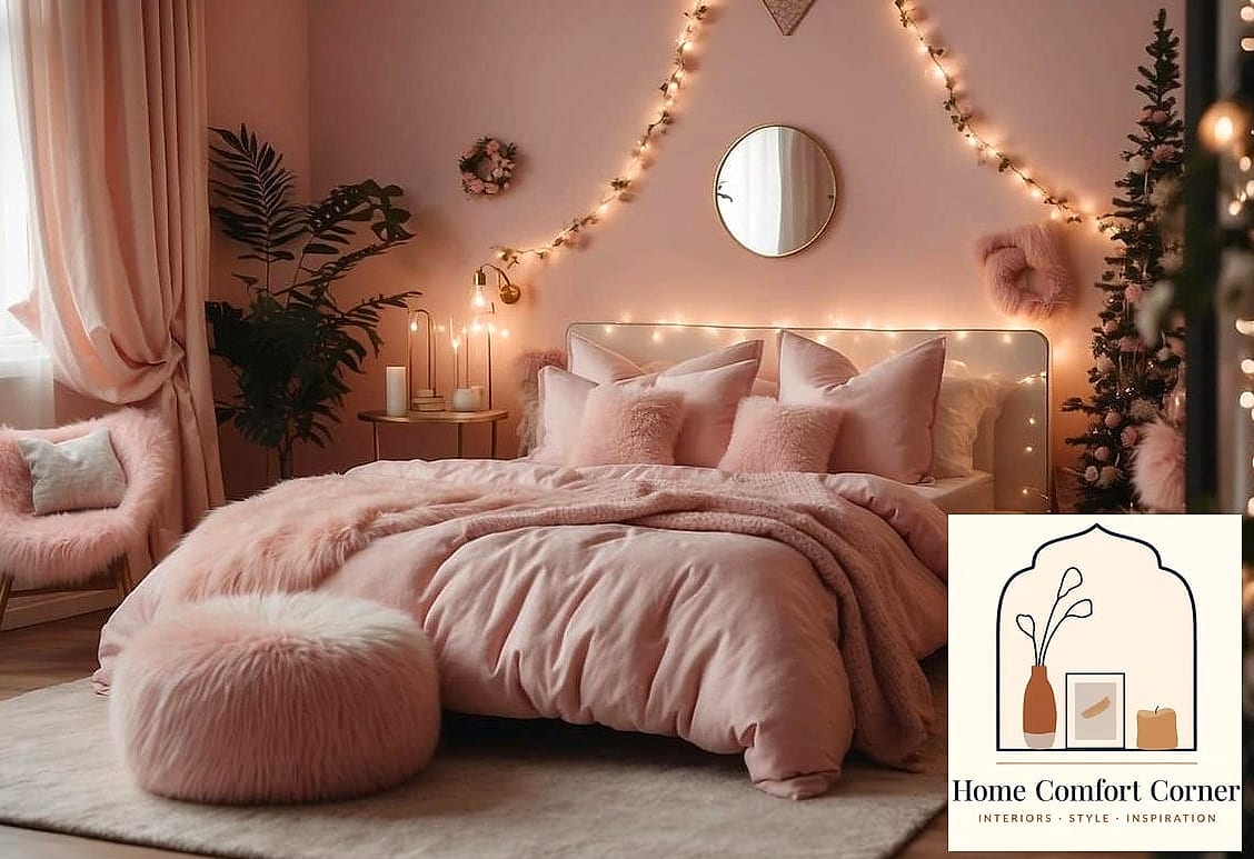
Sometimes the easiest way to bring pink into a room is through furniture rather than paint. A blush or dusty rose velvet sofa, chair, or headboard instantly becomes a focal point.
This approach works in living rooms, bedrooms, or even home offices where you want a pop of color without repainting anything. Velvet also adds a tactile, cozy element that flat paint can’t replicate.
Pair with neutral walls so the furniture piece gets to shine. This is a great option for renters since you can take the pink with you when you move.
Pink Kids’ Room That Grows With Them
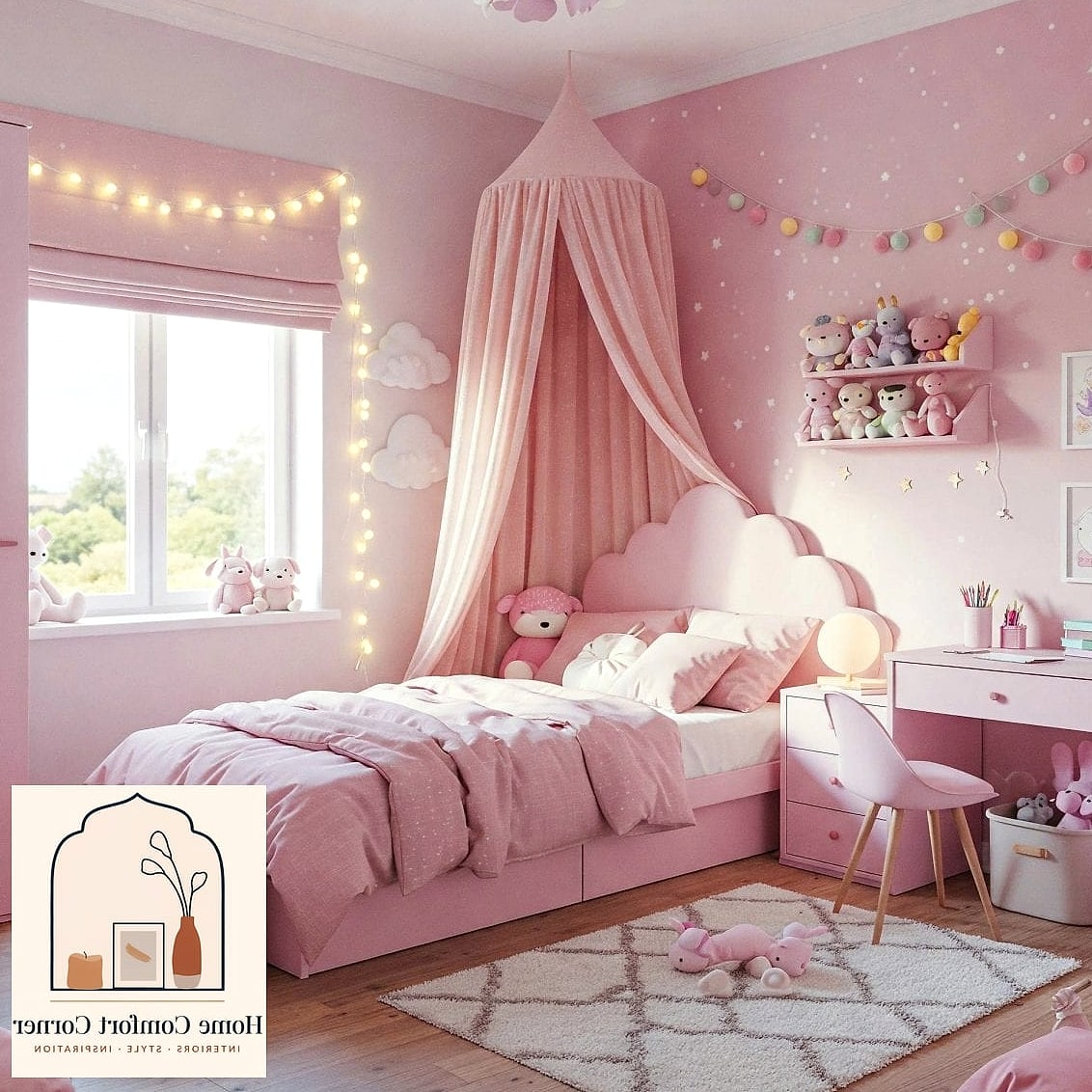
Instead of a hyper-specific theme, this board uses a versatile dusty pink as the base, then builds in playful but removable elements like wall decals, a colorful rug, and swappable art prints.
As kids get older, you can update the accessories without repainting the whole room. This is a practical, budget-conscious approach for parents who don’t want to redo a bedroom every couple of years.
Storage matters a lot here too. Look for bins and baskets in coordinating colors to keep toys contained while still looking intentional.
Dark Academia Meets Pink
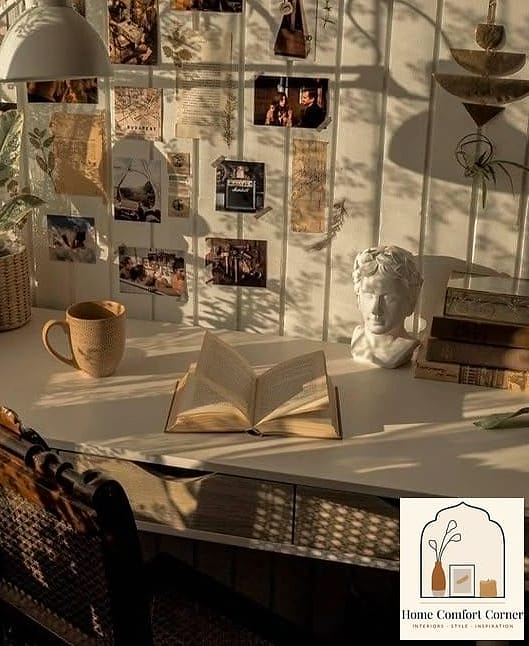
This is a less expected pairing: rich mahogany or walnut furniture, deep green or burgundy textiles, and a surprising dusty pink accent wall or bedding layer. The pink softens what would otherwise be a very moody, masculine palette.
Vintage books, brass reading lamps, and leather accents all support the dark academia feel while the pink keeps things from feeling too heavy. This works particularly well in a home office or reading nook.
It’s an unexpected combination that tends to surprise people in the best way when they see it in person.
Pink Home Office With Gold Accents
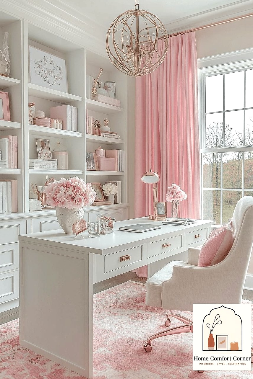
A soft pink home office paired with gold or brass accents creates a workspace that feels polished rather than playful. This is a popular choice for anyone who wants their office to feel a little glamorous without being distracting.
A glass or acrylic desk keeps the space feeling light, while a patterned rug and framed art add personality. Open shelving with curated books and decor items rounds out the look.
This board works especially well in smaller offices or nooks since the light color palette helps the space feel bigger than it is.
Pink Ombre Wall Treatment
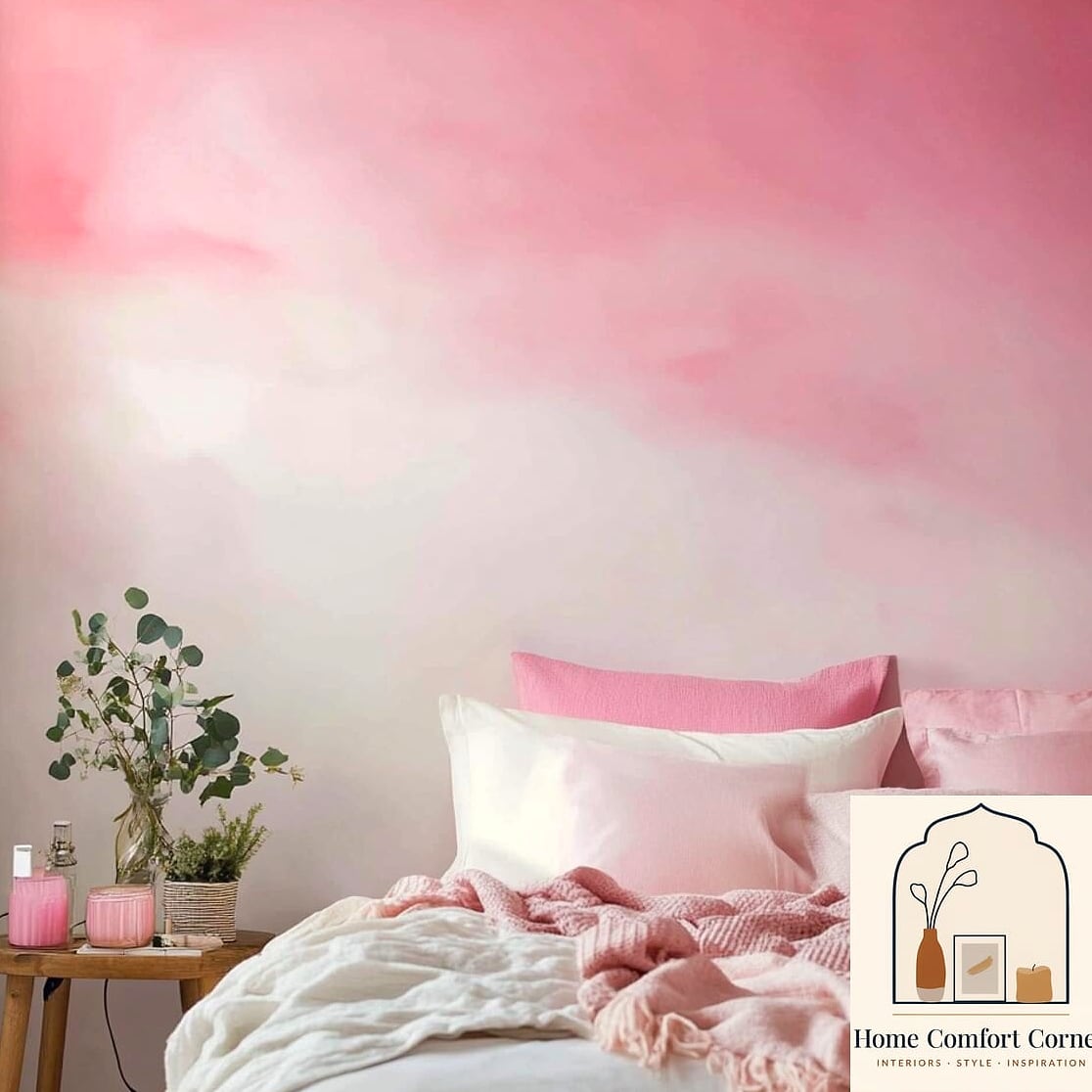
Rather than a solid color, this board uses a gradient effect, moving from deep pink at the bottom to a soft blush or white near the ceiling. It’s a striking, artistic approach that works as a statement piece on its own.
This technique does require more skill than a standard paint job, so it may be worth hiring a professional painter or muralist unless you’re comfortable freehanding gradients. Keep the rest of the room simple so the wall stays the focal point.
This is a great option for a nursery, creative studio, or any room where you want something a little more artistic than a flat wall color.
Pink and Black Contrast Bedroom
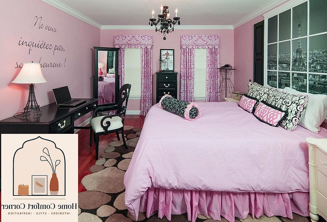
For anyone who loves pink but wants an edgier feel, pairing it with black creates a striking, high-contrast look. Black bed frames, black-framed art, and black hardware against soft or bold pink walls feel modern and a little rebellious.
This combination photographs really well and tends to stand out on a mood board. Keep other elements neutral, like white bedding or light wood floors, so the black and pink contrast stays the star of the show.
This board leans more mature and works nicely in teen rooms, guest rooms, or anyone’s primary bedroom who wants pink without it reading as soft or delicate.
Pastel Pink Reading Nook
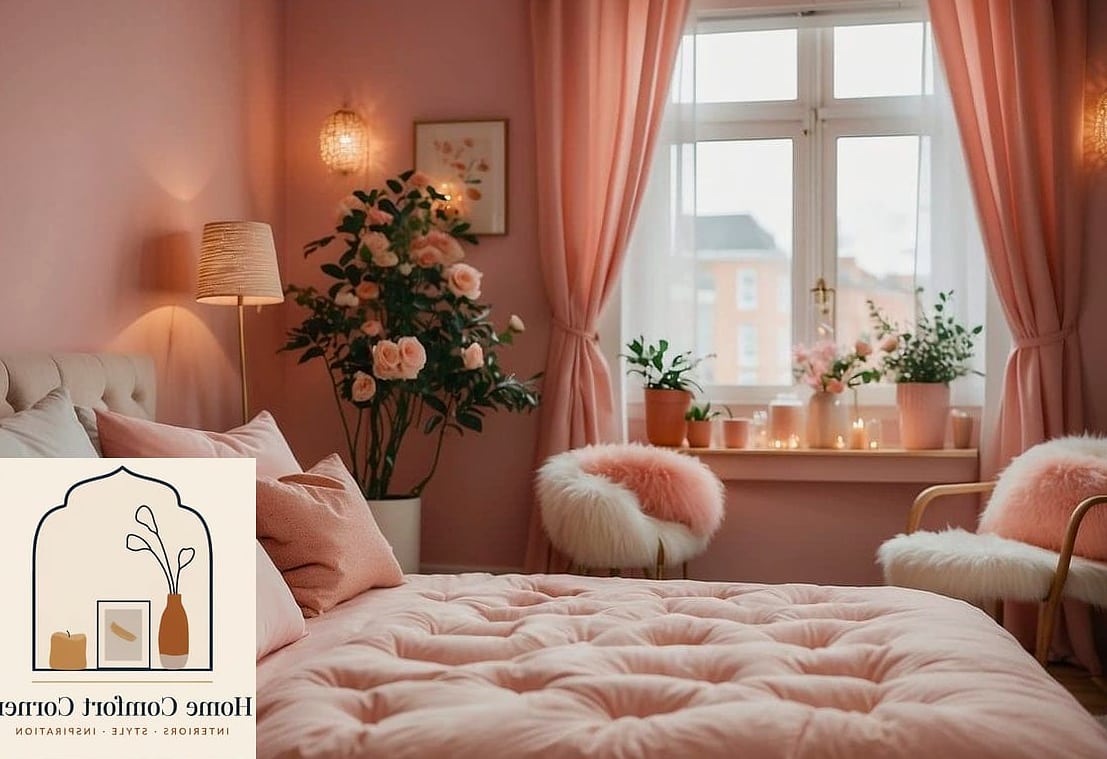
This smaller-scale board focuses on creating a cozy corner rather than an entire room. A soft pink accent chair, a small side table, a floor lamp, and a stack of books turn any unused corner into a little retreat.
Layering in a textured throw blanket and a small rug helps define the space even if it’s tucked into a larger room. This is one of the most budget-friendly boards on this list since it only requires a few key pieces.
It’s also incredibly renter-friendly, since nothing here requires paint or permanent changes, just furniture and styling.
Pink rooms get a bad rap sometimes, but as you can see, there’s a version of this color for basically every style and budget. Whether you’re drawn to something soft and romantic or bold and maximalist, the key is picking one direction and layering in materials, textures, and accents that support it. Pull a few of these boards, mix in your own personal touches, and you’ll end up with a room that feels like yours instead of a copy-paste Pinterest trend.