7 Creative Pink Room Aesthetic Ideas You Haven’t Seen Before
- Terracotta Pink Paired with Warm Wood Tones
- Deep Berry Pink for a Moody, Dramatic Bedroom
- Pink Zellige Tile in a Kitchen or Bathroom
- Pink and Sage Green as an Unexpected Color Pairing
- Pink Lacquered or High-Gloss Furniture as an Accent
- Dusty Mauve Walls with Black Matte Fixtures
- Pink Grasscloth or Textured Wallpaper for Depth
7 Creative Pink Room Aesthetic Ideas You Haven’t Seen Before
Pink has come a long way from the pastel nursery walls you might remember growing up. These days it’s showing up in moody dining rooms, home offices, even kitchens, and it’s doing a lot more than looking “pretty.” The right shade of pink can feel grounding, warm, and surprisingly sophisticated when you pair it with the right materials and finishes.
If you’ve been scrolling for pink room aesthetic ideas and keep landing on the same blush-and-gold mood boards, I get it. That look is fine, but it’s been done to death. Below are seven ideas that lean into pink in ways that feel fresh, a little unexpected, and genuinely livable.
Terracotta Pink Paired with Warm Wood Tones
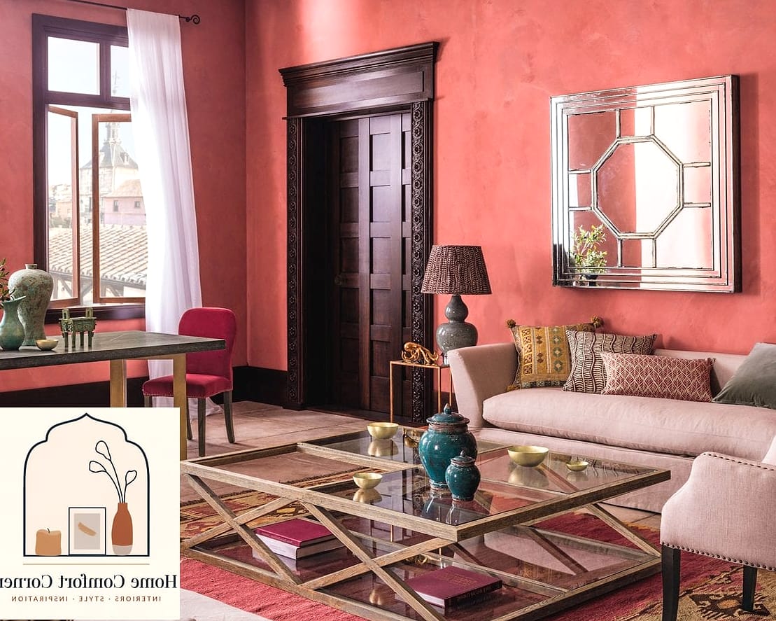
This is the pink for people who think they don’t like pink. Think dusty, clay-like shades that lean more orange-brown than bubblegum, almost like a sun-faded brick wall.
It works beautifully in living rooms and entryways, especially when you bring in warm wood tones like oak or walnut furniture. The combo feels earthy and grounded instead of sweet, which is why it’s popping up in a lot of modern Mediterranean and Spanish-revival inspired spaces.
Skip the glossy paint finish here. A matte or eggshell finish keeps that clay-like, textured look intact. If you’re renting, you can get a similar effect with a large terracotta-toned area rug and rust-colored throw pillows without touching the walls at all.
Deep Berry Pink for a Moody, Dramatic Bedroom
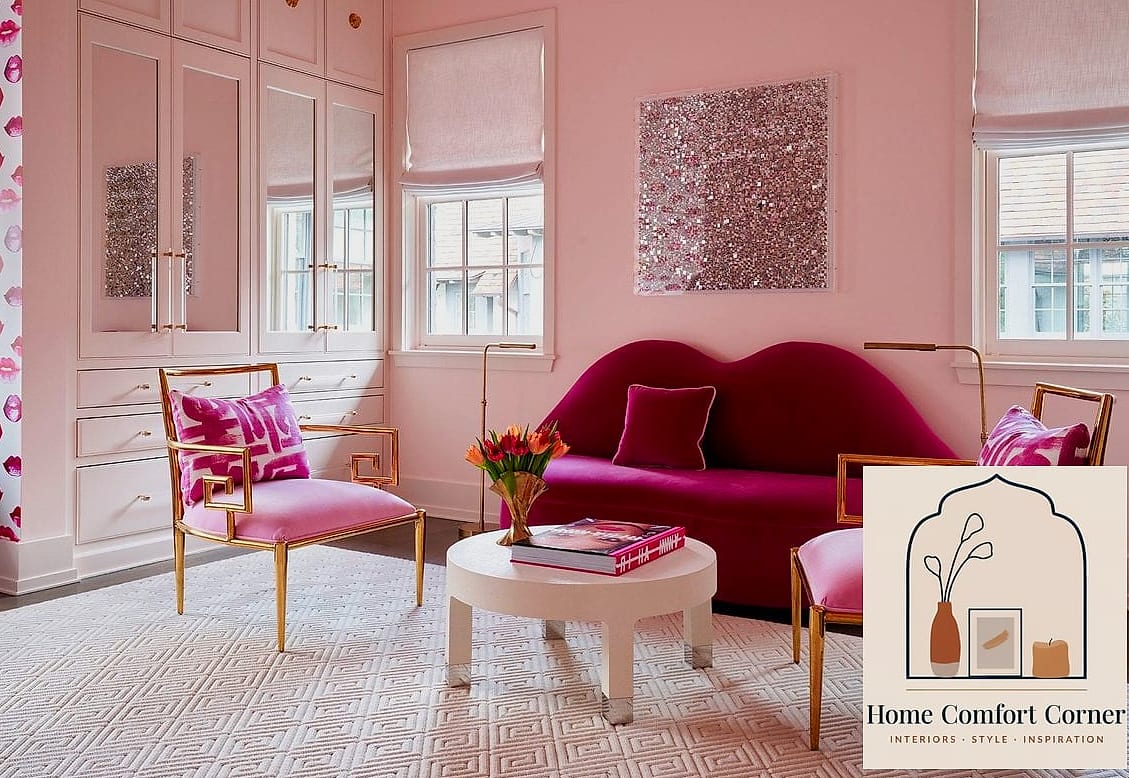
Forget light and airy. This idea is all about going deep and rich, using pinks that sit somewhere between raspberry and burgundy. It’s one of those colors that photographs incredibly well in the evening under warm lighting.
Bedrooms and powder rooms are the best spots for this look since they’re smaller spaces that can handle a bold, saturated color without feeling overwhelming. Pair the walls with black or brushed brass hardware and you get this unexpectedly luxe, almost jewel-box feeling.
Layered lighting matters a lot here. A single overhead fixture will flatten the color, but a mix of a floor lamp, table lamp, and maybe a wall sconce will let the pink shift and glow depending on the time of day. If painting a full room feels like too much commitment, try it on just one accent wall behind the headboard.
Pink Zellige Tile in a Kitchen or Bathroom
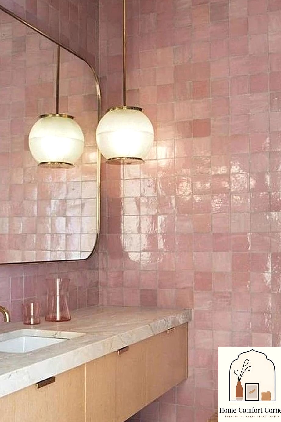
Zellige tile has been trending for a couple years now, but most people default to white or blue. Pink zellige is the same handmade, slightly irregular tile with that gorgeous light-catching texture, just in a soft rose or blush tone instead.
It’s stunning as a kitchen backsplash, especially paired with brass fixtures and butcher block counters, or as a full shower surround in a bathroom. Because each tile has natural variation in color and shape, the finished wall has this subtle, almost watercolor effect that flat ceramic tile just can’t replicate.
Zellige is pricier than standard ceramic or porcelain tile, and installation is trickier because of the irregular edges, so this is one project where hiring a pro is usually worth it. If the budget doesn’t stretch that far, look for porcelain tile designed to mimic zellige. You’ll get a similar look for a fraction of the cost and it’s much more DIY-friendly.
Pink and Sage Green as an Unexpected Color Pairing
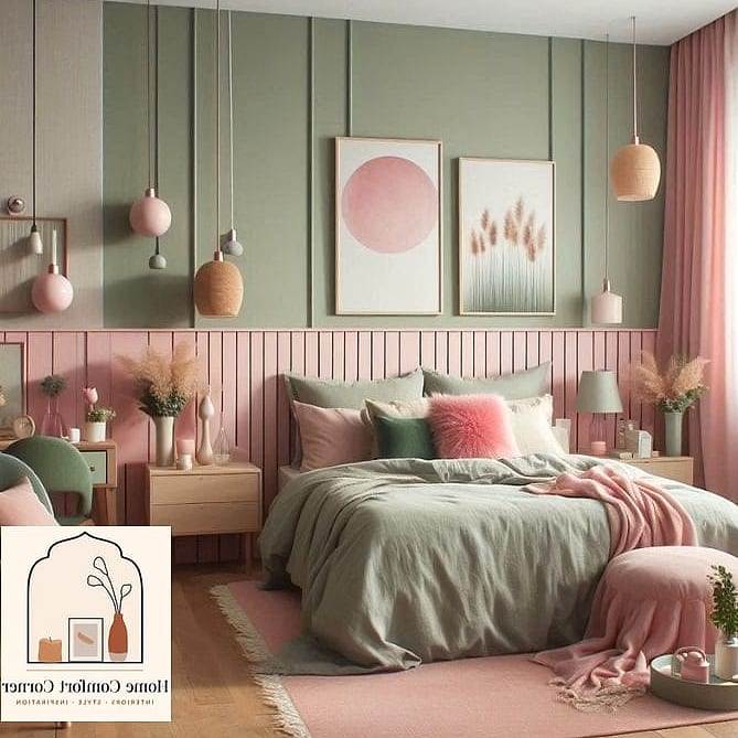
Pink and green together sounds like it could go very wrong, very fast, but when you land on the right shades, it’s one of the most soothing combinations out there. Think dusty rose paired with sage or olive green rather than anything bright or saturated.
This pairing works really well in living rooms and home offices where you want the space to feel calm rather than energizing. A sage green sofa against blush pink walls, or the reverse, pink accent chairs in a room with sage cabinetry, both read as intentional and collected rather than themed.
Bring in natural elements like rattan, jute rugs, and plenty of greenery to tie the two colors together. It keeps the palette feeling organic instead of like you picked two random paint chips off a rack.
Pink Lacquered or High-Gloss Furniture as an Accent
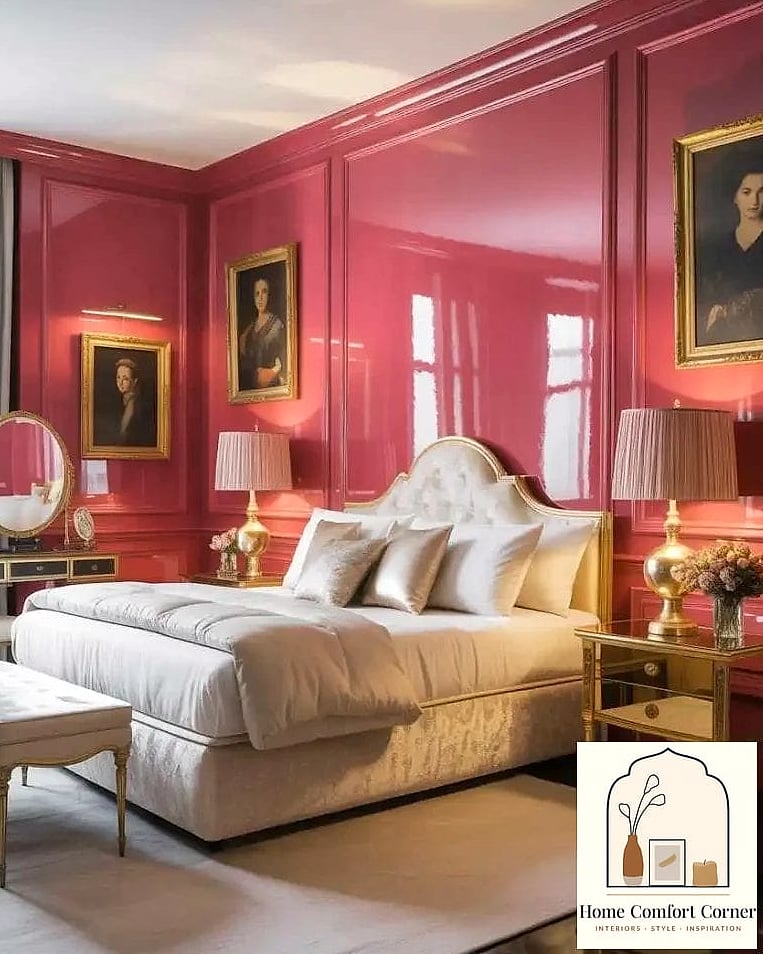
Instead of committing to pink walls, this idea puts the color on a single statement piece, a lacquered dresser, a glossy console table, or even a painted vintage cabinet. The high-shine finish makes the pink feel more polished and less playful than a matte version would.
It’s a great option for renters or anyone who wants to test out a pink room aesthetic without repainting anything. Drop a lacquered pink piece into an otherwise neutral room, a beige sofa, white walls, natural wood floors, and it instantly becomes the focal point.
If you’re up for a weekend project, you can DIY this with a piece of secondhand furniture, a good primer, and a few coats of lacquer or high-gloss spray paint. Just know that glossy finishes show fingerprints and dust more than matte ones, so it’s not the lowest-maintenance option if you’ve got kids or pets running around.
Dusty Mauve Walls with Black Matte Fixtures
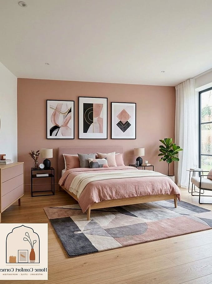
Mauve sits in that gray-pink family, which makes it feel more like a neutral than a true color choice. It’s incredibly easy to live with long term because it doesn’t scream “trend” the way brighter pinks can.
Where this idea gets interesting is pairing mauve walls with black matte fixtures, door hardware, light fixtures, faucets, cabinet pulls. The contrast is subtle but it keeps the room from feeling too soft or too feminine, which makes it a good pick for shared bedrooms or offices where not everyone wants a pink room.
This combo works in almost any room size since mauve doesn’t compete with light the way darker pinks can. Small bedrooms and home offices both handle it well. For upkeep, matte black fixtures do show water spots more than chrome, so a quick wipe-down in bathrooms keeps them looking sharp.
Pink Grasscloth or Textured Wallpaper for Depth
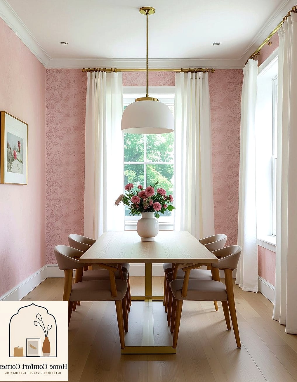
Flat paint is great, but textured wallpaper in a pink tone adds a dimension that solid color just can’t. Grasscloth, in particular, has a woven, natural texture that catches light differently throughout the day, so the wall never looks totally static.
This idea shines in dining rooms, entryways, or as an accent wall in a bedroom. It’s also a smart choice if your walls have minor imperfections, since the texture does a nice job of camouflaging small dings and dents that flat paint would show off.
Peel-and-stick pink textured wallpaper has gotten a lot better in recent years, so this is genuinely renter-friendly now. If you’re going the traditional wallpaper route in a high-traffic area, look for a vinyl-coated option since it’ll hold up better against scuffs and is easier to spot-clean.
Final Thoughts
The best pink room aesthetic ideas right now aren’t about going full pastel, they’re about using pink the way you’d use any other neutral or accent color, paired thoughtfully with texture, wood tones, and the right fixtures. Whether you’re ready to commit to a zellige tile backsplash or just want to test the waters with a lacquered dresser, there’s a version of this trend that’ll work for pretty much any space and any budget. Start small if you’re unsure, a pillow, a rug, a single accent wall, and see how you feel living with it before you go all in.