20 Aesthetic Room Decor Ideas Inspiration Boards You’ll Want to Copy
- Warm Neutral Base With Layered Textures
- Gallery Wall With Mismatched Frames
- Curated Bookshelf Styling
- Dopamine Decor With Bold Color Blocking
- Japandi-Inspired Minimalism
- Vintage-Inspired Curtain Layering
- Statement Ceiling Treatment
- Cottagecore Floral and Lace Accents
- Open Shelving in the Kitchen or Living Room
- Moody Dark Accent Wall
- Layered Rug Combinations
- Reclaimed Wood Accent Furniture
- Woven Basket Storage Solutions
- Arched Mirror as a Focal Point
- Terracotta and Clay Tones Throughout
- Canopy or Draped Fabric Over the Bed
- Built-In Look With Freestanding Shelving
- Textured Wall Treatments With Limewash or Plaster
- Curated Vignettes on Console Tables and Nightstands
- Indoor Greenery as a Design Layer
20 Aesthetic Room Decor Ideas Inspiration Boards You’ll Want to Copy
If your Pinterest board has turned into a full-time hobby, you’re not alone. There’s something so satisfying about collecting little snippets of color palettes, textures, and layouts until a room finally clicks into place. The tricky part is turning all that inspiration into something you can actually live in.
That’s exactly what this list is for. These are real, doable ideas pulled from the kind of rooms people screenshot and save for later. Some are quick weekend swaps, others are bigger commitments, but every single one is meant to feel like you, not a showroom.
Warm Neutral Base With Layered Textures
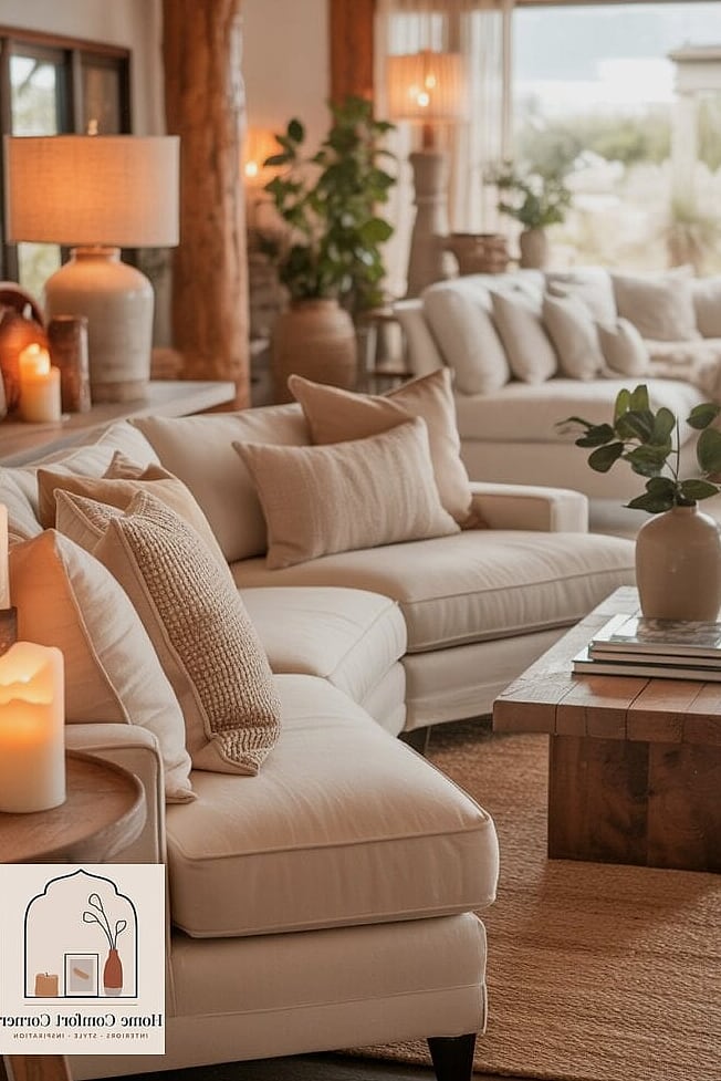
This is the foundation behind most of the cozy-but-elevated rooms you see saved a thousand times over. Think oatmeal, sand, and soft taupe walls paired with a mix of linen, boucle, and chunky knit throws.
It works in almost any room because neutral doesn’t mean boring here, it means flexible. You can swap out accent colors seasonally without repainting a thing.
The key is variety in texture rather than color. A smooth leather chair next to a nubby wool rug next to a raw wood side table keeps things interesting even when the palette stays quiet.
Gallery Wall With Mismatched Frames
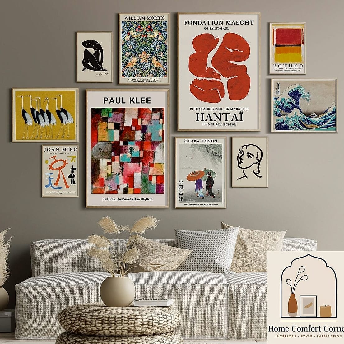
Nothing fills a blank wall with personality quite like a curated gallery wall. The trick people often get wrong is matching every frame, when the more collected look actually comes from mixing finishes.
Combine thin black metal frames with a couple of ornate vintage ones and one or two floating frames with no border at all. Toss in a small mirror or a piece of textile art for variation.
Budget-wise this is one of the most forgiving projects on the list since thrifted frames work beautifully. Just measure your layout on the floor first, or trace paper templates and tape them to the wall before committing to nail holes.
Curated Bookshelf Styling
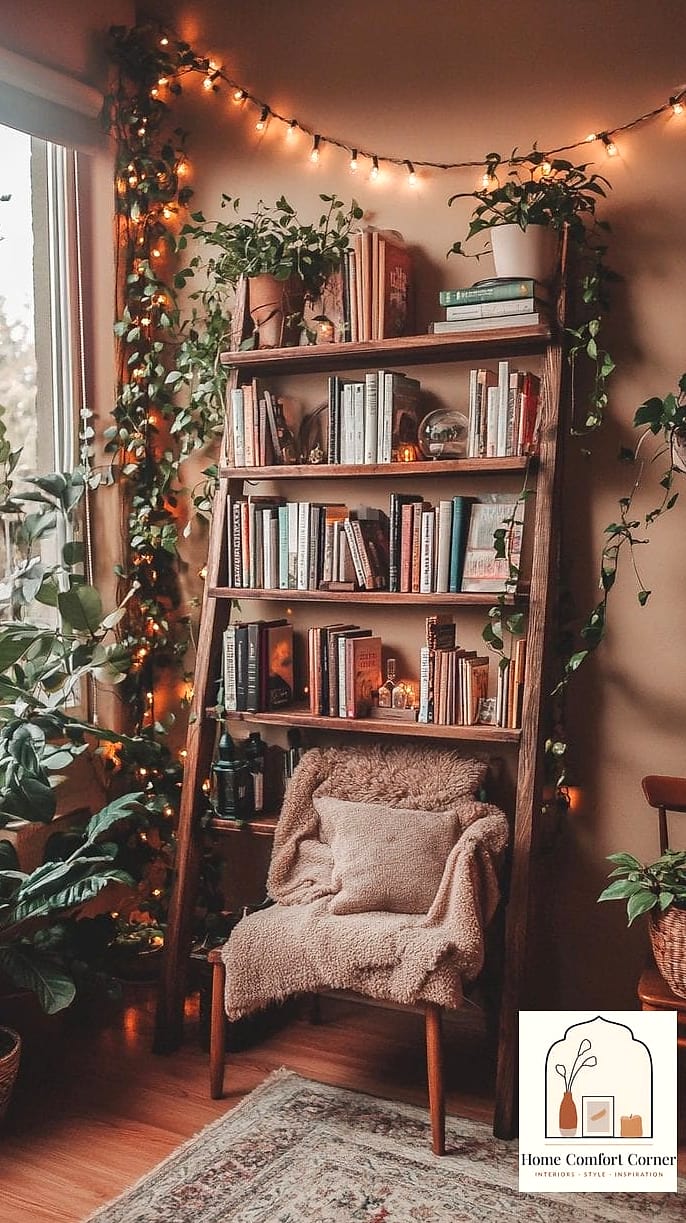
A shelf full of books spine-out can look chaotic fast, and it’s one of the most common styling mistakes I see. The fix is grouping by color, stacking some horizontally, and leaving breathing room between objects.
Add a small plant, a ceramic vase, or a framed photo every few feet to break up the rhythm. Bookends don’t have to match either, mismatched brass and stone ones actually look more intentional.
This works in living rooms, home offices, and even bedrooms with a reading nook. It’s also endlessly changeable since you’re just rearranging what you already own.
Dopamine Decor With Bold Color Blocking
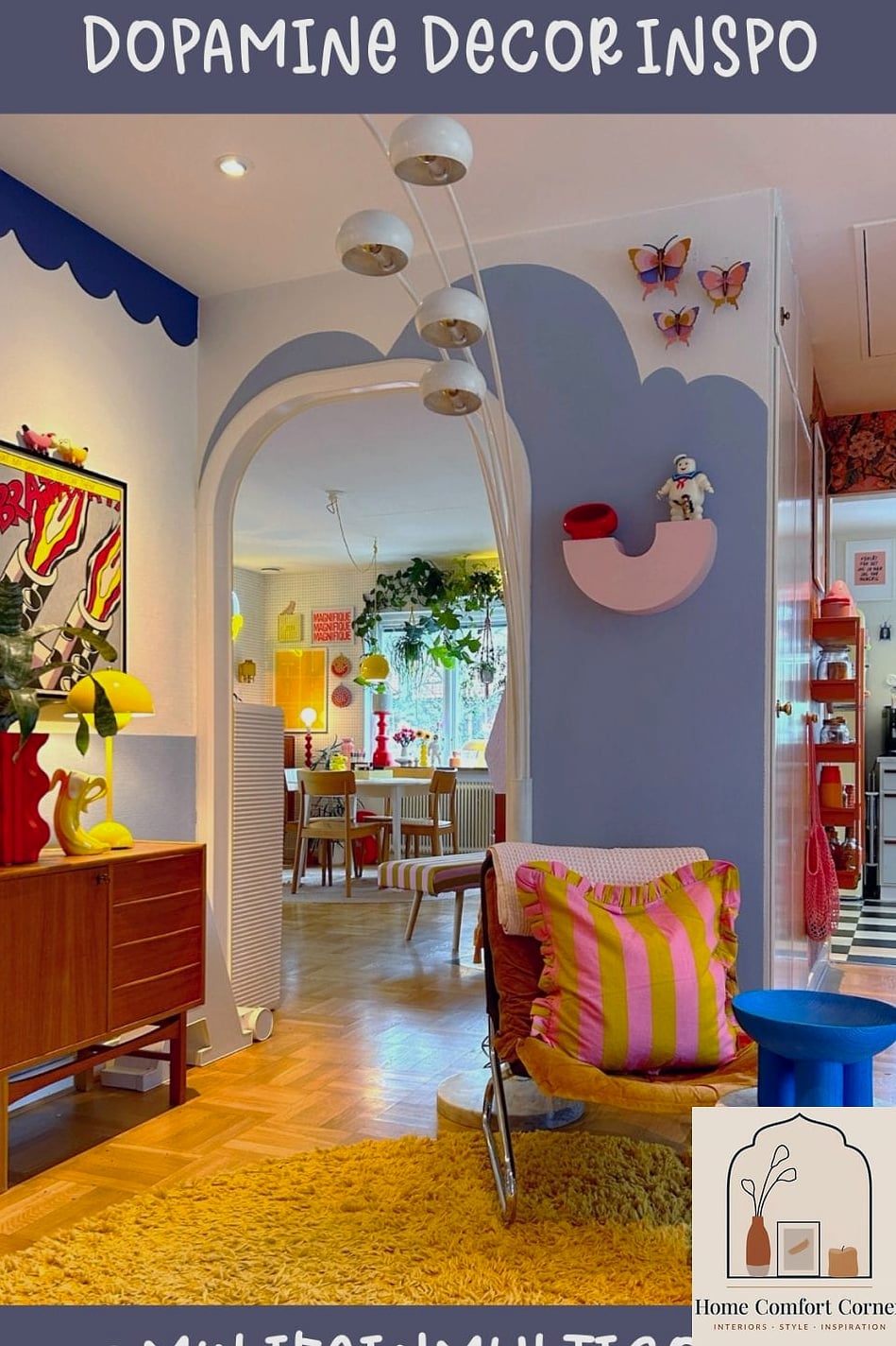
Not every aesthetic board is soft and neutral, and this one leans hard into color for people who want their space to feel joyful and expressive. Think a mustard accent wall paired with emerald green textiles and a punch of hot pink in the throw pillows.
It sounds like a lot on paper, but the trick is picking three colors max and repeating them throughout the room so it reads as intentional rather than random.
This style works especially well in smaller spaces like a reading nook or home office where you’re not trying to color-coordinate an entire open floor plan.
Japandi-Inspired Minimalism
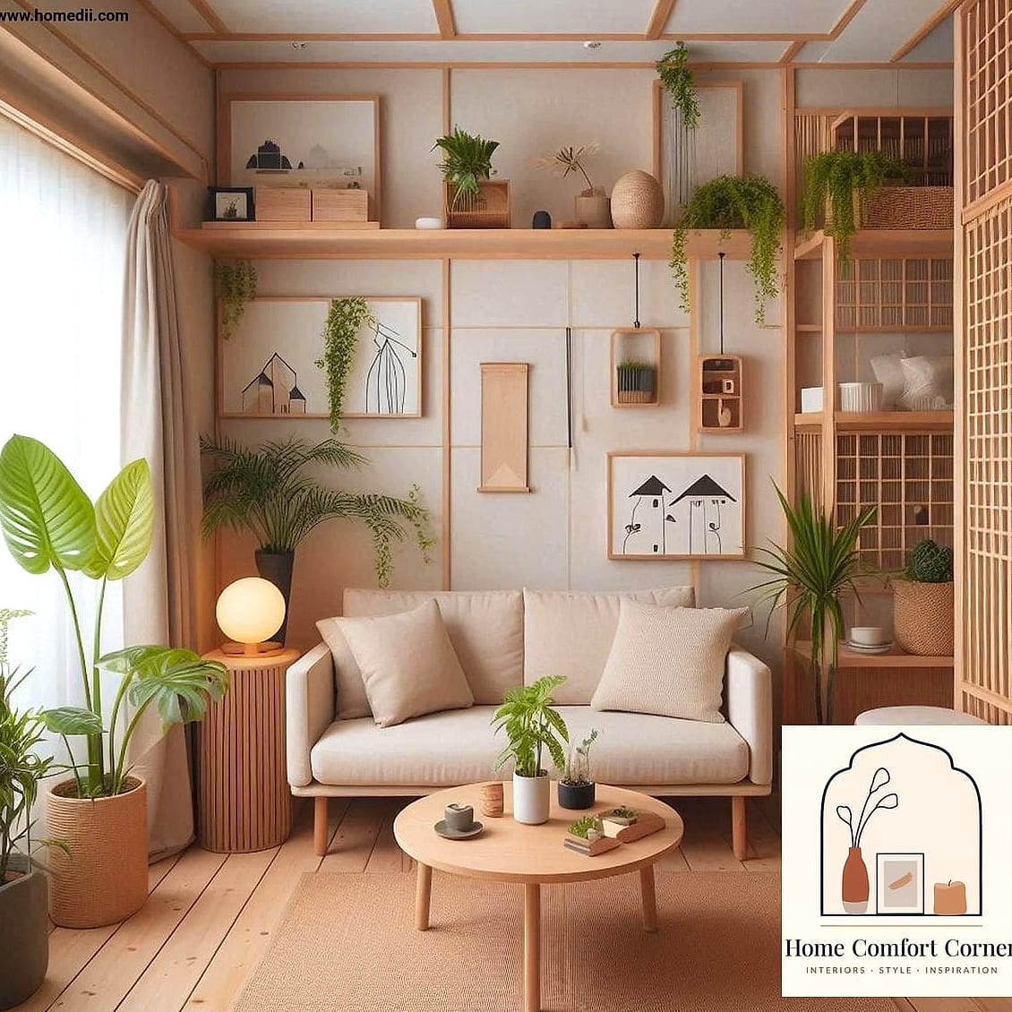
This is the blend of Japanese simplicity and Scandinavian warmth that keeps showing up on inspiration boards for a reason. Low-profile furniture, natural wood tones, and a muted palette of clay, sage, and charcoal define the look.
Clutter is the enemy here, so storage matters as much as styling. Closed cabinetry, woven baskets, and furniture with hidden compartments keep surfaces clear without sacrificing function.
It’s a great fit for small apartments since the pared-back approach makes rooms feel more spacious than they actually are.
Vintage-Inspired Curtain Layering
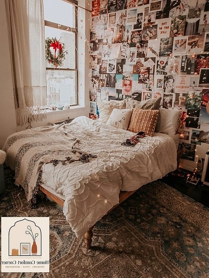
Curtains get overlooked constantly, but layering a sheer panel underneath a heavier drape adds instant softness and depth to a room. Go for a warm ivory sheer with a rust or olive linen overlay for a lived-in, collected feel.
Hang the rod higher than the window frame, close to the ceiling if you can, since it tricks the eye into thinking the ceilings are taller than they are.
This is a rental-friendly upgrade too, since tension rods mean no drilling required.
Statement Ceiling Treatment
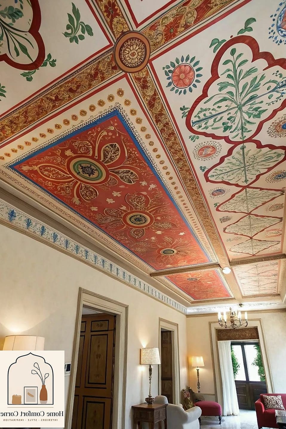
Painting or wallpapering the ceiling is one of those choices that photographs incredibly well and gets people talking the moment they walk in. A deep navy or forest green ceiling paired with white trim adds drama without overwhelming the whole room.
Bedrooms and dining rooms tend to handle this best since you’re usually looking up at the ceiling while relaxed or seated. Peel-and-stick wallpaper is a solid renter-friendly alternative to paint if you want pattern instead of solid color.
Just budget extra time for this project since ceilings are awkward to reach and usually need a second coat.
Cottagecore Floral and Lace Accents
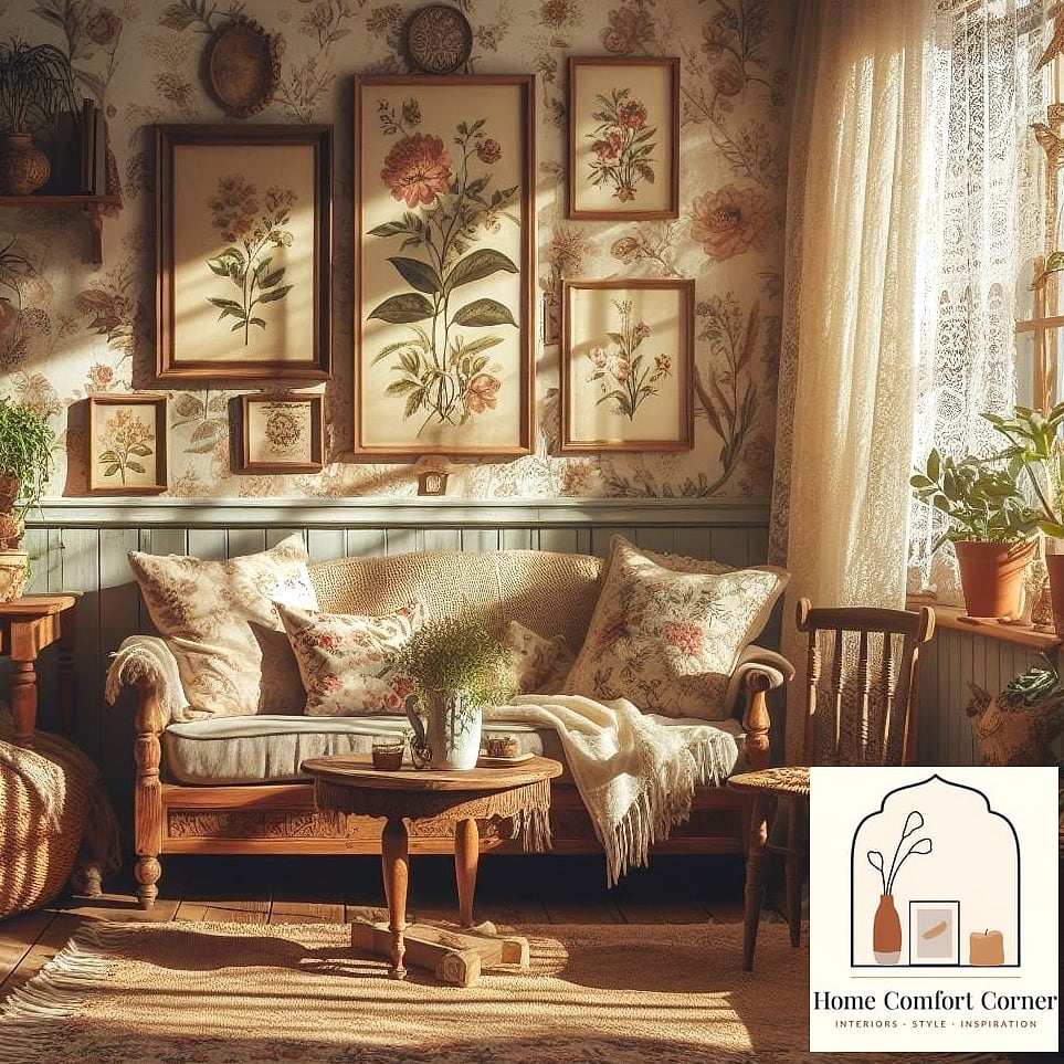
Soft florals, lace trim, and a slightly romantic, worn-in feel define this aesthetic, and it’s had a real resurgence lately. Think vintage floral bedding, dried flower arrangements, and a lace table runner draped over a wood dresser.
This works especially well in bedrooms and reading corners where the softness feels appropriate rather than fussy. Secondhand shops are a goldmine for this look since a lot of the charm comes from pieces that already feel a little lived-in.
Balance the softness with something structural, like a black iron bed frame, so the room doesn’t tip into overly sweet territory.
Open Shelving in the Kitchen or Living Room
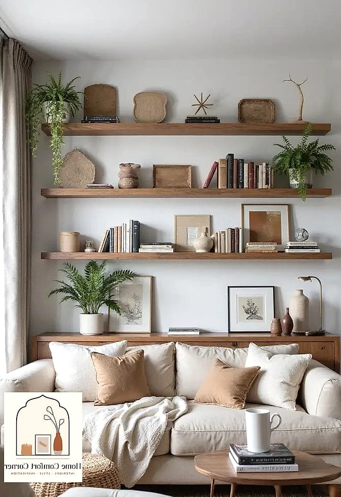
Swapping upper cabinets for open shelving is a favorite on inspiration boards because it makes a space feel lighter and more personal. Floating wood shelves with brackets in black or brass hold everyday dishes, plants, and small collected objects.
The honest tradeoff is dusting more often since everything is exposed, so this works best for people who don’t mind a little extra upkeep. Keep styling loose rather than perfectly symmetrical, stacked bowls, a small plant, and a few cookbooks look more natural than a rigid arrangement.
Moody Dark Accent Wall
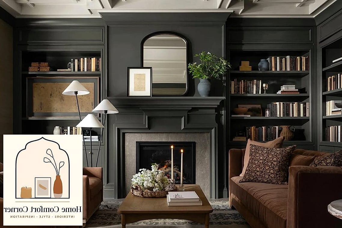
One dramatic wall in charcoal, deep plum, or near-black can completely change how a room feels without the commitment of painting everything. It grounds a space and makes lighter furniture and decor pop against it.
Bedrooms and home offices tend to handle this best since the coziness factor works in your favor when you’re trying to relax or focus. Pair it with warm lighting rather than harsh overhead fixtures so the dark tone doesn’t feel flat.
If painting feels intimidating, a removable dark wallpaper achieves a similar effect without the same commitment.
Layered Rug Combinations
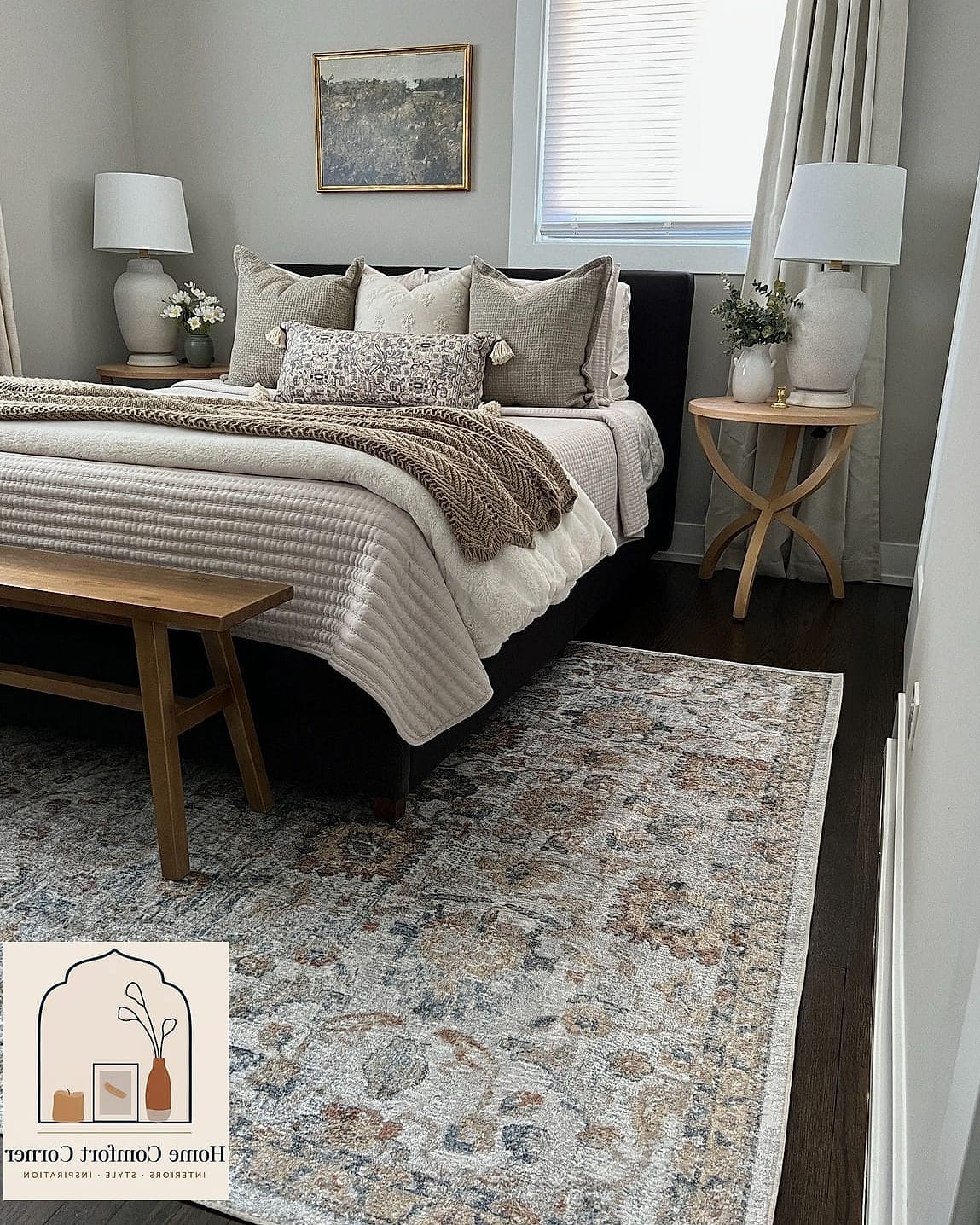
Placing a smaller patterned rug on top of a larger neutral jute or sisal rug adds texture and visual interest that a single rug just can’t match. It’s a trick borrowed straight from boutique hotel design.
This works especially well in living rooms and bedrooms where you want the floor to feel as intentional as the walls. Stick to one busy pattern and one calm texture so the combination reads as styled rather than mismatched.
Budget-wise, this is a great way to use an inexpensive base rug and splurge slightly on a smaller statement piece layered on top.
Reclaimed Wood Accent Furniture
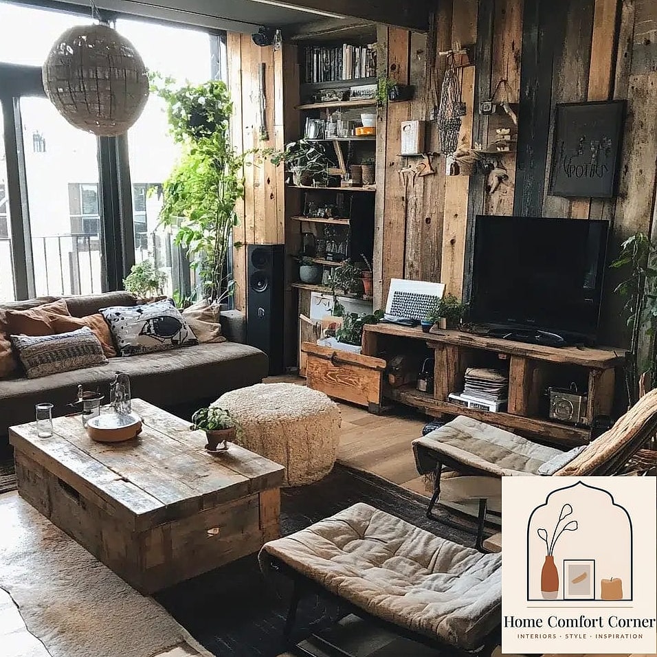
A single reclaimed wood piece, whether it’s a coffee table, console, or headboard, brings warmth and history into a room in a way that new furniture sometimes can’t replicate. The imperfections are the whole point.
This pairs beautifully with the warm neutral and Japandi aesthetics mentioned earlier since the wood grain adds organic texture against softer surfaces. Local salvage yards and marketplace listings are worth checking before buying new.
Keep in mind these pieces can be heavier and less uniform in size, so measure your space carefully before committing.
Woven Basket Storage Solutions
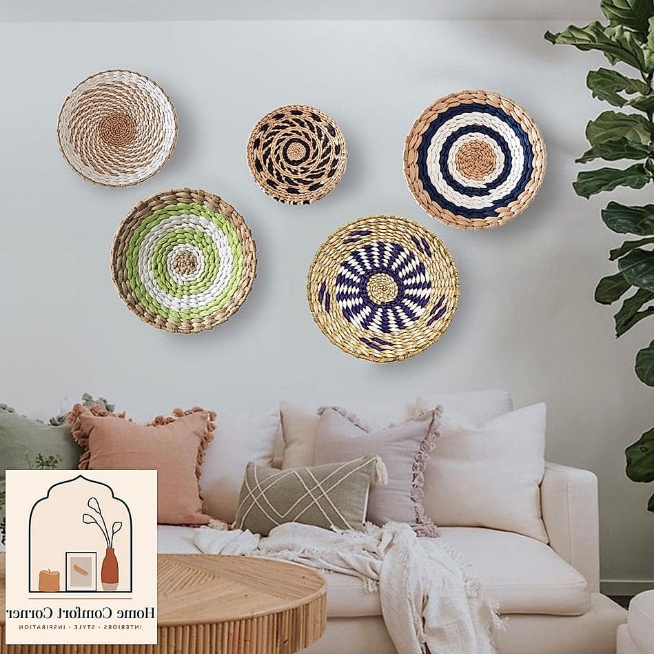
Baskets solve two problems at once, they hide clutter and add texture, which is exactly why they show up constantly on decor boards. Stack a few different sizes of seagrass or rattan baskets near a couch or under a console table.
They’re especially useful in family-friendly rooms where toys, blankets, and remotes need a home that doesn’t look like storage. Pet owners love them too for hiding leashes, toys, and grooming supplies out of sight.
This is also one of the more budget-friendly ideas here since baskets range widely in price and are easy to find secondhand.
Arched Mirror as a Focal Point
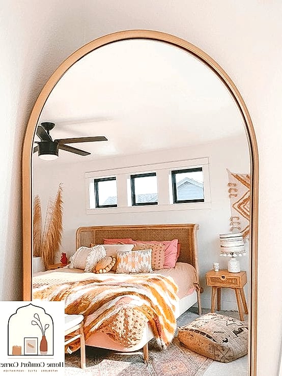
An oversized arched mirror leaning against a wall instantly adds height and softness to a room, and it’s become a signature piece in a lot of aesthetic inspiration boards. The curved shape balances out all the straight lines furniture tends to have.
Entryways and living rooms benefit the most since mirrors bounce light around and make the space feel larger immediately. A wood or brushed brass frame tends to photograph the best against neutral walls.
Just make sure it’s secured properly if you have kids or pets running through the space, leaning mirrors need anti-tip hardware.
Terracotta and Clay Tones Throughout
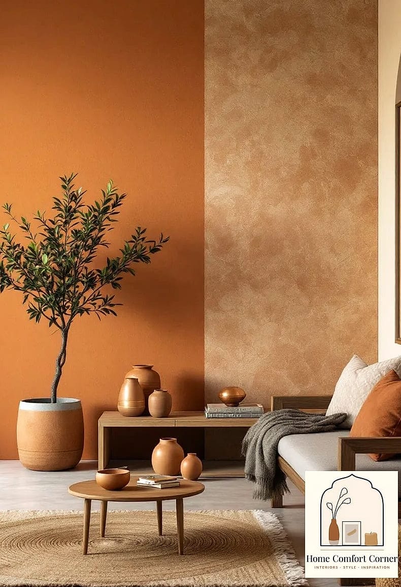
Warm terracotta, rust, and clay shades have taken over a lot of decor boards lately, and they bring an earthy warmth that cooler tones just don’t have. Think terracotta planters, clay-toned throw pillows, and even a painted accent wall in the shade.
This palette pairs beautifully with green plants and natural wood, making it a strong choice for sunrooms or living rooms with lots of natural light. It also works well in smaller doses if you’re not ready to commit to a full room.
A few terracotta pots on a windowsill is honestly enough to bring the whole aesthetic into a space.
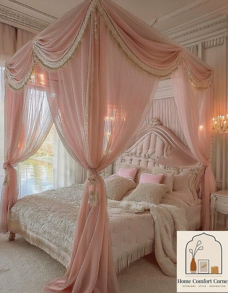
Canopy or Draped Fabric Over the Bed
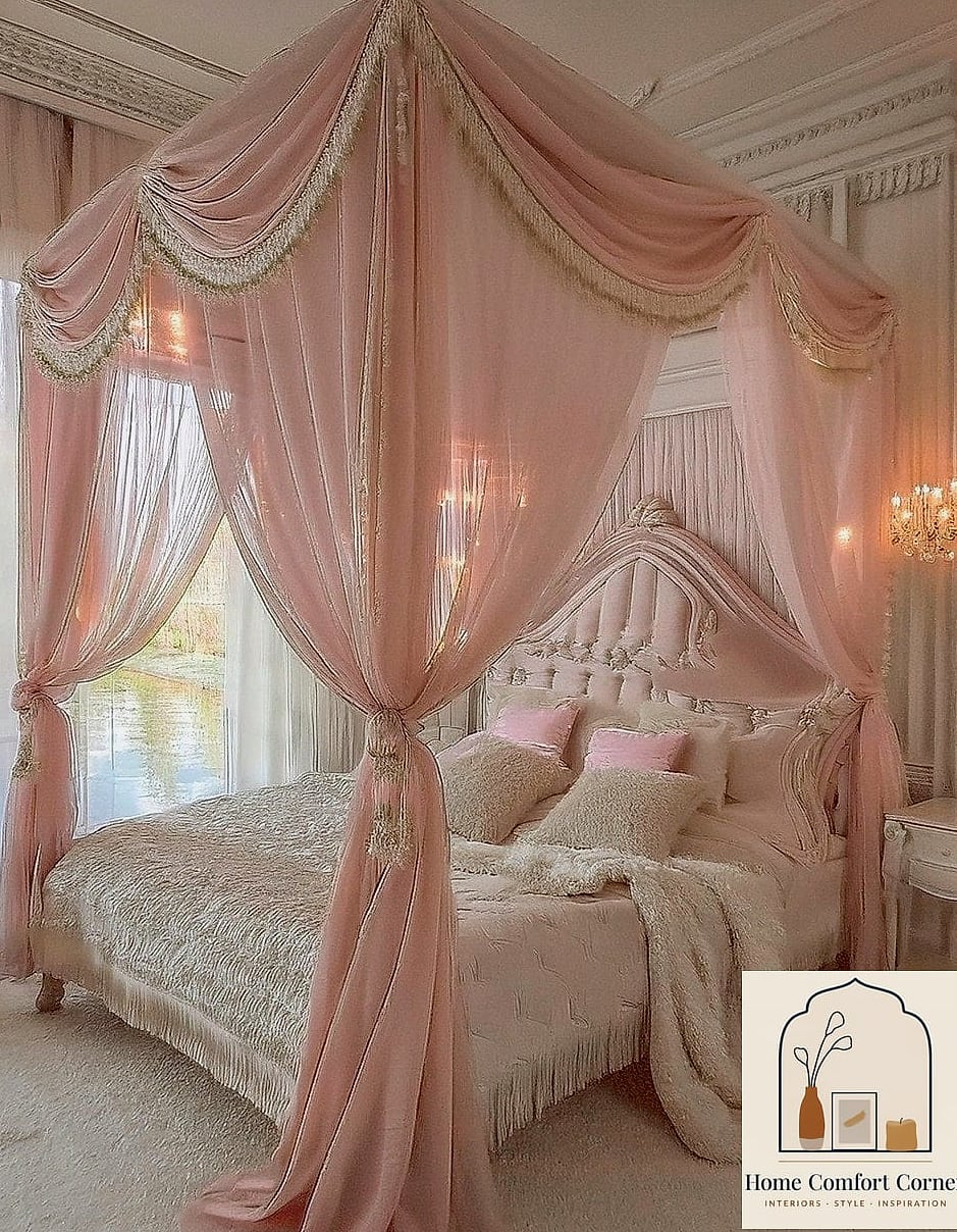
Draping fabric above a bed frame, whether from a canopy frame or simply mounted hooks, adds a soft, dreamy focal point that photographs beautifully. Sheer linen in white or a warm ivory tends to work best.
This is a bedroom-specific idea, obviously, but it’s a favorite for anyone wanting a boutique hotel feel without a full renovation. It’s also very renter-friendly since most versions mount with simple hooks rather than permanent hardware.
Keep the fabric loosely draped rather than perfectly symmetrical for a more relaxed, collected look.
Built-In Look With Freestanding Shelving
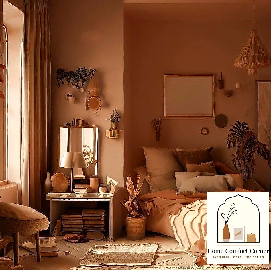
Not everyone has the budget for actual built-in cabinetry, but flanking a fireplace or window with matching freestanding bookshelves creates a similar effect for a fraction of the cost. Paint the shelves to match the wall color so they blend in rather than stand out.
This is a great option for renters or anyone who might move in the next few years, since the shelves go with you. Style them with a mix of books, plants, and personal objects rather than uniform rows for the most natural look.
Adding crown molding trim along the top edge helps sell the built-in illusion even further.
Textured Wall Treatments With Limewash or Plaster
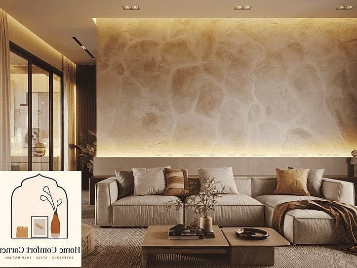
Limewash paint has become one of the most requested finishes for anyone chasing that soft, cloudy, old-world texture on their walls. Unlike flat paint, it has natural variation and depth that changes with the light throughout the day.
Bedrooms and living rooms tend to be the best fit since the texture is subtle enough not to overwhelm smaller spaces. It does take a bit more skill to apply evenly, so this might be a project worth hiring out if you’re not confident with a brush.
The payoff is a wall that looks handcrafted and nothing like standard builder-grade paint.
Curated Vignettes on Console Tables and Nightstands
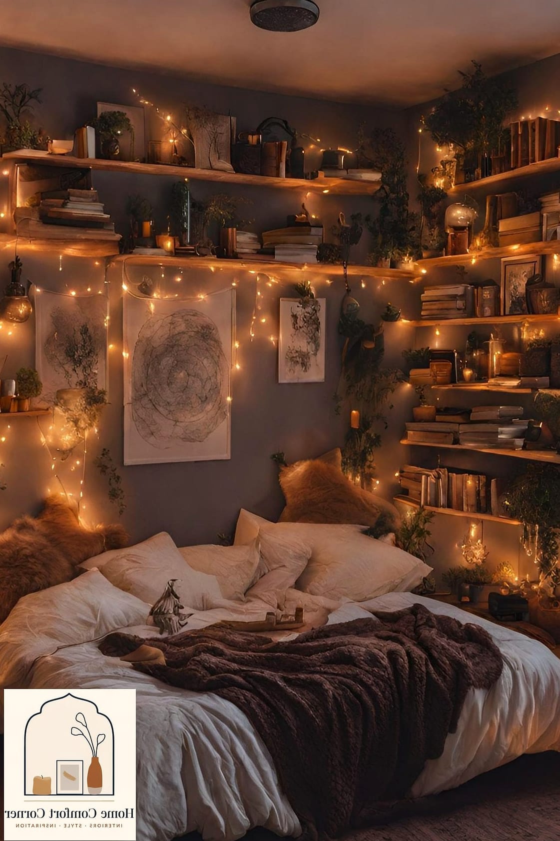
A vignette is just a small, intentional grouping of objects, think a lamp, a stack of books, a small plant, and one meaningful object like a piece of pottery or a framed photo. It’s a simple styling trick that makes surfaces feel finished rather than cluttered.
Odd numbers tend to look more natural than even ones, and varying height matters more than people expect. A tall lamp next to a short stack of books next to a medium plant creates a visual triangle that’s pleasing to the eye.
This costs nothing if you’re just rearranging what you already have, which makes it one of the easiest ideas to try today.
Indoor Greenery as a Design Layer
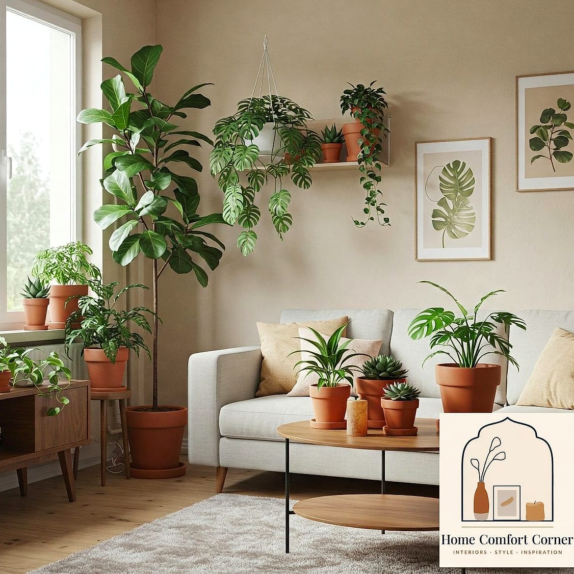
Plants aren’t just decor, they’re one of the fastest ways to make a room feel finished and alive. A large fiddle leaf fig or monstera in a woven basket planter adds height and softness that furniture alone can’t provide.
Low-maintenance options like pothos or snake plants are great if you don’t have the most reliable green thumb, and both tolerate lower light conditions. Grouping plants of varying heights together, rather than scattering single pots around, tends to look more styled and less accidental.
This is also one of the most affordable ways to bring life into a room without touching paint or furniture at all.
Pulling together your own version of these boards doesn’t mean copying every single idea into one room. Pick two or three that genuinely feel like you, whether that’s the moody accent wall or the layered rugs, and build outward from there. The best rooms usually come from a handful of intentional choices rather than trying to fit everything in at once.