30 Pastel Room Decor Makeovers That Look Incredibly Expensive
- Sage Green Walls with Brass Accents
- Blush Pink Velvet Headboard
- Lavender Accent Wall Behind a Neutral Sofa
- Buttercream Yellow Kitchen Cabinets
- Powder Blue Bathroom Tile
- Mint Green Kitchenette in a Studio Apartment
- Dusty Rose Dining Room with Wainscoting
- Pale Peach Reading Nook
- Seafoam Green Built-In Shelving
- Soft Lilac Accent Chair
- Pastel Terracotta Entryway
- Baby Blue Laundry Room Cabinetry
- Pastel Pink Home Office Nook
- Sage and Cream Primary Bedroom
- Pastel Yellow Front Door
- Lavender Tiled Backsplash
- Blush and Gold Powder Room
- Soft Mint Kids’ Room That Doesn’t Look Childish
- Pastel Peach Kitchen Island
- Dusty Blue Built-In Window Seat
- Pastel Green Vintage-Inspired Kitchen
- Soft Coral Accent Wallpaper
- Pastel Lilac Bathroom Vanity
- Buttery Yellow Reading Chair in a Neutral Living Room
- Sage Green Kitchen Nook Banquette
- Pastel Pink Tiled Fireplace Surround
- Soft Blue Ceiling in a Sunroom
- Pastel Peach and White Striped Accent Wall
- Lavender Kitchen Cabinets with Unlacquered Brass
- Pastel Green Bookshelf Styling
30 Pastel Room Decor Makeovers That Look Incredibly Expensive
Pastels get a bad reputation for looking childish or overly sweet, but that’s only true when they’re done wrong. Done right, soft colors like sage, blush, lavender, and buttery yellow can make a room feel like it belongs in a design magazine. The trick is pairing them with the right textures, metals, and layout choices so they read as sophisticated instead of syrupy.
I’ve pulled together 30 pastel makeovers that prove this point over and over again. Some are full room transformations, others are small styling swaps you can knock out in a weekend. All of them borrow from the same playbook that high-end designers use to make soft colors feel rich rather than washed out.
Sage Green Walls with Brass Accents
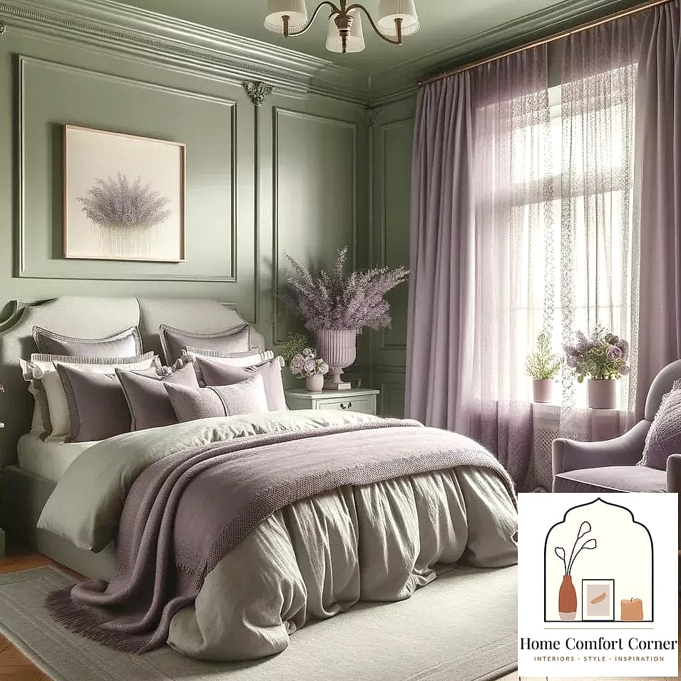
There’s a reason sage green shows up in nearly every designer portfolio right now. It reads as calming without feeling flat, especially when you pair it with warm brass hardware or lighting fixtures. Try it in a bedroom or home office where you want a quiet, grounded feeling. The contrast between the cool green and warm metal is what sells the expensive look.
Blush Pink Velvet Headboard
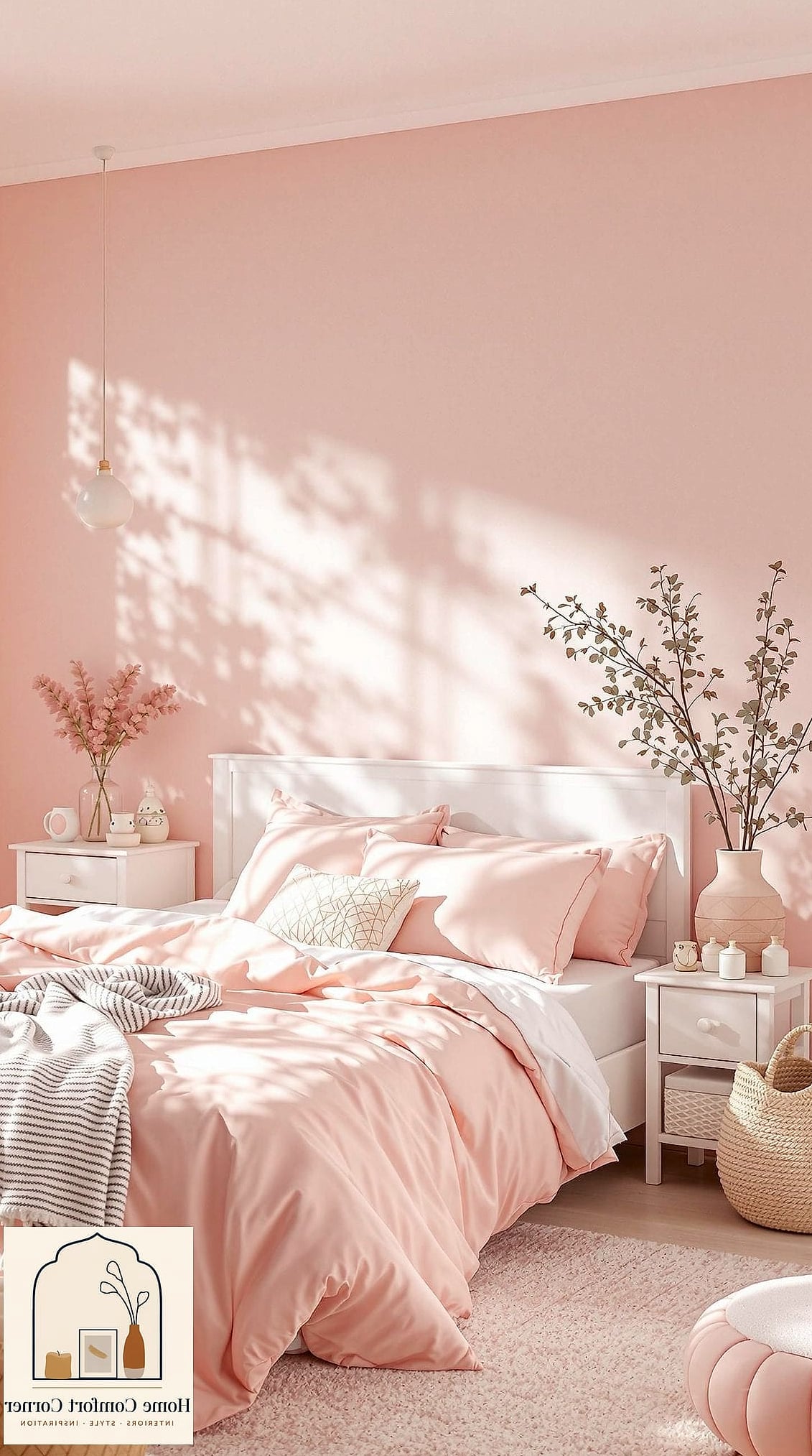
A velvet headboard in dusty pink instantly upgrades a bedroom without touching the walls at all. Velvet has this way of catching light that makes even a budget piece look plush and tailored. Pair it with white or cream bedding so the pink stays the star of the show instead of competing with patterns.
Lavender Accent Wall Behind a Neutral Sofa
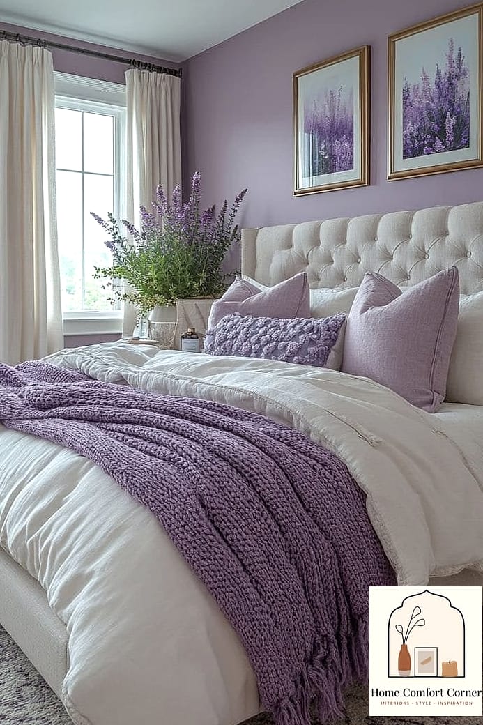
Painting just one wall in a soft lavender keeps the room from feeling overly saturated while still giving you that pastel payoff. Keep the sofa and rug neutral so the wall does the talking. This works especially well in living rooms with lots of natural light, since lavender can go a little flat in dim spaces.
Buttercream Yellow Kitchen Cabinets
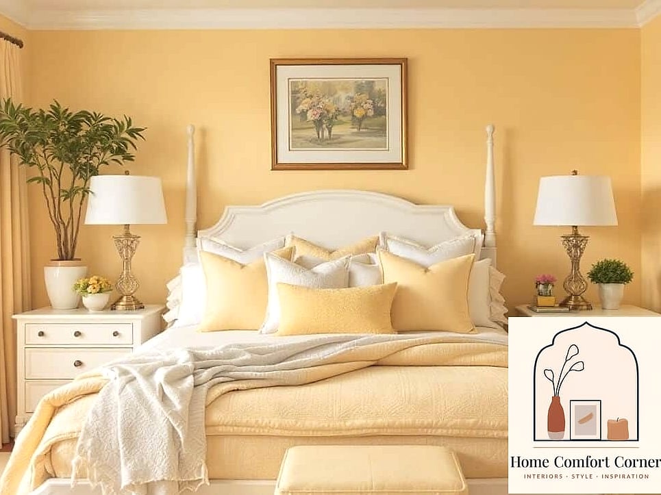
Yellow cabinets sound risky until you see them in a soft, buttery shade rather than anything bright or neon. It pairs beautifully with brushed brass or unlacquered hardware and warm wood open shelving. This is a favorite among renovators who want a kitchen that feels custom without going full color-drenched.
Powder Blue Bathroom Tile
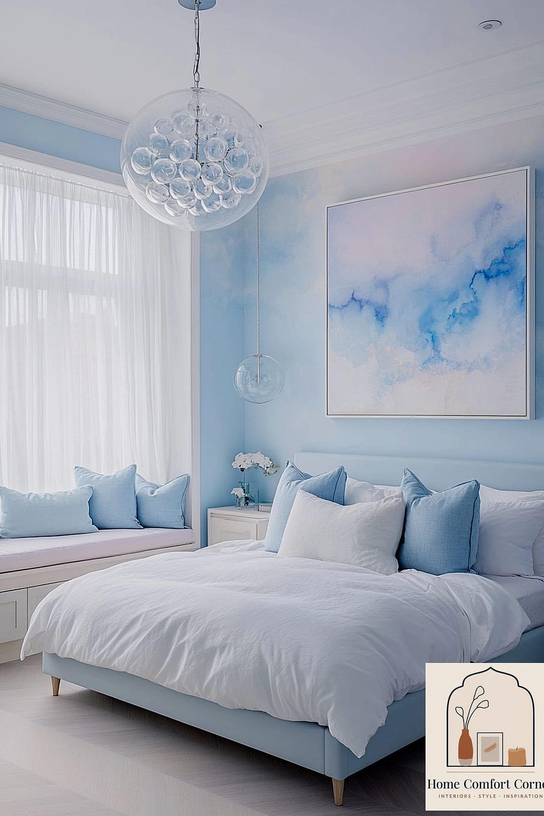
Small bathrooms are the perfect testing ground for pastel tile, and powder blue in particular photographs like a boutique hotel. Use it on a shower wall or as a half-tiled accent with white paint above. Matte finishes tend to look more grown-up here than glossy ones.
Mint Green Kitchenette in a Studio Apartment
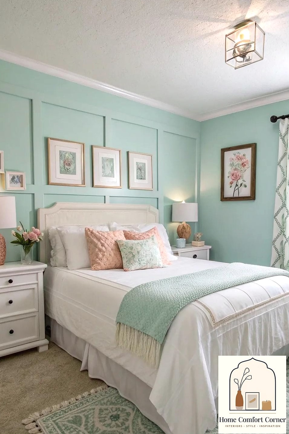
If you’re working with a small footprint, mint green cabinetry can make a kitchenette feel like an intentional design choice rather than an afterthought. Keep countertops and backsplash tile neutral so the green doesn’t overwhelm the space. This is a great renter-friendly option if you use removable cabinet wrap instead of paint.
Dusty Rose Dining Room with Wainscoting
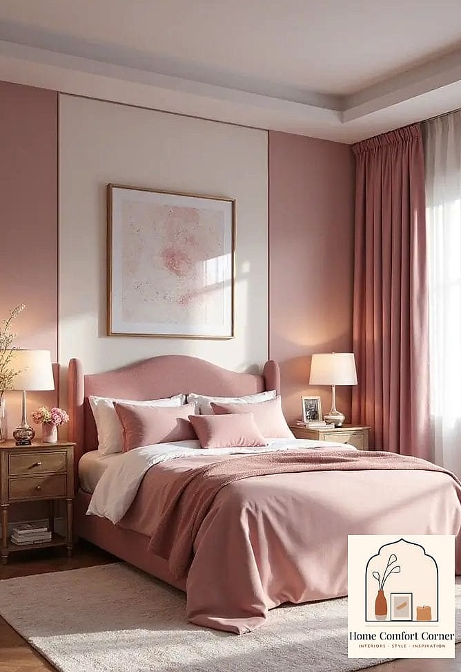
Wainscoting painted in dusty rose brings a sense of architecture and history to a dining room, even in a newer build. Top it with a cream or white upper wall and a warm wood table. It’s a combination that feels collected and layered rather than trendy for trendy’s sake.
Pale Peach Reading Nook
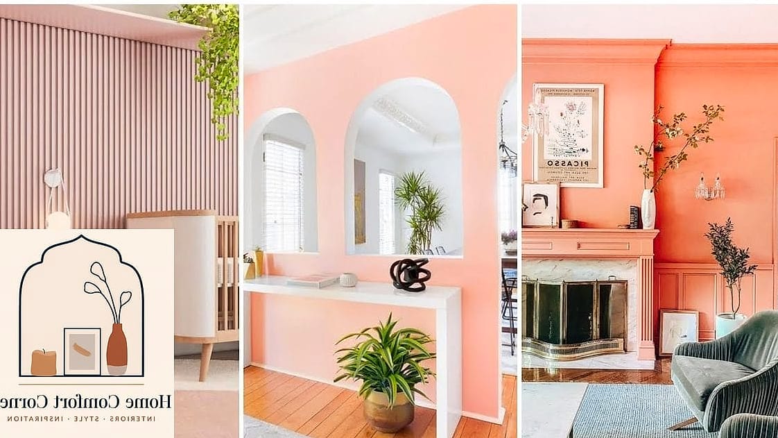
A small reading nook painted in pale peach with layered lighting feels cozy without tipping into overly saturated territory. Add a floor lamp, a stack of books, and a textured throw blanket. This is one of those corners that photographs beautifully and costs almost nothing to put together.
Seafoam Green Built-In Shelving
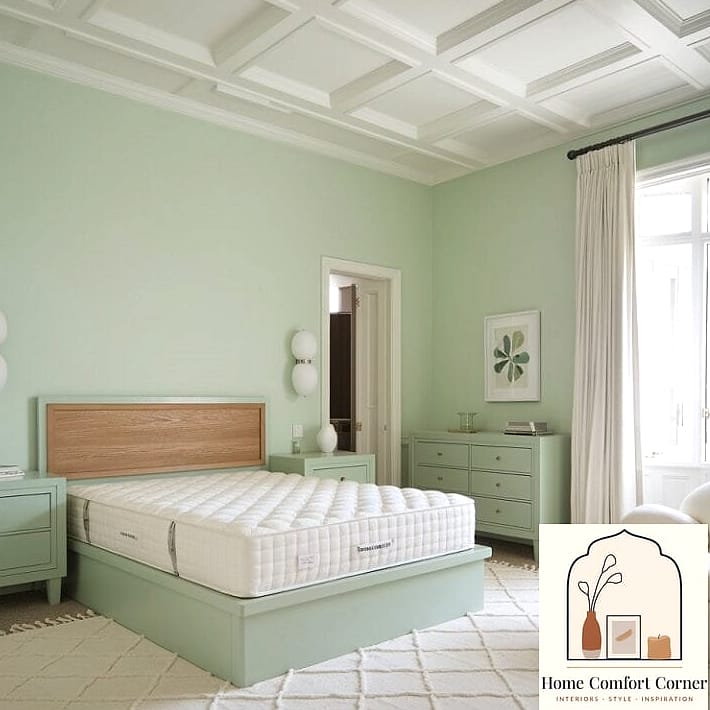
Built-in shelving painted seafoam green instantly reads as custom millwork, especially when styled with a mix of books, baskets, and greenery. Keep the surrounding walls white so the shelving becomes the focal point. This works well in living rooms, home offices, or even a primary bedroom.
Soft Lilac Accent Chair
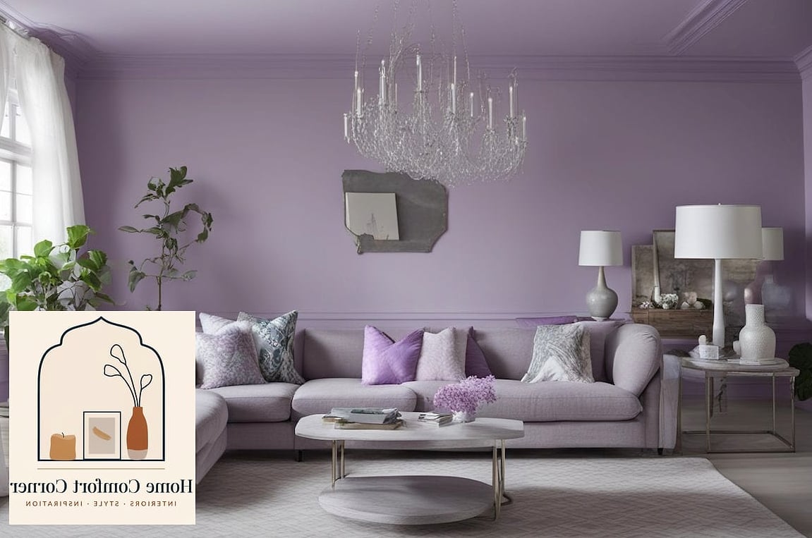
Sometimes the easiest pastel upgrade is a single statement chair. A soft lilac accent chair in a boucle or linen fabric adds color without any commitment to paint or wallpaper. Place it near a window with a small side table for a vignette that looks pulled from a catalog.
Pastel Terracotta Entryway
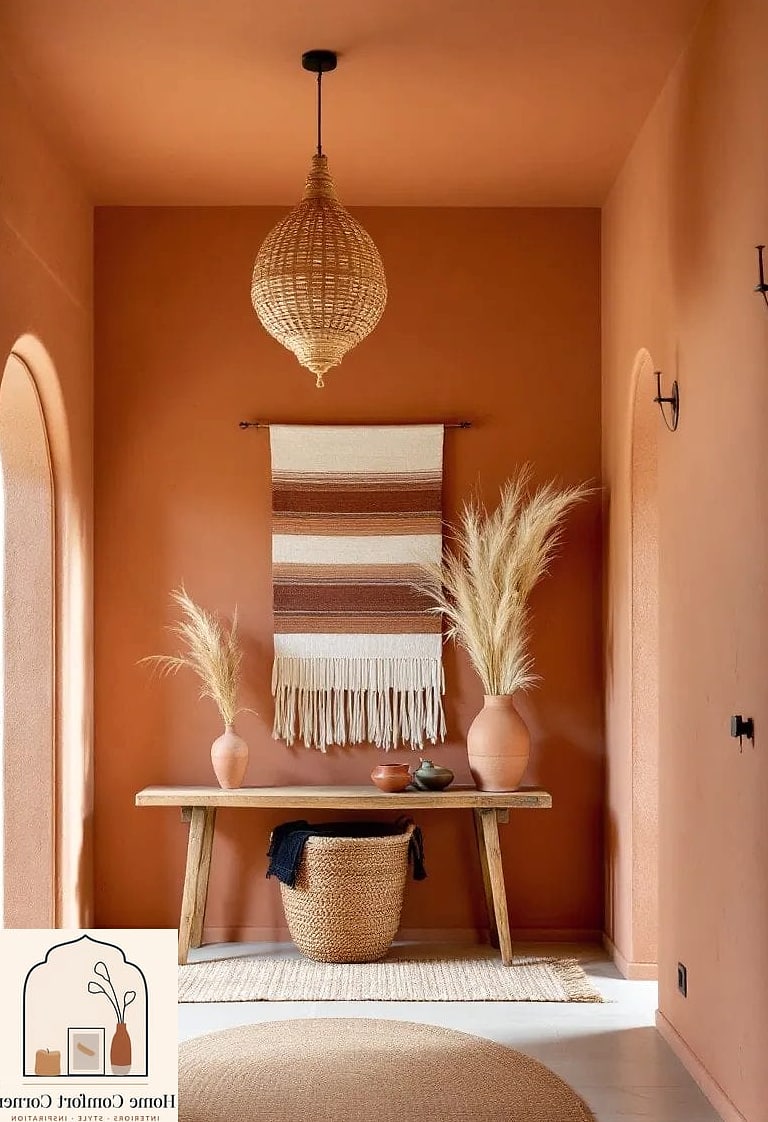
Terracotta gets softened into a dusty, pastel version that works beautifully in entryways. Pair it with black iron hardware and a woven jute rug for contrast. It’s warm enough to feel welcoming but muted enough to stay sophisticated.
Baby Blue Laundry Room Cabinetry
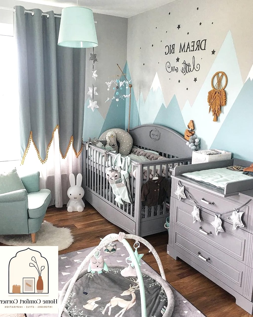
Laundry rooms are having a moment, and baby blue cabinetry paired with brass pulls makes even a small utility space feel designed on purpose. Add open shelving above for baskets and labeled bins. This is a project most DIYers can tackle over a weekend with cabinet paint.
Pastel Pink Home Office Nook
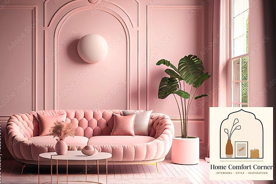
A small office nook in soft pink with a wood desk and woven chair strikes a nice balance between playful and professional. Keep accessories minimal, maybe a ceramic desk organizer and a small plant. This setup works especially well in a corner of a bedroom or hallway.
Sage and Cream Primary Bedroom
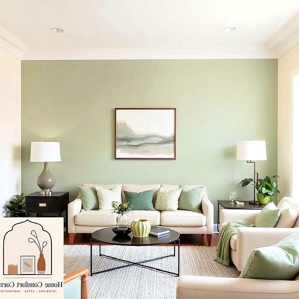
Combining sage green bedding with cream walls and warm wood furniture creates a bedroom that feels like a boutique hotel suite. Add linen curtains and a woven bench at the foot of the bed. This palette tends to age well, so it’s a smart choice if you don’t want to repaint every few years.
Pastel Yellow Front Door
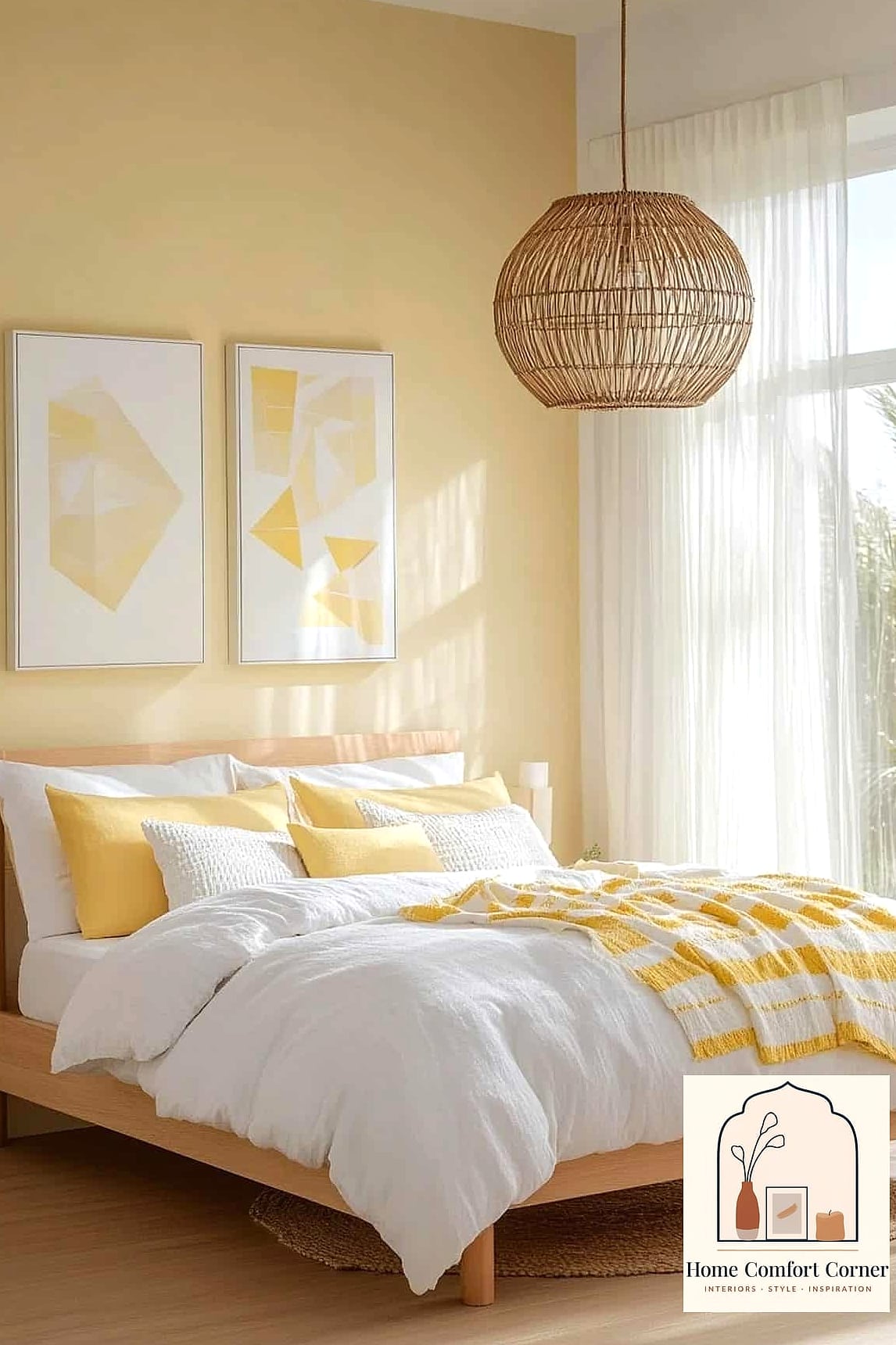
Sometimes the makeover isn’t inside at all. A pastel yellow front door against a neutral exterior gives a home instant curb appeal without a full repaint. Pair it with black hardware and a natural fiber doormat for a look that feels curated rather than accidental.
Lavender Tiled Backsplash
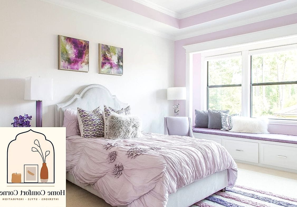
A lavender mosaic or subway tile backsplash brings unexpected color into a kitchen that’s otherwise neutral. It works best with white or wood cabinetry so the tile has room to shine. This is a great option if you want pastel without committing to painted cabinets.
Blush and Gold Powder Room
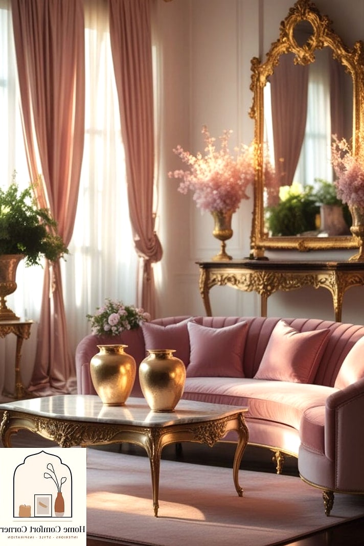
Powder rooms are a low-risk place to go bold with color since you’re only dealing with a small footprint. Blush pink walls paired with a gold-framed mirror and brass faucet make the space feel like a jewelry box. Wallpaper is another option here if you want more texture than paint alone provides.
Soft Mint Kids’ Room That Doesn’t Look Childish
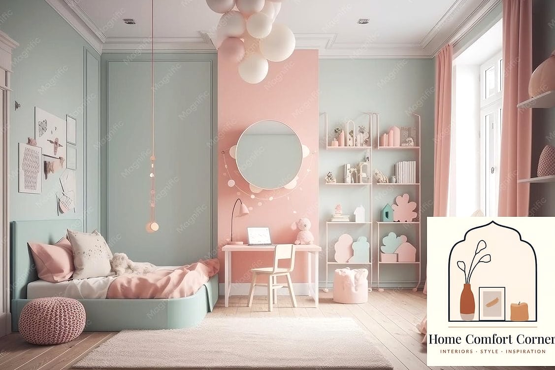
Soft mint green can work in a kids’ room without feeling babyish if you pair it with grown-up furniture shapes and natural wood tones. Skip the cartoon decor and lean into simple line art or botanical prints instead. This is a palette that can transition well into the tween years too.
Pastel Peach Kitchen Island
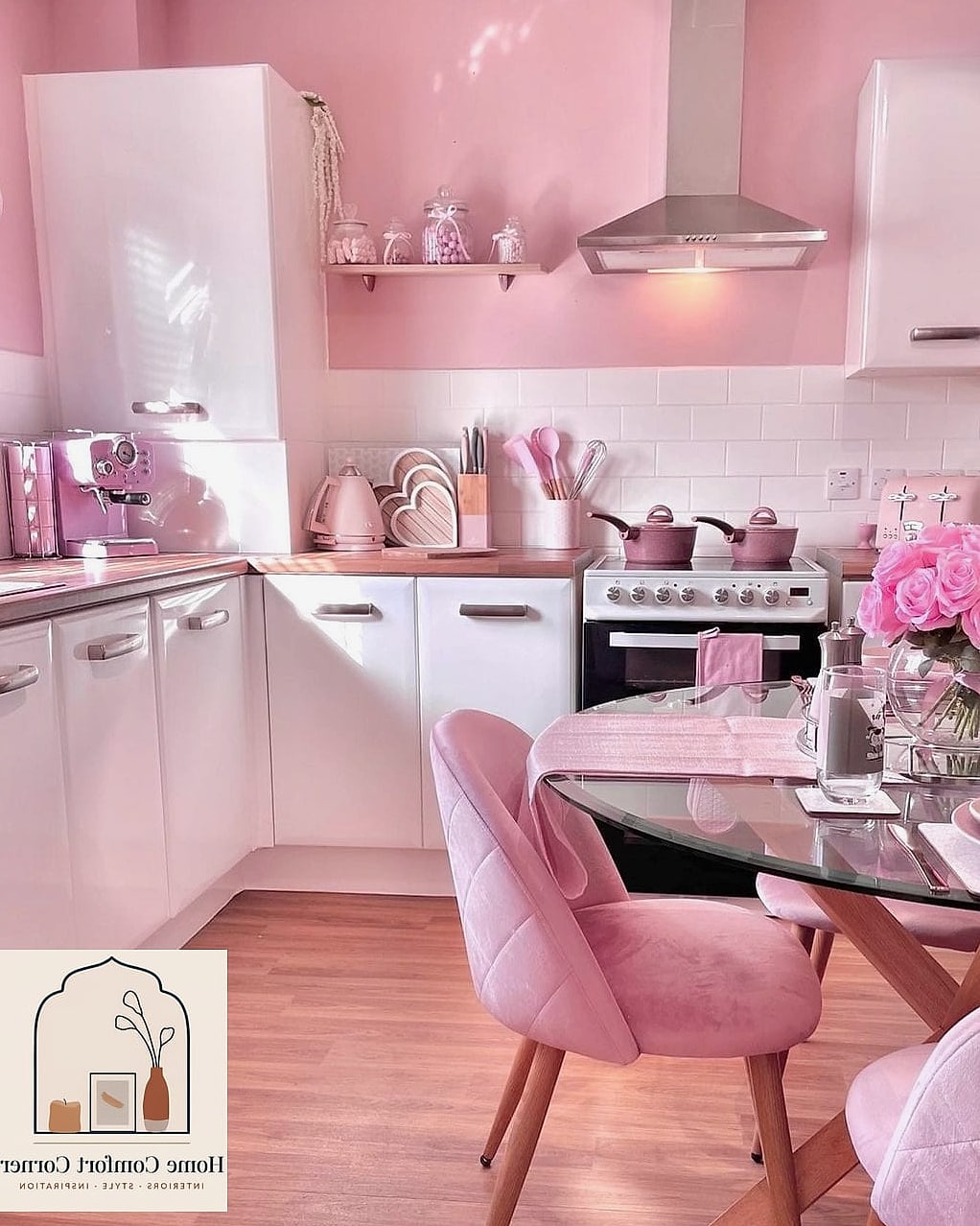
Painting just the kitchen island in pastel peach while keeping perimeter cabinets white or wood is a great way to test a bold color commitment. It becomes a natural focal point, especially with contrasting countertops like butcher block or quartz. This is also easier to change later than repainting the whole kitchen.
Dusty Blue Built-In Window Seat
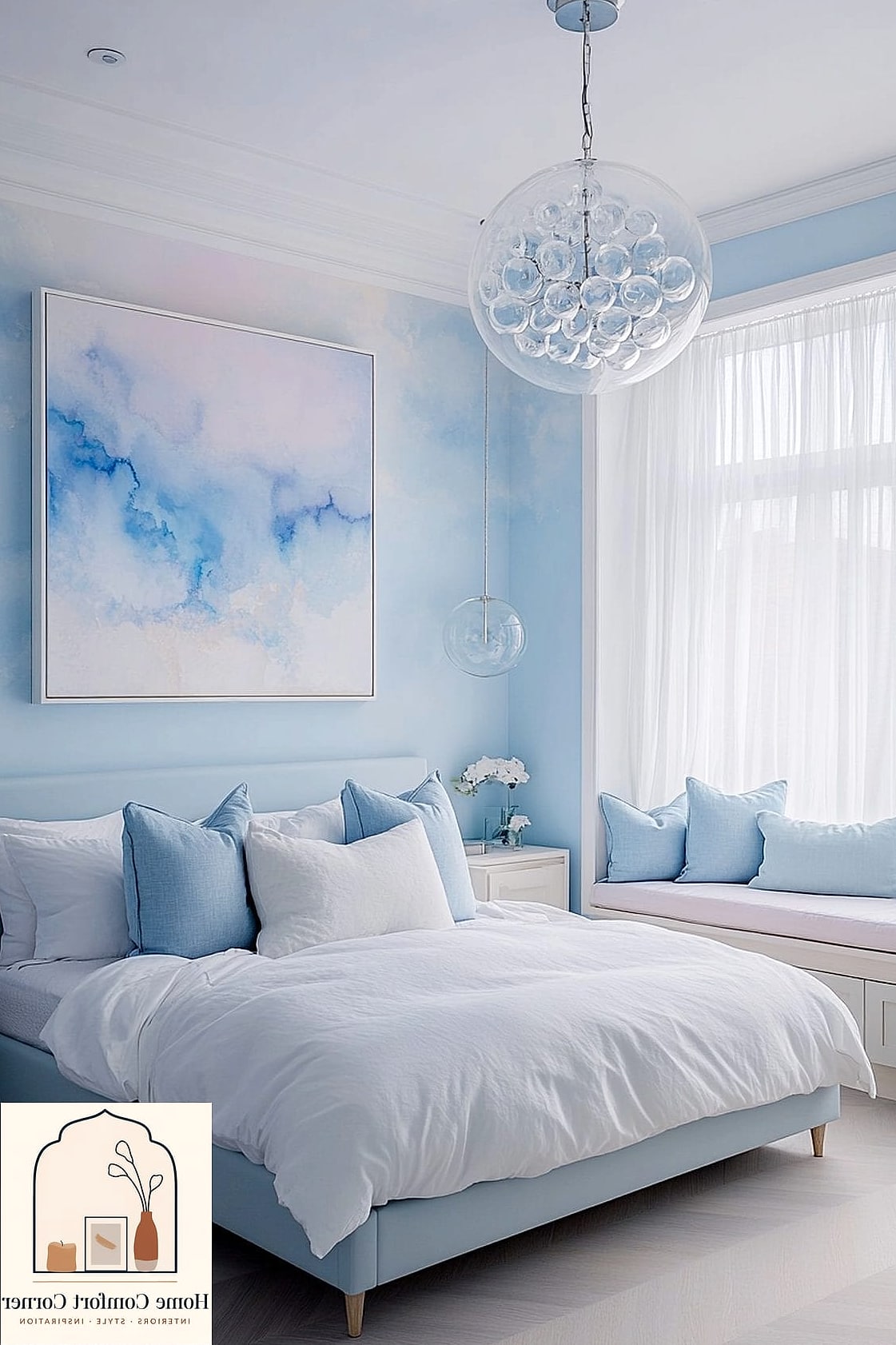
A window seat upholstered in dusty blue with layered pillows turns an awkward nook into one of the coziest spots in the house. Add hidden storage underneath for blankets or toys. Natural light really makes this color pop, so it’s ideal for a sunny corner.
Pastel Green Vintage-Inspired Kitchen
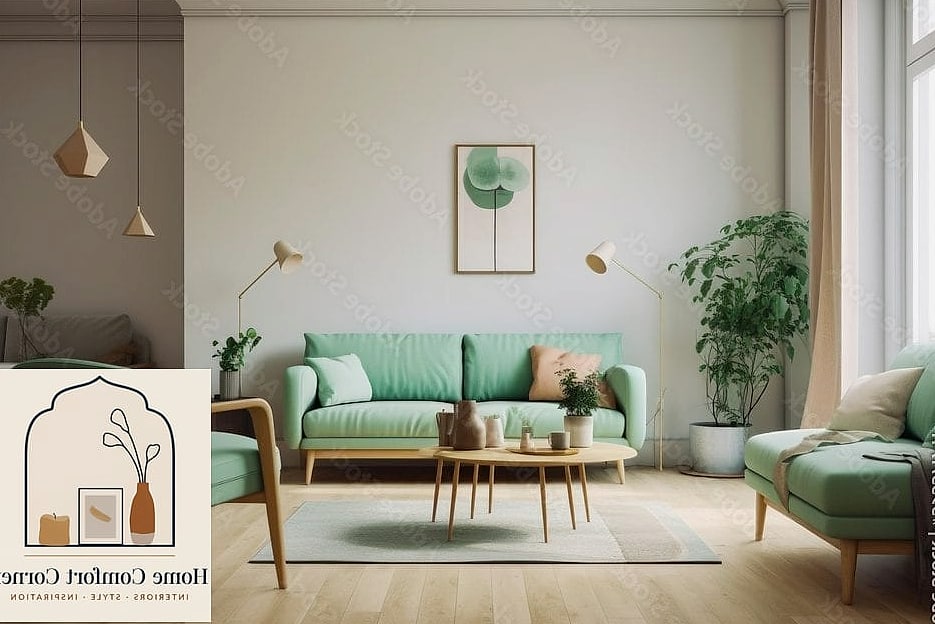
Leaning into a retro color palette with pastel green appliances or cabinetry gives a kitchen serious character. Balance it with modern black fixtures so it doesn’t feel like a costume theme. This look tends to work best in older homes with existing vintage bones.
Soft Coral Accent Wallpaper
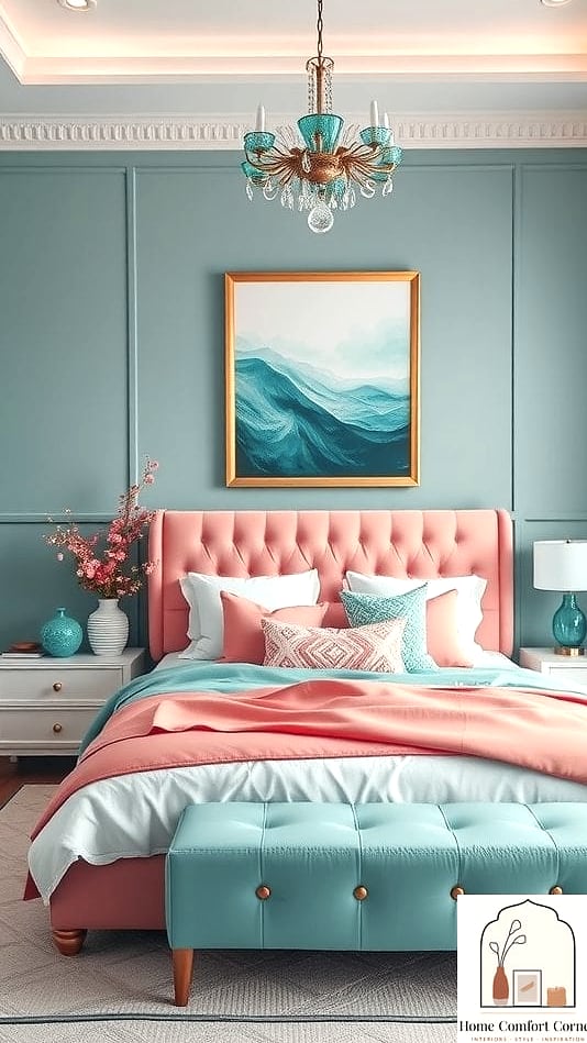
A soft coral wallpaper with a subtle pattern, like a small floral or geometric print, adds warmth and texture to a bedroom or hallway. Peel-and-stick versions make this renter-friendly if you’re not ready to commit long term. Keep furniture simple so the wallpaper doesn’t feel too busy.
Pastel Lilac Bathroom Vanity
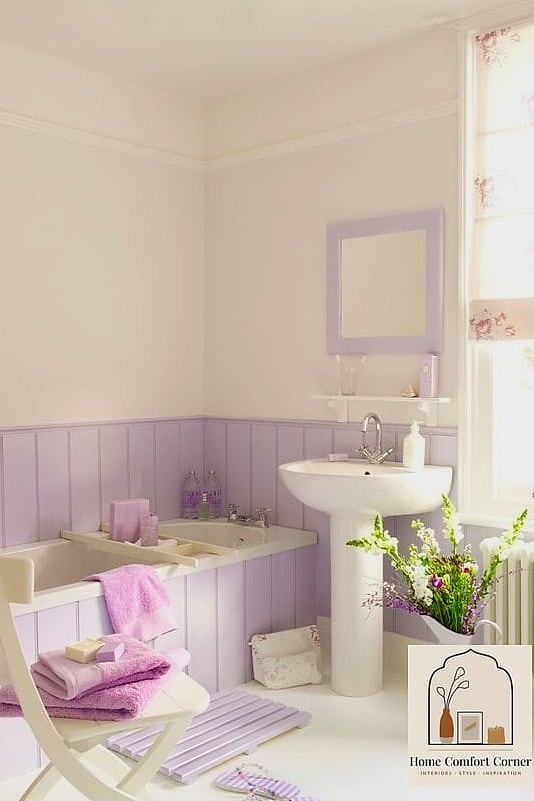
Painting an existing bathroom vanity in pastel lilac is one of the most budget-friendly makeovers on this list. Swap the hardware to brushed gold or matte black for extra polish. It’s a project you can finish in an afternoon with the right cabinet paint and a little patience.
Buttery Yellow Reading Chair in a Neutral Living Room
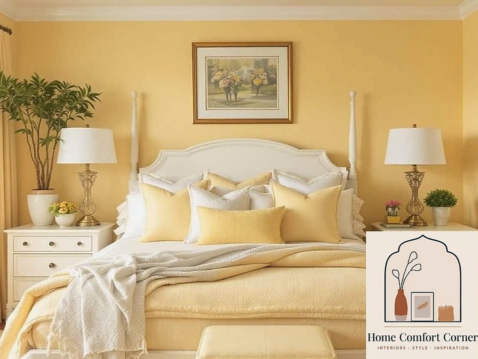
Dropping one buttery yellow chair into an otherwise neutral living room adds a pop of personality without redesigning the whole space. Pair it with a small round side table and a floor lamp for a cozy corner. This is an easy way to test pastel colors before going bigger.
Sage Green Kitchen Nook Banquette
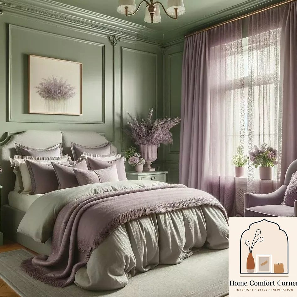
A built-in banquette upholstered in sage green fabric makes a breakfast nook feel like a cafe you’d actually want to sit in. Add a round wood table and mismatched pastel throw pillows for texture. This works especially well in kitchens with limited dining space.
Pastel Pink Tiled Fireplace Surround
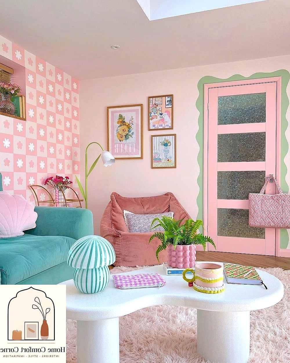
Tiling a fireplace surround in soft pink zellige or subway tile turns a plain fireplace into a genuine design feature. Keep the mantel and surrounding trim white to let the tile stand out. This is a higher-effort project, but the payoff in visual interest is significant.
Soft Blue Ceiling in a Sunroom
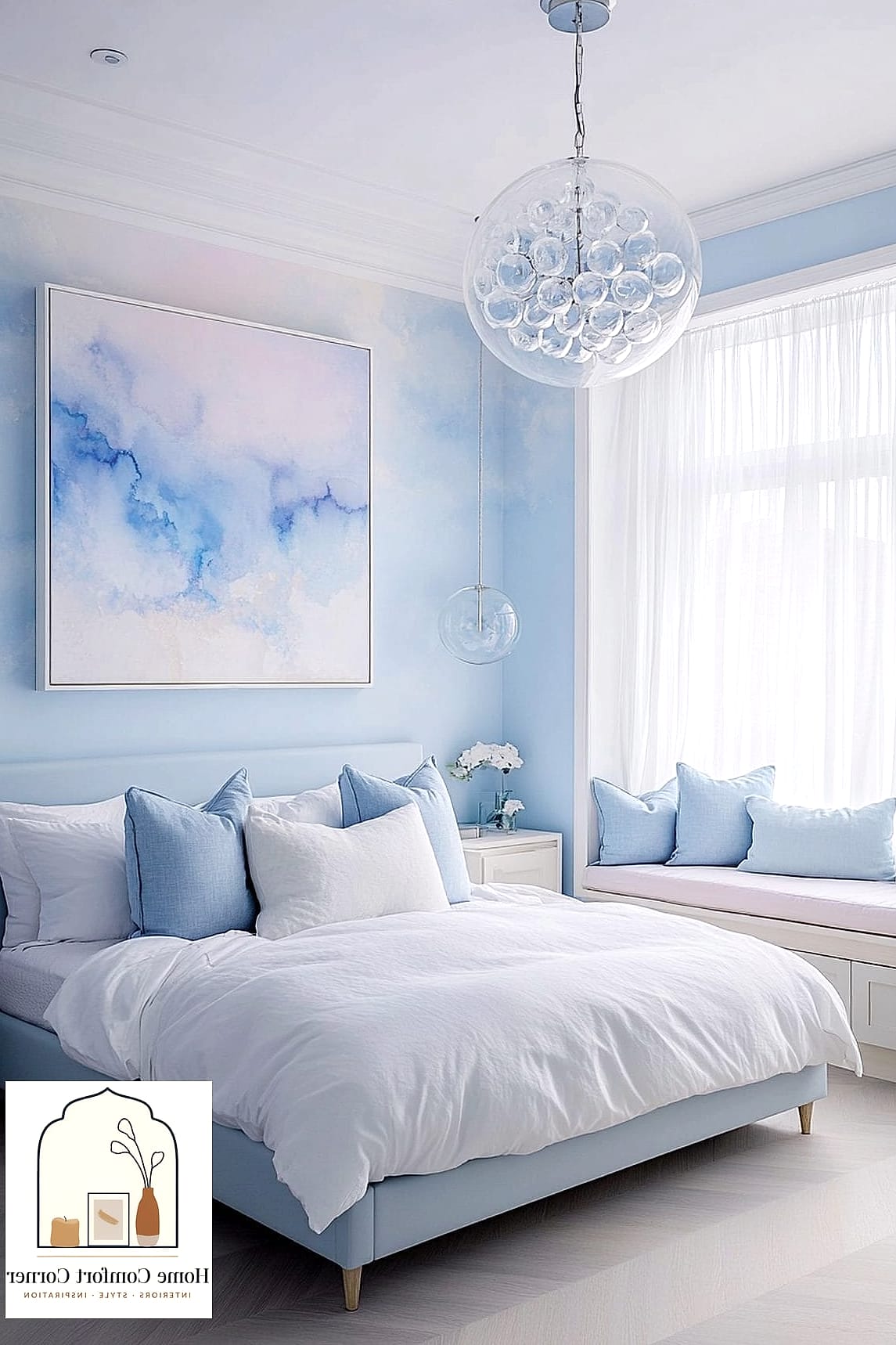
Painting the ceiling a soft, pastel blue in a sunroom or covered porch mimics a clear sky and makes the space feel more expansive. Pair it with white trim and wicker or rattan furniture. This is a classic Southern design trick that never really goes out of style.
Pastel Peach and White Striped Accent Wall
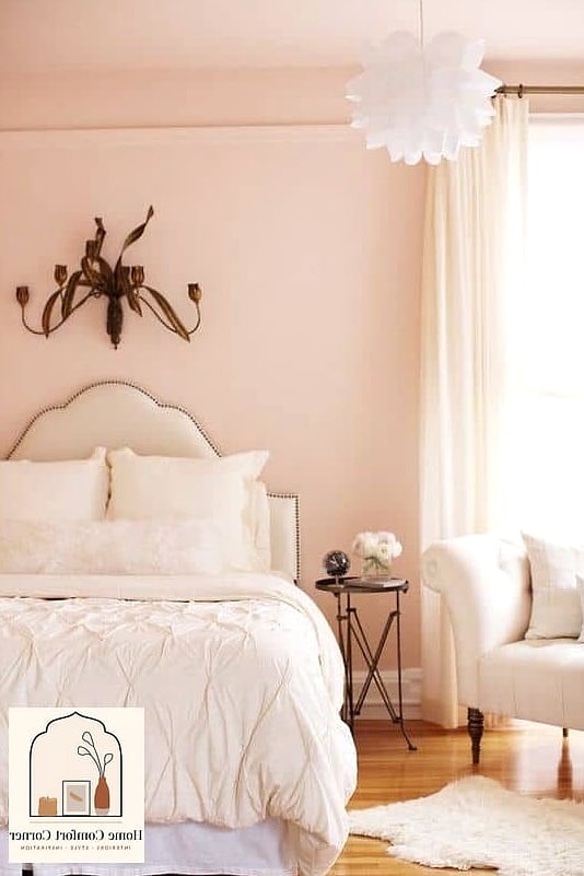
Hand-painted or taped stripes in pastel peach and white bring subtle pattern into a room without overwhelming it. This works nicely in a nursery, home office, or reading nook. Keep the stripe width generous rather than thin so it reads as intentional rather than busy.
Lavender Kitchen Cabinets with Unlacquered Brass
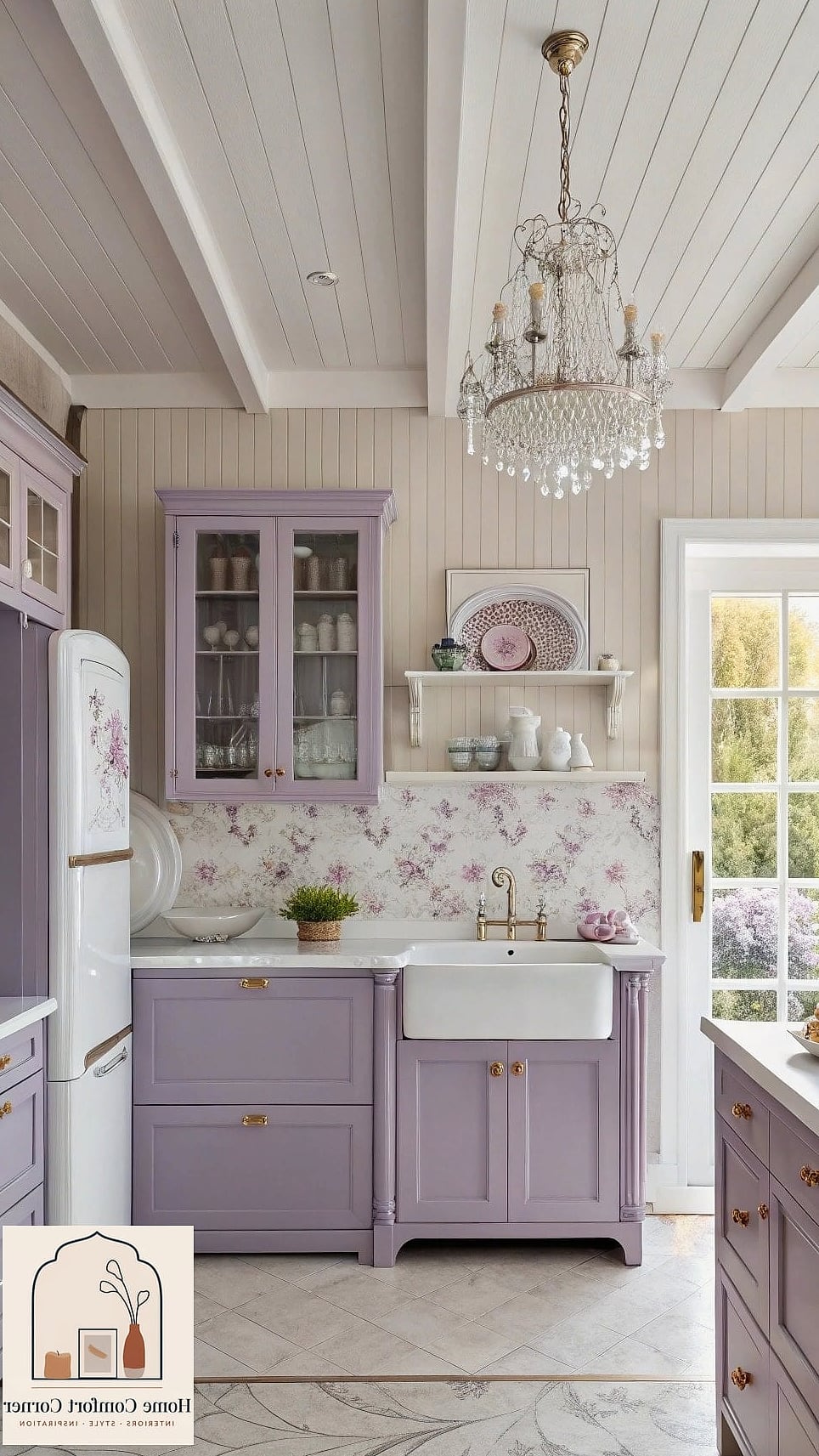
Lavender cabinetry paired with unlacquered brass hardware is one of the more daring choices on this list, but it photographs beautifully. The brass develops a natural patina over time, which only adds to the collected, expensive look. This works best in kitchens with plenty of natural light to keep the color from feeling heavy.
Pastel Green Bookshelf Styling
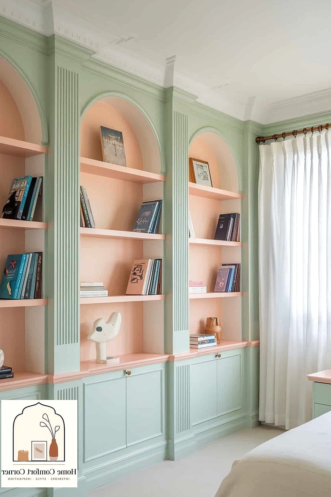
Sometimes the makeover is as simple as painting the back panels of an existing bookshelf in pastel green. It creates depth and makes your books and decor pop against the color. This is one of the most budget-friendly projects on this entire list and takes just a few hours.
Pastel colors have this reputation for being soft and maybe a little safe, but as you can see, they’re capable of a lot more than that. The common thread through every idea here is contrast: pastel paired with warm wood, brushed metal, or crisp white trim so the color has something to play against. That contrast is really what separates a pastel room that looks expensive from one that feels like an afterthought.
If you’re planning your own version of these 30 pastel room decor makeovers, start small. Paint one wall, swap one piece of hardware, or reupholster one chair before committing to a full room overhaul. Pastels are forgiving that way, and once you see how a soft color can transform a space, it’s hard not to want to do it again somewhere else in the house.