14 Aesthetic Room Paint Ideas Perfect for Every Home Style

- Warm Terracotta for Earthy, Grounded Spaces
- Soft Sage Green for a Calming Retreat
- Deep Charcoal for Moody, Modern Rooms
- Creamy Off-White for Timeless Simplicity
- Rich Navy Blue for Classic Sophistication
- Blush Pink for Soft, Feminine Touches
- Bold Forest Green for Dramatic Statement Walls
- Warm Greige for Versatile Everyday Living
- Buttery Yellow for Cheerful Kitchens
- Muted Lavender for Subtle Personality
- Classic Black for Bold Accent Moments
- Coastal Blue-Gray for Relaxed, Airy Rooms
- Warm Clay Pink for Cozy Living Spaces
- Crisp White with Warm Undertones for a Bright Reset
14 Aesthetic Room Paint Ideas Perfect for Every Home Style
Picking a paint color feels simple until you’re standing in the aisle staring at forty shades of white, wondering why this is so hard. Paint is honestly the cheapest, fastest way to change how a room feels, but the options can be overwhelming when you don’t know where to start.
That’s why I put together this list of aesthetic room paint ideas that work across different home styles, from cozy cottage to sleek modern. Whether you’re repainting one accent wall or committing to a whole-room color change, there’s something here for you.
Warm Terracotta for Earthy, Grounded Spaces
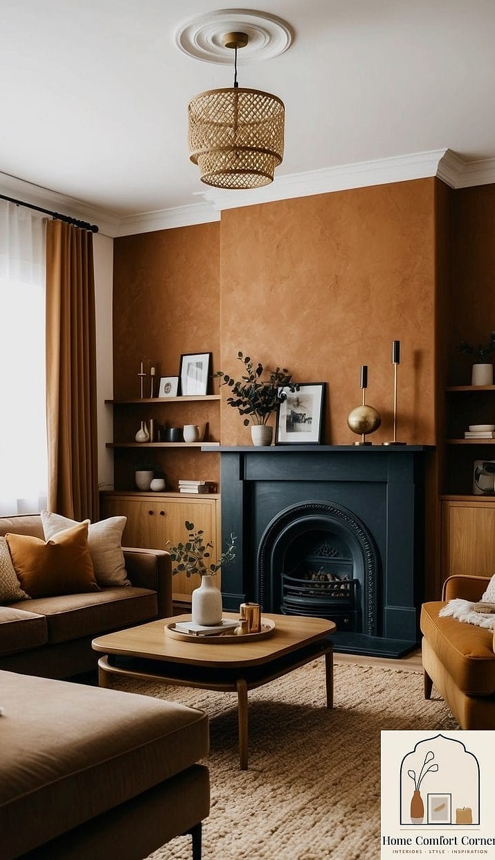
Terracotta has quietly become one of the most requested colors I hear about, and I get why. It’s warm without being loud, and it pairs beautifully with wood tones, woven textures, and greenery.
This shade works especially well in dining rooms and living rooms where you want the space to feel inviting rather than sterile. It also plays nicely with brushed brass hardware and natural stone accents if you’re leaning into an earthy aesthetic.
Terracotta can read a little dark in rooms with limited natural light, so test a swatch before committing. A budget-friendly way to try it is painting just one wall instead of the whole room.
Soft Sage Green for a Calming Retreat
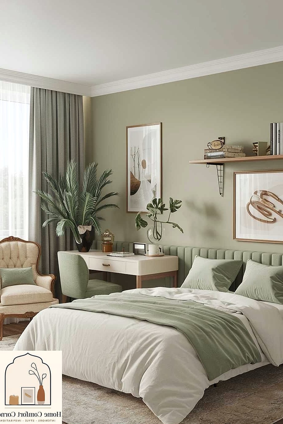
Sage green has staying power because it’s soft enough to feel soothing but still has enough depth to avoid looking washed out. It’s become a favorite for bedrooms and bathrooms where the goal is relaxation.
This color pairs well with warm wood tones, matte black fixtures, and neutral bedding. It also works surprisingly well in kitchens paired with butcher block counters or open shelving.
Sage tends to shift depending on lighting, so it can look more gray in the morning and greener in the evening. That’s part of its charm if you ask me.
Deep Charcoal for Moody, Modern Rooms
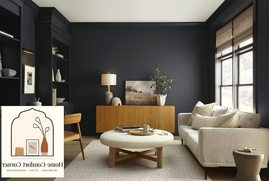
Charcoal is one of those colors people are scared to commit to, but it can completely transform a room when done right. It works particularly well in home offices, powder rooms, or accent walls behind a bed.
Paired with brass or black hardware and layered lighting, charcoal creates a cozy, almost cocoon-like feeling instead of coming off cold. It’s a favorite in modern and industrial-style homes.
Because dark colors show scuffs more easily, a matte or eggshell finish tends to hide imperfections better than glossy options. Just something to keep in mind if you have kids or pets running through the space.
Creamy Off-White for Timeless Simplicity
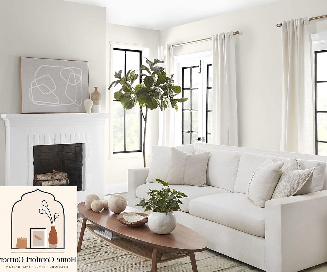
Not every room needs a bold color, and creamy off-whites prove that simplicity can still feel intentional. These shades work in almost every home style, from farmhouse to minimalist to traditional.
Off-white walls act as a blank canvas, letting your furniture, textiles, and decor do the talking. They also make small rooms feel larger and brighter, which is a huge plus if you’re working with limited square footage.
The tricky part with off-whites is undertones. Some lean yellow, some lean pink, and some lean gray, so it’s worth testing a few samples on your actual wall before deciding.
Rich Navy Blue for Classic Sophistication
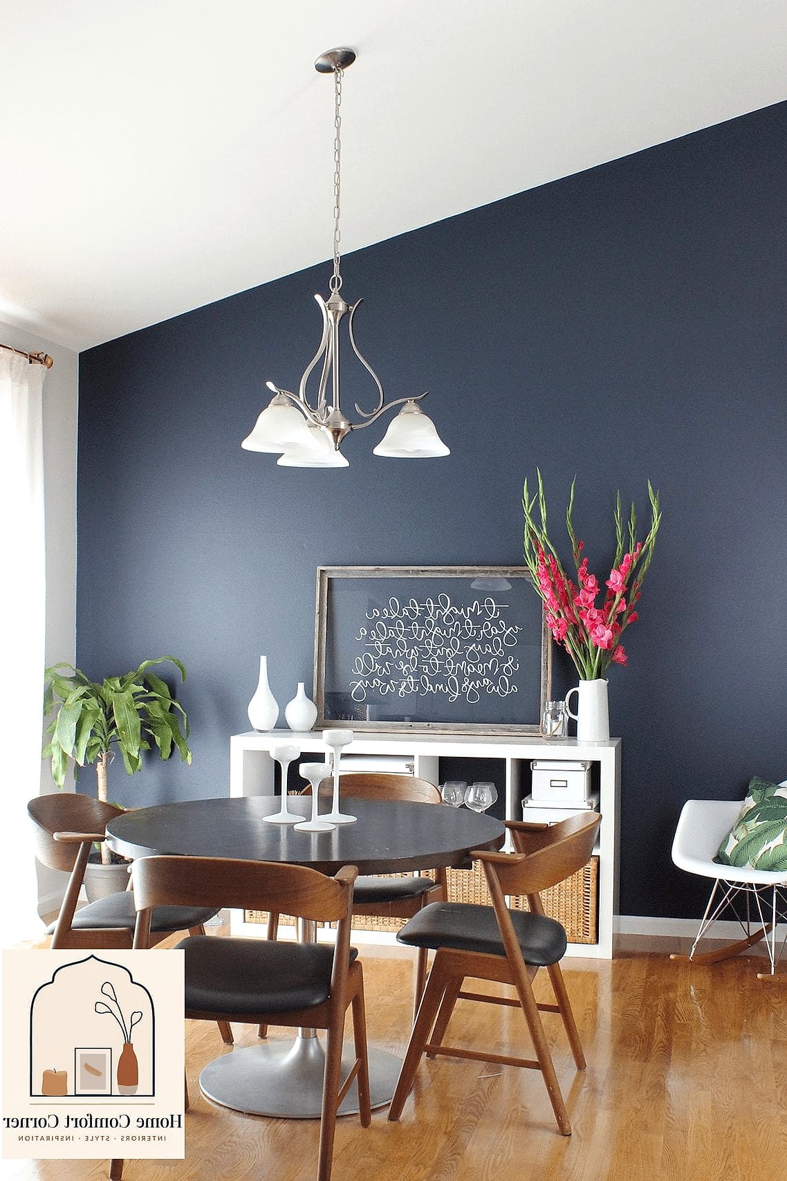
Navy blue has this ability to feel both traditional and current at the same time. It shows up often in home offices, libraries, and dining rooms where you want a slightly formal, polished feel.
This color pairs beautifully with brass hardware, warm wood furniture, and crisp white trim. It’s also a great choice if you love the idea of a dark room but aren’t ready to go full black or charcoal.
Navy can feel heavy in smaller spaces without enough light, so consider pairing it with lighter ceilings or plenty of layered lighting to keep things balanced.
Blush Pink for Soft, Feminine Touches
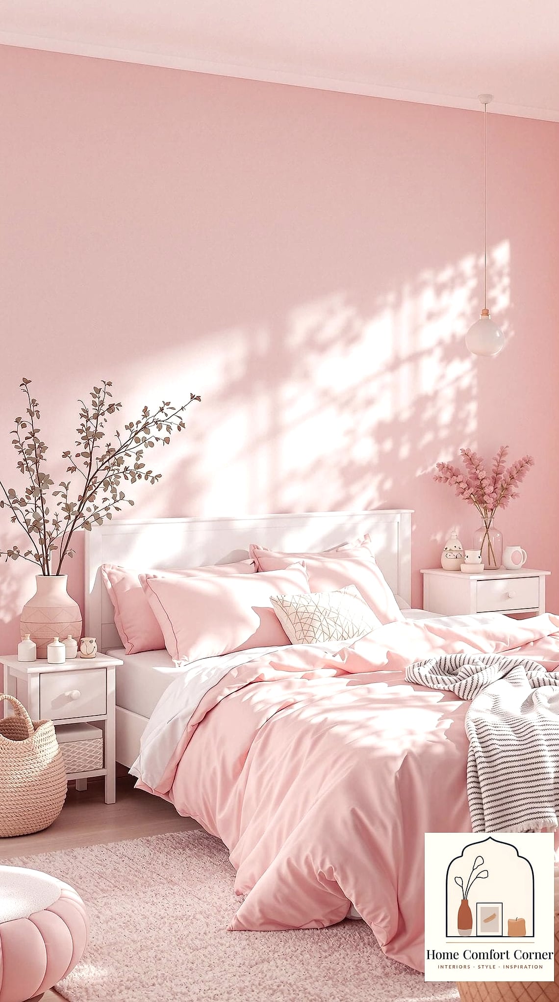
Blush pink has moved past its trendy phase and settled into being a genuinely versatile neutral. It works in nurseries, bedrooms, and even living rooms when paired with the right materials.
Pairing blush with warm wood tones, brass accents, or textured throw pillows keeps it from feeling too sweet or juvenile. It also looks surprisingly sophisticated next to black fixtures or dark wood furniture.
If you’re worried about commitment, a peel-and-stick wallpaper in a similar tone is a renter-friendly way to test the look before painting.
Bold Forest Green for Dramatic Statement Walls
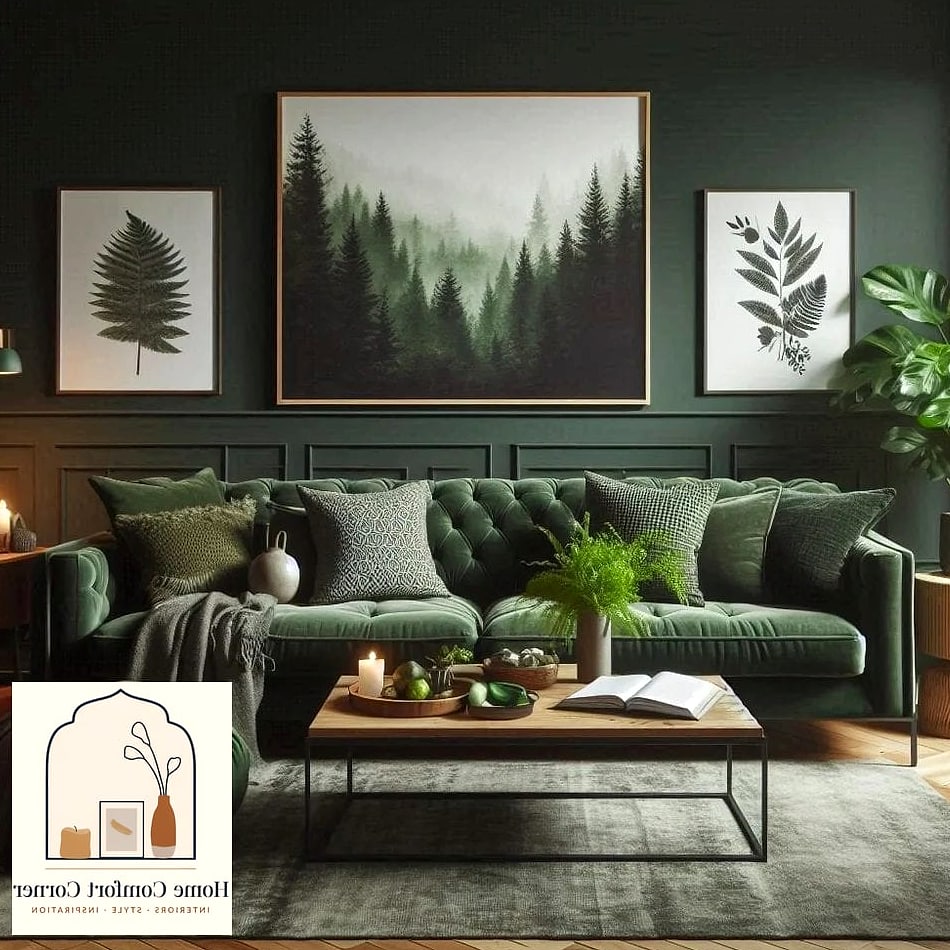
Forest green is for the person who wants their room to feel like a statement, not an afterthought. It’s especially popular in dining rooms, entryways, and home libraries where drama is welcome.
This color pairs naturally with natural stone, brass fixtures, and layered greenery, which almost feels redundant but works so well together. It also holds up nicely against wood paneling or wainscoting.
Because it’s such a saturated color, I’d recommend sampling a large swatch and living with it for a few days before painting the whole room.
Warm Greige for Versatile Everyday Living
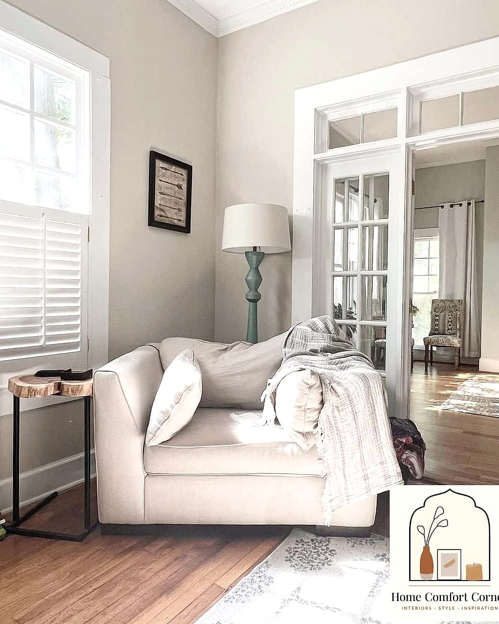
Greige, that in-between gray and beige, remains one of the most practical paint choices for people who want warmth without picking a specific color. It works in living rooms, hallways, and open floor plans where consistency matters.
This shade adapts well to almost any home style, whether you’re going for farmhouse, transitional, or modern. It also makes a great backdrop for colorful artwork or patterned textiles since it doesn’t compete for attention.
Greige can sometimes look flat under fluorescent lighting, so natural light really helps this color shine the way it’s meant to.
Buttery Yellow for Cheerful Kitchens
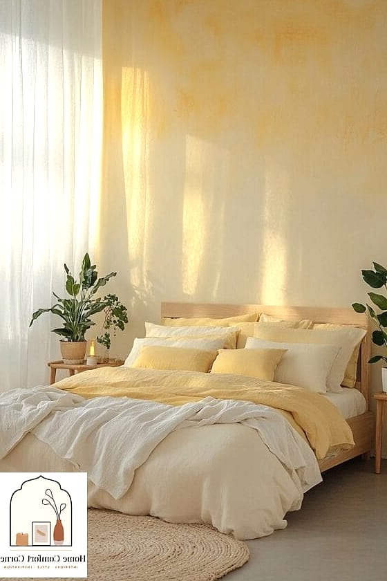
Yellow doesn’t get enough credit these days, but a soft buttery yellow can make a kitchen or breakfast nook feel instantly cheerful. It’s a great option if you want color without going too bold.
This shade pairs nicely with white cabinetry, wood cutting boards, and woven baskets for storage. It also tends to photograph beautifully in morning light, which is a nice bonus if you love sharing your space online.
Because yellow can read differently depending on undertones, testing samples at different times of day will save you from surprises.
Muted Lavender for Subtle Personality
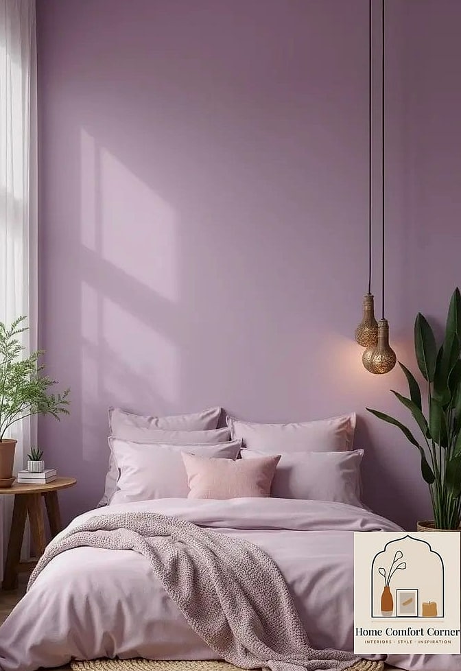
Lavender has come a long way from its overly sweet reputation. A muted, dusty version of this color works beautifully in bedrooms and home offices where you want personality without overwhelming the space.
Pairing lavender with matte black or brushed nickel hardware keeps it grounded rather than whimsical. It also looks great alongside neutral bedding and simple wood furniture.
This is a fairly renter-friendly color choice since it’s soft enough not to clash with existing trim or flooring in most homes.
Classic Black for Bold Accent Moments
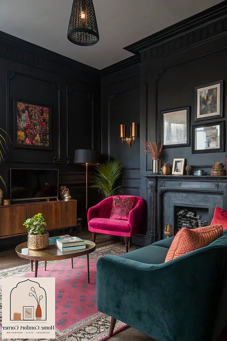
Black paint isn’t just for goth teenagers anymore, and honestly, it might be one of the most underrated choices for accent walls or trim. It adds instant sophistication to entryways, powder rooms, and built-in shelving.
This color works especially well paired with brass hardware, natural wood tones, and plenty of texture to keep things from feeling flat. Black trim against white walls has also become a signature look in modern farmhouse homes.
Because black shows dust and fingerprints more than lighter colors, a satin or eggshell finish tends to be easier to maintain than high gloss.
Coastal Blue-Gray for Relaxed, Airy Rooms
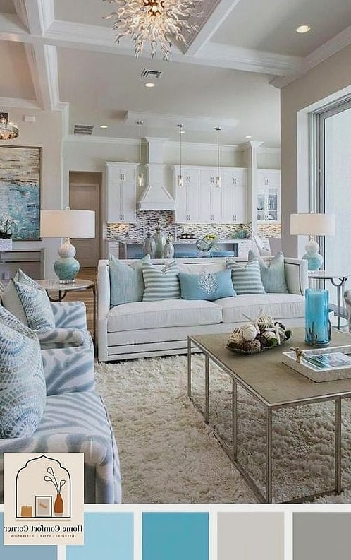
Blue-gray sits in this perfect middle ground between calming and interesting, which is probably why it shows up so often in coastal and modern farmhouse homes. It works beautifully in bathrooms, bedrooms, and sunrooms.
This shade pairs well with white shiplap, natural fiber rugs, and light wood tones for a relaxed, breezy feel. It also tends to look different throughout the day depending on how the light hits it, which some people love and others find tricky.
If you’re testing this color, paint a sample board and move it around the room throughout the day before deciding on wall placement.
Warm Clay Pink for Cozy Living Spaces
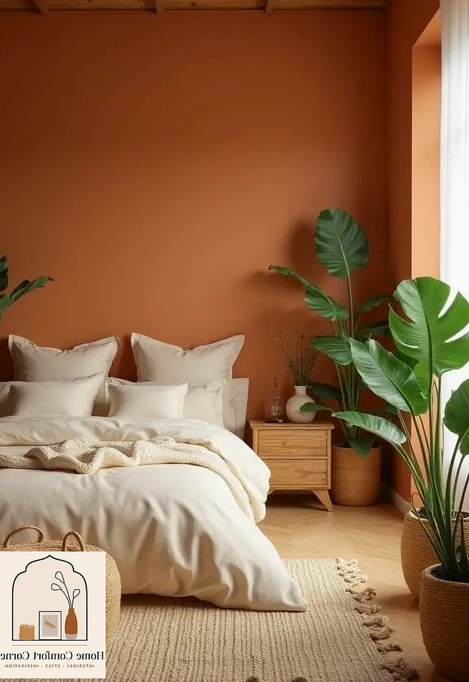
Clay pink is a bit deeper and more muted than blush, giving it a cozier, more grounded feel. It works particularly well in living rooms and bedrooms where you want warmth without full commitment to a bold color.
This shade pairs nicely with warm wood furniture, woven textures, and brass accents for a look that feels curated rather than overly designed. It also complements neutral color palettes if you only want it as an accent wall.
Clay pink tends to look more sophisticated in a matte finish, which helps it avoid feeling overly soft or pastel.
Crisp White with Warm Undertones for a Bright Reset
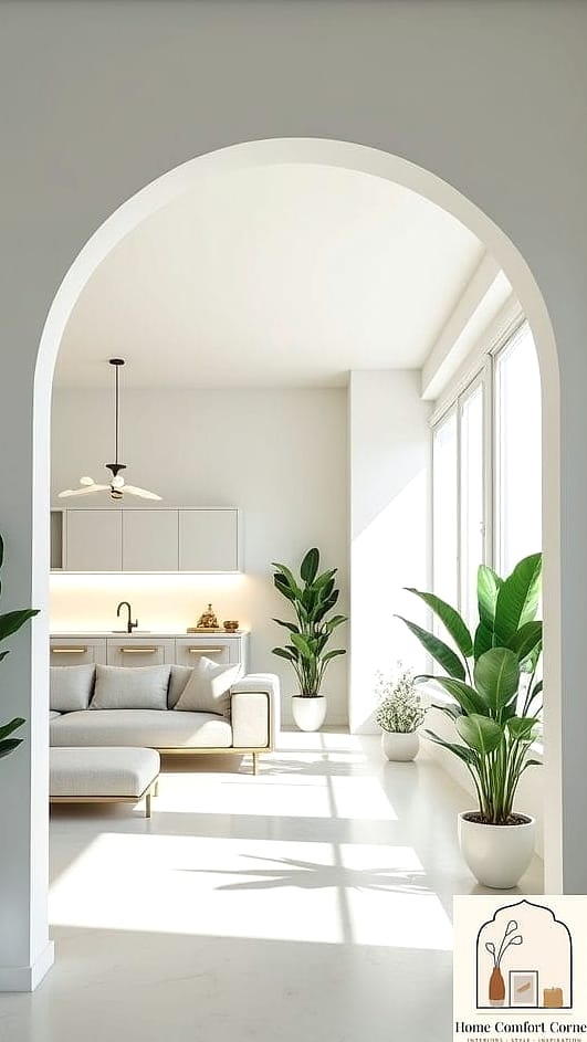
Sometimes the best paint idea is simply a fresh, crisp white, especially if your home hasn’t been repainted in years. A white with subtle warm undertones avoids feeling cold or clinical while still brightening up a space.
This works in literally every room and every home style, which is part of why it remains such a popular choice. It’s especially useful in small bathrooms, hallways, or rooms with limited natural light.
Because white shows imperfections on walls more easily, patching and sanding before painting really does make a noticeable difference in the final result.
Final Thoughts
There’s no single “right” answer when it comes to choosing paint colors, and that’s honestly the fun part. Every one of these 14 aesthetic room paint ideas can work depending on your home’s lighting, existing furniture, and personal style.
If you’re still unsure, start small. Paint a sample board, live with it for a few days, and see how it feels in different lighting throughout the day. A little patience upfront saves you from repainting twice, and trust me, your future self will thank you.